## Bar Chart: CoC (Python)
### Overview
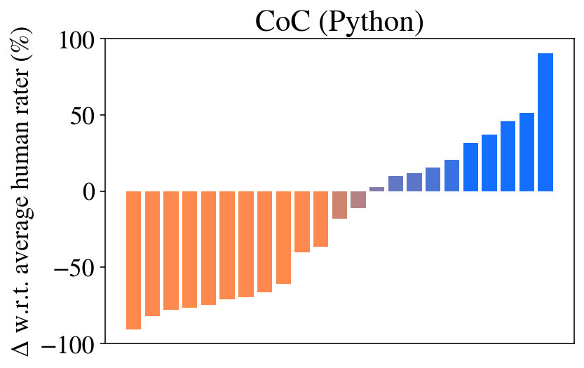
The chart visualizes the delta (Δ) between a metric (CoC) and the average human rater percentage across 101 categories (x-axis: 0 to 100). The y-axis ranges from -100% to 100%, with negative values (orange bars) dominating the left half and positive values (blue bars) increasing sharply on the right.
### Components/Axes
- **Title**: "CoC (Python)"
- **Y-Axis**: "Δ w.r.t. average human rater (%)" (range: -100 to 100)
- **X-Axis**: Categories labeled 0 to 100 (discrete intervals)
- **Legend**: Implied by color (orange = negative Δ, blue = positive Δ)
### Detailed Analysis
- **Negative Δ (Orange Bars)**:
- Categories 0–50 show progressively decreasing values:
- x=0: ~-100%
- x=10: ~-90%
- x=20: ~-80%
- x=30: ~-70%
- x=40: ~-60%
- x=50: ~-50%
- Bars decrease in height linearly from left to right.
- **Positive Δ (Blue Bars)**:
- Categories 50–100 show progressively increasing values:
- x=50: ~+5%
- x=60: ~+10%
- x=70: ~+20%
- x=80: ~+30%
- x=90: ~+40%
- x=100: ~+100%
- Bars increase in height exponentially from left to right.
### Key Observations
1. **Transition at x=50**: The shift from negative to positive Δ occurs abruptly at x=50, with a small positive value (~+5%) immediately following the last negative bar (~-50%).
2. **Extreme Values**:
- The most negative value (-100%) occurs at x=0.
- The most positive value (+100%) occurs at x=100.
3. **Symmetry**: The magnitude of negative and positive values mirrors each other (e.g., x=0: -100% vs. x=100: +100%).
### Interpretation
The chart suggests a **threshold effect** at x=50, where the metric (CoC) transitions from underperforming to outperforming the average human rater. The exponential growth in positive Δ values for x > 50 implies that higher x-values correlate with significantly better performance. The symmetry in magnitude between negative and positive extremes hints at a binary or polarized evaluation system (e.g., "poor" vs. "excellent"). The absence of intermediate values (e.g., x=50: +5%) suggests a categorical rather than continuous relationship between x and Δ.
**Note**: The chart lacks explicit labels for x-axis categories, leaving their semantic meaning (e.g., "0" vs. "100") ambiguous. Further context is required to interpret the practical significance of these values.