## Pie Chart: Error Distribution
### Overview
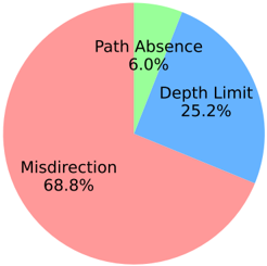
The image is a pie chart illustrating the distribution of errors across three categories: Misdirection, Depth Limit, and Path Absence. The chart visually represents the proportion of each error type, with Misdirection being the most prevalent.
### Components/Axes
* **Categories:**
* Misdirection (Red)
* Depth Limit (Blue)
* Path Absence (Light Green)
* **Values:** The percentage associated with each category, displayed directly on the pie chart.
### Detailed Analysis
* **Misdirection:** 68.8% (Red) - This category occupies the largest portion of the pie chart.
* **Depth Limit:** 25.2% (Blue) - This category occupies the second largest portion of the pie chart.
* **Path Absence:** 6.0% (Light Green) - This category occupies the smallest portion of the pie chart.
### Key Observations
* Misdirection errors are significantly more frequent than Depth Limit or Path Absence errors.
* Path Absence errors are the least common.
* The sum of all percentages is 100%.
### Interpretation
The pie chart indicates that Misdirection is the primary source of errors, accounting for over two-thirds of all errors. Depth Limit errors are the second most significant, while Path Absence errors are relatively rare. This suggests that efforts to reduce errors should focus primarily on addressing the causes of Misdirection. The large disparity between Misdirection and the other categories implies that different error-reduction strategies may be needed for each category.