\n
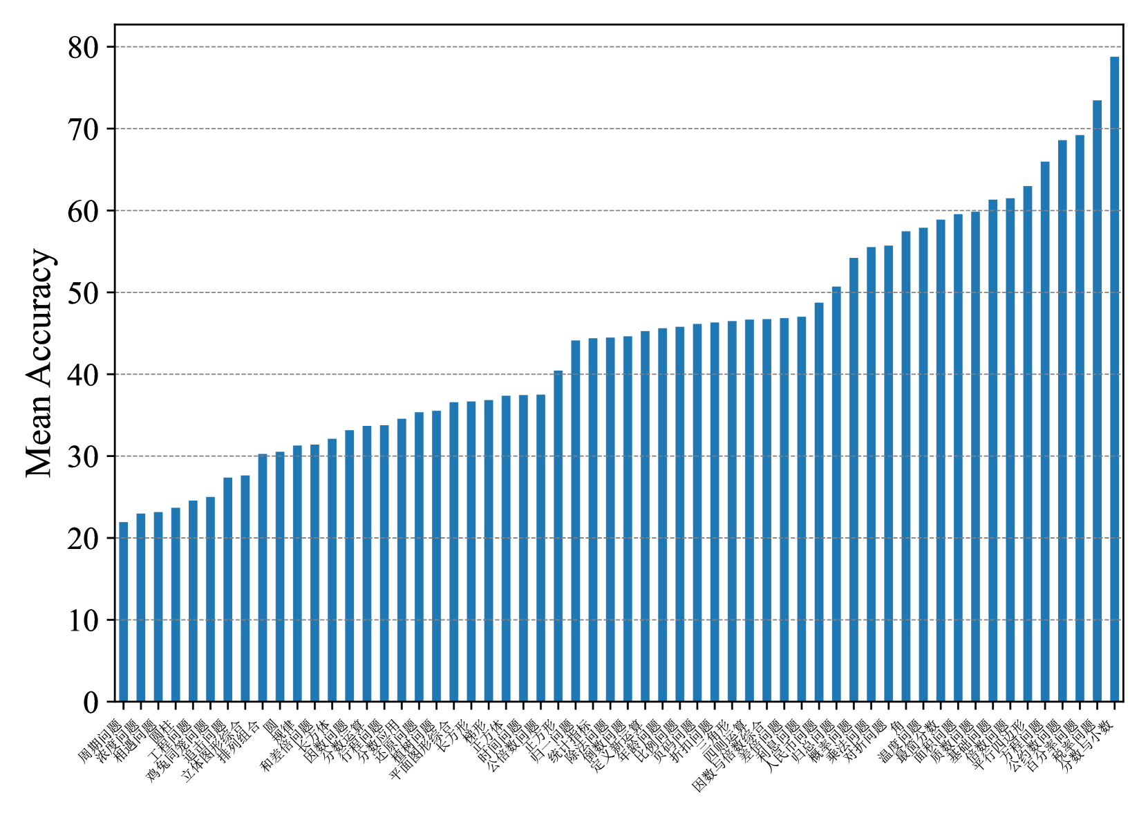
## Bar Chart: Mean Accuracy vs. Category
### Overview
The image presents a bar chart displaying "Mean Accuracy" on the y-axis against a series of categories on the x-axis. The categories are labeled in Chinese characters. The chart shows a generally increasing trend in mean accuracy as you move from left to right across the categories.
### Components/Axes
* **Y-axis:** "Mean Accuracy" ranging from 0 to 80, with tick marks at intervals of 10.
* **X-axis:** A series of categories labeled in Chinese characters. The labels are densely packed and appear to represent different conditions or groups.
* **Bars:** Each bar represents the mean accuracy for a specific category. All bars are the same color (blue).
* **Gridlines:** Horizontal gridlines are present at y-axis intervals of 10, aiding in reading the accuracy values.
### Detailed Analysis
The chart contains approximately 40 bars. Due to the Chinese characters, precise category identification is difficult without translation. However, we can approximate the mean accuracy for several bars:
* **First Bar (leftmost):** Approximately 24.
* **5th Bar:** Approximately 28.
* **10th Bar:** Approximately 32.
* **15th Bar:** Approximately 36.
* **20th Bar:** Approximately 40.
* **25th Bar:** Approximately 44.
* **30th Bar:** Approximately 48.
* **35th Bar:** Approximately 54.
* **38th Bar:** Approximately 60.
* **Last Bar (rightmost):** Approximately 76.
The trend is clearly upward. The initial bars have relatively low mean accuracy (around 24-30). The accuracy gradually increases, with a steeper rise observed in the later bars, culminating in a mean accuracy of approximately 76 for the final category.
### Key Observations
* The mean accuracy values are not evenly distributed. There's a noticeable acceleration in the increase of accuracy in the latter half of the categories.
* There are no apparent outliers or sudden drops in accuracy.
* The chart suggests a positive correlation between category and mean accuracy.
### Interpretation
The data suggests that the factor represented by the categories on the x-axis has a positive impact on the measured accuracy. As you move through the categories, the mean accuracy consistently increases. This could indicate a learning curve, an optimization process, or the effect of different conditions on performance. The steeper increase in the later categories suggests that the effect is more pronounced for certain conditions or groups.
Without knowing the meaning of the Chinese labels, it's difficult to provide a more specific interpretation. However, the chart clearly demonstrates a positive trend and highlights the importance of the categories in influencing the observed accuracy. The consistent upward slope suggests a systematic relationship rather than random variation.
The chart is a visual representation of a quantitative relationship, and the data points are presented in a clear and concise manner. The use of gridlines and a consistent bar color enhances readability.