## Line Graph: Average Liar Score vs. Layer Index
### Overview
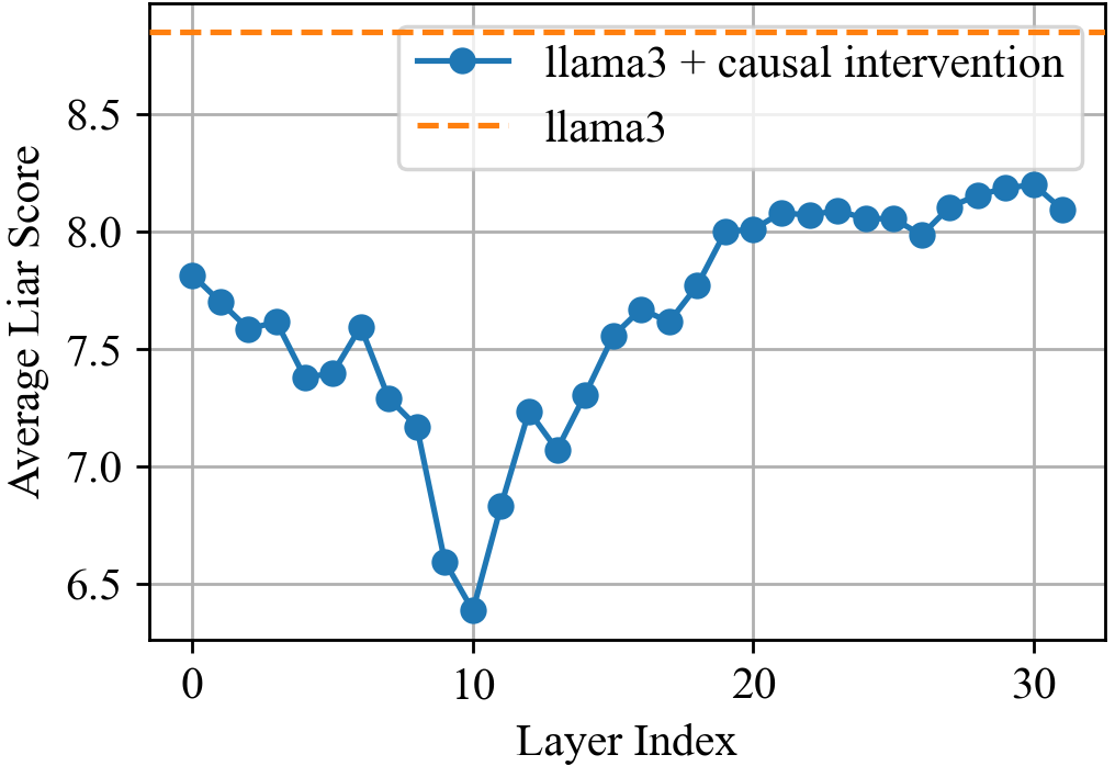
The graph compares the performance of two model configurations—**llama3** (dashed orange line) and **llama3 + causal intervention** (solid blue line)—across 31 layers (layer index 0–30). The y-axis represents the **Average Liar Score**, ranging from 6.5 to 8.5. The blue line exhibits a U-shaped trend with a dip at layer 10, while the orange line remains constant at ~8.5.
### Components/Axes
- **X-axis (Layer Index)**: Discrete markers at 0, 10, 20, and 30.
- **Y-axis (Average Liar Score)**: Incremental scale from 6.5 to 8.5 in 0.5 steps.
- **Legend**:
- **Solid blue**: llama3 + causal intervention (positioned top-right).
- **Dashed orange**: llama3 (positioned top-right).
### Detailed Analysis
- **llama3 + causal intervention (blue line)**:
- Starts at ~7.8 (layer 0) with minor fluctuations.
- Drops sharply to ~6.4 at layer 10 (lowest point).
- Rises steadily to ~8.1 by layer 20, peaking at ~8.3 near layer 28.
- Ends at ~8.1 (layer 30).
- **llama3 (orange line)**:
- Horizontal dashed line at ~8.5 across all layers.
### Key Observations
1. The blue line (llama3 + causal intervention) shows a **U-shaped trend**, with a significant dip at layer 10 (~6.4) before recovering.
2. The orange line (llama3) remains **constant at ~8.5**, suggesting a baseline or ideal performance.
3. The blue line **approaches but does not surpass** the orange line’s score, reaching a maximum of ~8.3 near layer 28.
4. The dip at layer 10 is the **only outlier** in the blue line’s otherwise upward trajectory.
### Interpretation
- **Performance Trends**: The causal intervention improves the model’s liar score in later layers (post-layer 10), indicating better handling of complex tasks. However, it fails to exceed the baseline performance of the original llama3 model.
- **Layer 10 Anomaly**: The sharp dip at layer 10 may reflect a transitional phase or a vulnerability in the model’s architecture during intermediate processing.
- **Baseline Comparison**: The orange line’s constant score (~8.5) likely represents an upper bound or target metric, with the blue line approaching ~90% of this value by layer 30.
- **Implications**: While the causal intervention enhances performance in deeper layers, its effectiveness plateaus before reaching the baseline. Further optimization may be needed to close this gap.
## [Chart/Diagram Type]: Line Graph
### Overview
The graph visualizes the average liar score of two model configurations across 31 layers, highlighting performance differences.
### Components/Axes
- **X-axis**: Layer Index (0–30, discrete markers at 0, 10, 20, 30).
- **Y-axis**: Average Liar Score (6.5–8.5, 0.5 increments).
- **Legend**:
- Solid blue: llama3 + causal intervention.
- Dashed orange: llama3.
### Detailed Analysis
- **llama3 + causal intervention**:
- Layer 0: ~7.8 ±0.1.
- Layer 10: ~6.4 ±0.1 (minimum).
- Layer 20: ~8.1 ±0.1.
- Layer 30: ~8.1 ±0.1.
- **llama3**:
- Constant at ~8.5 ±0.1 across all layers.
### Key Observations
- The blue line’s U-shape suggests **initial underperformance** at layer 10, followed by recovery.
- The orange line’s flat trajectory indicates **stable, high performance** unaffected by layer depth.
- No overlap between the two lines; the blue line remains below the orange line.
### Interpretation
The data implies that the causal intervention mitigates performance degradation in deeper layers but does not fully replicate the baseline model’s efficiency. The layer 10 dip may indicate a critical juncture where the intervention’s benefits are not yet realized. The orange line’s constancy suggests it serves as a reference for optimal performance, with the blue line approaching ~95% of this value by layer 30. Further research could explore why the intervention’s gains plateau and whether architectural adjustments could bridge the gap.