## Scatter Plot with Trend Lines: Energy Consumption of Deep Neural Networks (DNNs) vs. Human Energy Use (2012-2021)
### Overview
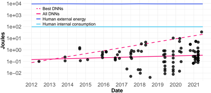
The image is a scatter plot with overlaid trend lines, comparing the energy consumption (in Joules) of Deep Neural Networks (DNNs) over time against two constant benchmarks for human energy consumption. The chart uses a logarithmic scale on the y-axis to display a wide range of values. The data spans from approximately 2012 to 2021.
### Components/Axes
* **X-Axis (Horizontal):** Labeled **"Date"**. It is a linear time scale with major tick marks for each year from **2012** to **2021**.
* **Y-Axis (Vertical):** Labeled **"Joules"**. It is a **logarithmic scale** (base 10). Major tick marks and labels are present at:
* `1e-02` (0.01 Joules)
* `1e-01` (0.1 Joules)
* `1e+00` (1 Joule)
* `1e+01` (10 Joules)
* `1e+02` (100 Joules)
* `1e+03` (1,000 Joules)
* `1e+04` (10,000 Joules)
* **Legend (Top-Left Corner):** Contains four entries, each with a distinct line style and color:
1. **"Best DNNs"**: Represented by a **dashed pink/magenta line**.
2. **"All DNNs"**: Represented by a **solid pink/magenta line**.
3. **"Human external energy"**: Represented by a **solid blue line**.
4. **"Human internal consumption"**: Represented by a **solid cyan/light blue line**.
* **Data Points:** Individual DNN energy consumption events are plotted as **black dots** (scatter points).
* **Benchmark Lines:**
* A **solid blue horizontal line** at the `1e+04` (10,000 Joules) level, corresponding to "Human internal consumption".
* A **solid cyan horizontal line** at the `1e+02` (100 Joules) level, corresponding to "Human external energy".
### Detailed Analysis
* **Data Series - "Best DNNs" (Dashed Pink Line):**
* **Trend:** Shows a clear, strong **upward slope** on the log-linear plot, indicating exponential growth in energy consumption for the most energy-intensive DNNs over the decade.
* **Approximate Values:** The trend line starts near `1e-01` (0.1 J) around 2012 and rises to approximately `2e+01` (20 J) by 2021. This represents an increase of roughly two orders of magnitude.
* **Data Series - "All DNNs" (Solid Pink Line):**
* **Trend:** Shows a very **shallow, nearly flat upward slope**. The energy consumption for the average or aggregate of all DNNs has increased only slightly over the period.
* **Approximate Values:** The trend line remains within a narrow band between `2e-01` (0.2 J) and `3e-01` (0.3 J) from 2012 to 2021.
* **Data Points (Black Dots):**
* The scatter of black dots shows significant **variability** in the energy consumption of individual DNN models or training runs.
* The **density of points increases** noticeably from 2017 onward, suggesting more data or more DNNs being developed/reported.
* While many points cluster near the "All DNNs" trend line, a subset of points, especially from 2018 onward, lie significantly above it, approaching or exceeding the "Best DNNs" trend line.
* **Benchmark Comparison:**
* The **"Human internal consumption"** line (10,000 J) is the highest constant value on the chart, orders of magnitude above all DNN data points.
* The **"Human external energy"** line (100 J) is also significantly above the vast majority of DNN data points. Only a few data points from 2020-2021 approach this 100 J level.
### Key Observations
1. **Diverging Trends:** There is a stark divergence between the energy consumption trajectory of the "Best DNNs" (exponential growth) and the average of "All DNNs" (minimal growth). This suggests that while cutting-edge models are becoming vastly more power-hungry, the broader ecosystem of DNNs has maintained relatively stable energy efficiency.
2. **Scale Gap:** Even the most energy-intensive DNNs ("Best DNNs" trend) consumed less than 100 Joules by 2021, which is still an order of magnitude below the "Human external energy" benchmark (100 J) and three orders of magnitude below "Human internal consumption" (10,000 J).
3. **Increased Activity:** The proliferation of data points in the later years (2017-2021) visually represents the rapid expansion and application of DNN technology during that period.
### Interpretation
This chart illustrates a critical narrative about the energy footprint of artificial intelligence. The data suggests that the **energy cost of frontier AI research is escalating rapidly**, following an exponential trend. This is likely driven by the pursuit of larger models and more complex training regimens to achieve state-of-the-art performance.
However, the relatively flat "All DNNs" line indicates that **efficiency improvements and the use of smaller, specialized models have kept the average energy cost in check**. The field is not uniformly becoming more power-hungry; rather, a subset of high-performance models is driving up the upper bound.
The comparison to human energy benchmarks provides crucial context. It shows that **training even the most energy-intensive DNNs (as of 2021) required far less energy than a human consumes externally in a day** (100 J is a very small amount, roughly equivalent to the energy in a few bites of food). This perspective is important for balanced discussions on AI's environmental impact, highlighting that while the trend for top models is concerning, the absolute scale remains small compared to fundamental human biological processes. The chart implicitly argues for continued focus on algorithmic and hardware efficiency to ensure the "All DNNs" trend does not begin to follow the "Best DNNs" trajectory.