TECHNICAL ASSET FINGERPRINT
6d4f62caefe209802c04a80b
Click to view fullscreen
Press ESC or click to close
FOUND IN PAPERS
EXPERT: healer-alpha-free VERSION 1
RUNTIME: free/openrouter/healer-alpha
INTEL_VERIFIED
\n
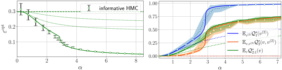
## [Dual-Panel Line Charts]: Analysis of ε_opt and Expected Q-values vs. α
### Overview
The image contains two side-by-line charts sharing a common x-axis variable (α) but plotting different metrics on the y-axes. The left chart shows the optimal error (ε_opt) decreasing with α, while the right chart shows the expected values of three different Q-functions increasing with α. Both charts include multiple data series with error bars or confidence intervals.
### Components/Axes
**Left Chart:**
* **Y-axis:** Label is `ε_opt`. Scale ranges from 0.0 to 0.3, with major ticks at 0.0, 0.1, 0.2, 0.3.
* **X-axis:** Label is `α`. Scale ranges from 0 to 8, with major ticks at 0, 2, 4, 6, 8.
* **Legend:** Located in the top-right corner. Contains one entry: a black error bar symbol labeled `informative HMC`.
* **Data Series:** A single primary data series plotted as a green line with open circle markers and black vertical error bars. There are also three faint, dotted green lines that appear to be theoretical bounds or alternative models.
**Right Chart:**
* **Y-axis:** Unlabeled, but represents a probability or normalized value. Scale ranges from 0.00 to 1.00, with major ticks at 0.00, 0.25, 0.50, 0.75, 1.00.
* **X-axis:** Label is `α`. Scale ranges from 0 to 7, with major ticks at 0, 1, 2, 3, 4, 5, 6, 7.
* **Legend:** Located in the bottom-right corner. Contains three entries with mathematical notation:
1. Blue line: `E_{v,(2)} Q_1^{(2)}(v^{(2)})`
2. Orange line: `E_{v,(2)} Q_2^{(2)}(v, v^{(2)})`
3. Green line: `E_{v} Q_{2,1}(v)`
* **Data Series:** Three primary data series, each with a solid line and a shaded confidence interval of the same color:
* **Blue Series:** Corresponds to the first legend entry.
* **Orange Series:** Corresponds to the second legend entry.
* **Green Series:** Corresponds to the third legend entry.
* There is also a faint, dotted blue line and a faint, dotted green line, likely representing alternative models or baselines.
### Detailed Analysis
**Left Chart (ε_opt vs. α):**
* **Trend Verification:** The primary green line with error bars shows a clear, monotonic downward trend. It starts high at α=0 and decreases rapidly, flattening out as α increases.
* **Data Points (Approximate):**
* At α ≈ 0: ε_opt ≈ 0.30 (error bar spans ~0.28 to ~0.32).
* At α ≈ 1: ε_opt ≈ 0.25.
* At α ≈ 2: ε_opt ≈ 0.18.
* At α ≈ 3: ε_opt ≈ 0.10.
* At α ≈ 4: ε_opt ≈ 0.05.
* At α ≈ 6: ε_opt ≈ 0.02.
* At α ≈ 8: ε_opt ≈ 0.01.
* **Error Bars:** The error bars are largest at small α (e.g., at α=0, the bar spans ~0.04 units) and become progressively smaller as α increases, indicating reduced variance or uncertainty.
* **Dotted Lines:** Three faint green dotted lines are present. The top one is nearly horizontal at ε_opt ≈ 0.30. The middle one decreases slowly from ~0.30 to ~0.24. The bottom one decreases from ~0.30 to ~0.19. These likely represent performance bounds or other methods.
**Right Chart (Expected Q-values vs. α):**
* **Trend Verification:** All three primary series (blue, orange, green) show an upward, sigmoidal (S-shaped) trend, starting near 0 and saturating towards 1.0 as α increases.
* **Blue Series (`E Q_1`):**
* Rises the earliest and steepest. The inflection point is around α ≈ 2.5.
* Reaches a plateau near 1.0 by α ≈ 4.
* The shaded blue confidence interval is widest during the steep rise (α ≈ 2-3).
* **Orange Series (`E Q_2`):**
* Rises later than the blue series. Its inflection point is around α ≈ 3.5.
* Approaches a plateau near 0.75 by α ≈ 6.
* The shaded orange confidence interval is moderately wide during its rise.
* **Green Series (`E Q_{2,1}`):**
* Follows a path very similar to the orange series, with its inflection point also around α ≈ 3.5.
* Also approaches a plateau near 0.75 by α ≈ 6.
* The shaded green confidence interval overlaps significantly with the orange one.
* **Dotted Lines:** A faint blue dotted line rises slowly to ~0.4. A faint green dotted line rises slowly to ~0.25. These are likely baselines.
### Key Observations
1. **Inverse Relationship:** There is a clear inverse relationship between the metric on the left (ε_opt, an error) and the metrics on the right (Q-values, likely representing utility or value). As α increases, error decreases and value increases.
2. **Phase Transition:** The right chart exhibits a sharp phase transition behavior. The blue series transitions first, followed by the orange and green series which transition together at a higher α value.
3. **Convergence:** The left chart's error converges to near zero, while the right chart's primary series converge to distinct plateaus (blue ~1.0, orange/green ~0.75).
4. **Uncertainty Correlation:** In the left chart, uncertainty (error bar size) decreases with α. In the right chart, uncertainty (shaded interval width) is greatest during the transition phase for each series.
### Interpretation
This figure likely comes from a study on information acquisition, active learning, or decision-making under uncertainty, where `α` represents a parameter controlling the amount of information, samples, or exploration.
* **What the data suggests:** Increasing `α` leads to a better-informed model or agent. This is evidenced by the decreasing optimal error (`ε_opt`) and the increasing expected value of various Q-functions (which quantify the expected future reward or utility of actions/states).
* **How elements relate:** The left panel shows the *cost* (error) of the learning process diminishing with more information (`α`). The right panel shows the *benefit* (value) accruing. The different Q-functions (`Q_1`, `Q_2`, `Q_{2,1}`) likely represent values for different policies, states, or levels of a hierarchical decision process. The fact that `Q_1` rises first suggests it might be a simpler or more immediately accessible value estimate, while `Q_2` and `Q_{2,1}` require more information (`α`) to become confident.
* **Notable anomalies/patterns:** The tight coupling of the orange and green series in the right chart is striking. It suggests that the quantities `E Q_2^{(2)}(v, v^{(2)})` and `E Q_{2,1}(v)` are fundamentally linked or measure very similar aspects of the system's performance once sufficient information (`α > ~3`) is available. The plateau of the orange/green series below 1.0 (unlike the blue series) may indicate an inherent limit or a different objective being measured.
DECODING INTELLIGENCE...