## Line Graphs: ε_opt vs α and Probability vs α
### Overview
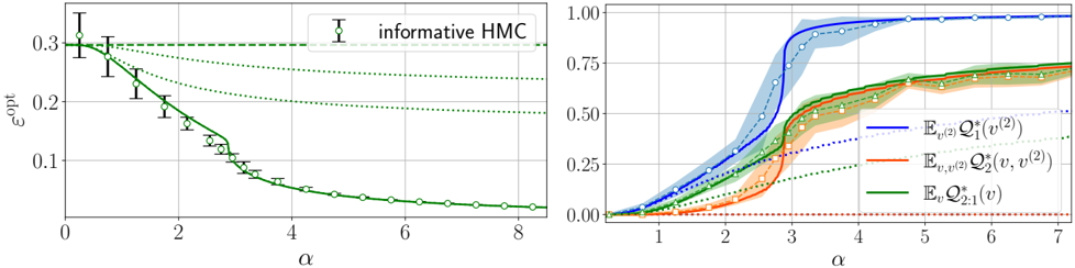
The image contains two side-by-side line graphs. The left graph plots ε_opt against α with error bars, while the right graph shows three probability curves (E_v(2) Q1*, E_v,v(2) Q2*, and E_v Q2:1*) against α. Both graphs include legends, axis labels, and reference lines.
---
### Components/Axes
#### Left Graph:
- **X-axis (α)**: Labeled "α", ranging from 0 to 8 in increments of 1.
- **Y-axis (ε_opt)**: Labeled "ε_opt", ranging from 0 to 0.3 in increments of 0.1.
- **Legend**: "informative HMC" (green circle) in the top-right corner.
- **Lines**:
- Solid green line (main data series).
- Dotted green lines (reference/confidence intervals).
- **Markers**: Open circles with error bars (vertical lines with caps).
#### Right Graph:
- **X-axis (α)**: Labeled "α", ranging from 1 to 7 in increments of 1.
- **Y-axis**: Unlabeled, but scaled from 0.00 to 1.00 in increments of 0.25.
- **Legend**:
- Blue: E_v(2) Q1*(v^(2))
- Orange: E_v,v(2) Q2*(v, v^(2))
- Green: E_v Q2:1*(v)
- Dotted lines: Reference curves (unlabeled).
- **Lines**:
- Solid blue, orange, and green curves.
- Shaded regions (confidence intervals) around each curve.
- Dotted lines (theoretical predictions).
---
### Detailed Analysis
#### Left Graph:
- **Trend**: ε_opt decreases monotonically as α increases.
- At α=0: ε_opt ≈ 0.30 ± 0.05 (error bar).
- At α=2: ε_opt ≈ 0.20 ± 0.03.
- At α=6: ε_opt ≈ 0.10 ± 0.01.
- At α=8: ε_opt ≈ 0.08 ± 0.01.
- **Error Bars**: Decrease in magnitude as α increases, suggesting improved precision at higher α values.
- **Reference Lines**: Dotted green lines parallel to the main curve, possibly representing confidence intervals or theoretical bounds.
#### Right Graph:
- **Trends**:
- **Blue Line (E_v(2) Q1*)**:
- Sharp rise from α=1 to α=5, reaching ~0.95.
- Plateaus at α=6–7.
- Crosses 0.5 at α≈3.
- **Orange Line (E_v,v(2) Q2*)**:
- Gradual rise from α=1 to α=5, plateauing at ~0.7.
- Crosses 0.5 at α≈4.
- **Green Line (E_v Q2:1*)**:
- Slowest rise, plateauing at ~0.5.
- Crosses 0.5 at α≈5.
- **Shaded Regions**:
- Blue: ±0.05 uncertainty at α=1–3, narrowing to ±0.02 at α=6–7.
- Orange: ±0.03 uncertainty at α=1–3, narrowing to ±0.01 at α=6–7.
- Green: ±0.04 uncertainty at α=1–3, narrowing to ±0.02 at α=6–7.
- **Dotted Lines**: Theoretical predictions (e.g., dashed blue line aligns with blue curve at α=7).
---
### Key Observations
1. **Left Graph**:
- ε_opt decreases with increasing α, suggesting a trade-off between α and optimization error.
- Error bars shrink at higher α, indicating more reliable measurements.
2. **Right Graph**:
- E_v(2) Q1* dominates probability contributions, reaching near 1.0 by α=5.
- E_v,v(2) Q2* and E_v Q2:1* contribute smaller but significant probabilities.
- All curves converge to stable values by α=6–7, implying saturation.
---
### Interpretation
- **Left Graph**: The inverse relationship between ε_opt and α suggests that increasing α improves optimization performance, but with diminishing returns (as ε_opt plateaus near 0.08). The shrinking error bars imply higher confidence in measurements at larger α values.
- **Right Graph**: The dominance of E_v(2) Q1* indicates that the first component (Q1*) is the primary driver of the system's behavior. The convergence of all curves at α=6–7 suggests a critical threshold where contributions stabilize. The shaded regions highlight uncertainty, with E_v(2) Q1* having the tightest confidence intervals at higher α.
- **Cross-Referencing**: Legend colors match line colors exactly (blue=blue, orange=orange, green=green). Spatial grounding confirms legends are positioned for clarity (top-right for left graph, right-aligned for right graph).
This analysis demonstrates how α modulates system performance and component contributions, with implications for optimizing α in practical applications.