## Line Chart & Scatter Plot: Learning Rate Schedules and Loss Correlation
### Overview
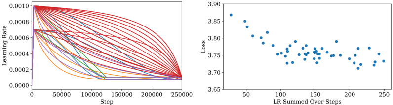
The image contains two distinct plots presented side-by-side. The left plot is a line chart displaying multiple learning rate decay schedules over training steps. The right plot is a scatter plot examining the relationship between the sum of learning rates over steps and the resulting loss. Together, they appear to analyze the impact of different learning rate schedules on model training performance.
### Components/Axes
**Left Plot (Line Chart):**
* **Chart Type:** Multi-line chart.
* **X-Axis:**
* **Label:** `Step`
* **Scale:** Linear.
* **Range & Ticks:** 0 to 250,000. Major ticks are at 0, 50000, 100000, 150000, 200000, 250000.
* **Y-Axis:**
* **Label:** `Learning Rate`
* **Scale:** Linear.
* **Range & Ticks:** 0.0000 to 0.0010. Major ticks are at 0.0000, 0.0002, 0.0004, 0.0006, 0.0008, 0.0010.
* **Data Series:** Approximately 20-25 distinct lines, each representing a different learning rate schedule. The lines are colored in various shades of red, orange, purple, blue, and green. **No legend is present** to map specific colors to schedule names.
* **Spatial Layout:** The plot area is bounded by a black frame. The axis labels are positioned conventionally (x-axis below, y-axis to the left).
**Right Plot (Scatter Plot):**
* **Chart Type:** Scatter plot.
* **X-Axis:**
* **Label:** `LR Summed Over Steps`
* **Scale:** Linear.
* **Range & Ticks:** Approximately 25 to 250. Major ticks are at 50, 100, 150, 200, 250.
* **Y-Axis:**
* **Label:** `Loss`
* **Scale:** Linear.
* **Range & Ticks:** 3.65 to 3.90. Major ticks are at 3.65, 3.70, 3.75, 3.80, 3.85, 3.90.
* **Data Series:** A single series of approximately 40-50 data points, all represented by blue dots. **No legend is present.**
* **Spatial Layout:** The plot area is bounded by a black frame. The axis labels are positioned conventionally.
### Detailed Analysis
**Left Plot - Learning Rate Schedules:**
* **Trend Verification:** All lines demonstrate a non-increasing trend; the learning rate either decays or remains constant over steps. The decay patterns vary significantly:
* **Steep Initial Decay:** Several lines (e.g., a prominent purple line) start at ~0.0007 and drop sharply to near zero before step 50,000.
* **Linear Decay:** Multiple lines (e.g., some red and orange lines) show a near-linear decrease from their starting point to a final value near zero at step 250,000.
* **Cosine/Exponential Decay:** Many lines (predominantly red) exhibit a smooth, concave-downward decay curve, starting at various points between 0.0007 and 0.0010 and converging towards zero at step 250,000.
* **Plateaus:** A few lines (e.g., a blue line) show a period of constant learning rate before decaying.
* **Starting Points (Approximate):** The initial learning rates cluster around two main values: ~0.0007 and ~0.0010. A few start at intermediate values like 0.0008 or 0.0009.
* **Ending Points:** Nearly all schedules converge to a learning rate at or very near 0.0000 by step 250,000.
**Right Plot - Loss vs. Summed LR:**
* **Trend Verification:** The data points show a general downward trend from left to right. As the "LR Summed Over Steps" increases, the "Loss" tends to decrease.
* **Data Distribution:**
* The highest loss value (~3.87) occurs at the lowest summed LR (~30).
* The lowest loss values (~3.71-3.72) are found in the summed LR range of 150-220.
* There is significant vertical scatter (variance in Loss) for any given x-value, especially between summed LR 100 and 200. For example, at a summed LR of ~150, loss values range from approximately 3.73 to 3.79.
* **Spatial Grounding:** The points are distributed fairly evenly across the x-axis range from ~30 to ~250. There is a slight clustering of points between x=100 and x=200.
### Key Observations
1. **Diverse Schedules:** The left plot reveals a wide experimentation with learning rate schedules, varying in initial value, decay function (linear, cosine, sharp drop), and duration of plateaus.
2. **Convergence Goal:** All schedules are designed to reduce the learning rate to near zero by the end of training (step 250k), a common practice for fine-tuning convergence.
3. **Negative Correlation:** The right plot suggests a negative correlation between the cumulative learning rate (summed over all steps) and the final loss. Higher total "learning rate budget" is associated with better (lower) loss.
4. **Non-Deterministic Relationship:** The scatter in the right plot indicates that the summed LR is not the sole determinant of loss. Other factors (likely the specific shape of the schedule, random seed, or data order) introduce significant variance. Two schedules with the same summed LR can yield notably different losses.
5. **Potential Optimal Range:** The lowest loss values appear clustered in the summed LR range of approximately 150 to 220, suggesting a possible optimal region for this hyperparameter.
### Interpretation
These plots together provide a Peircean investigative look into hyperparameter optimization for model training. The left chart is an **iconic** representation of the varied strategies (schedules) being tested. The right chart is an **indexical** sign, showing the direct correlation (or lack thereof) between one aggregated property of those strategies (summed LR) and the outcome (loss).
The data suggests that while simply increasing the total learning rate exposure tends to improve performance (lower loss), the **specific trajectory** of the learning rate (the shape of the curves on the left) is a critical, unmeasured variable causing the scatter. A schedule that spends more steps at a higher rate (e.g., a late-decaying cosine curve) will have a higher summed LR than one that decays sharply early on, even if they start at the same initial value. The plots argue that optimizing learning rate schedules is not just about the initial value or final decay, but about the integral of the rate over time, balanced against the need for stable convergence. The absence of a legend on the left chart is a significant limitation, as it prevents linking the most successful (low-loss) points on the right back to the specific schedule shapes that produced them.