## Line Chart and Scatter Plot: Learning Rate and Loss Analysis
### Overview
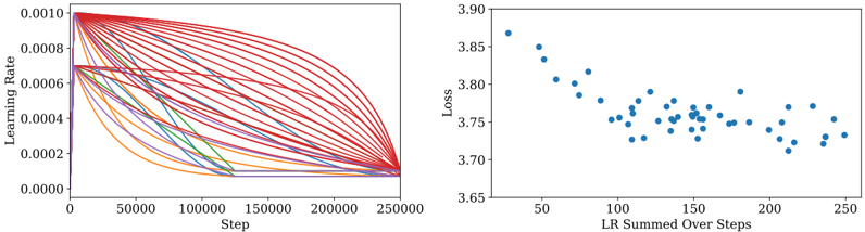
The image contains two side-by-side visualizations. The left graph is a multi-line chart showing learning rate decay over training steps, while the right graph is a scatter plot correlating summed learning rates with loss values. Both graphs use scientific notation for axis labels and display numerical trends in machine learning training dynamics.
### Components/Axes
**Left Graph (Line Chart):**
- **X-axis**: "Step" (0 to 250,000) with linear scale
- **Y-axis**: "Learning Rate" (0.0000 to 0.0010) with logarithmic-like spacing
- **Legend**: Right-aligned, color-coded labels:
- Red: "Initial LR: 0.0010"
- Blue: "Initial LR: 0.0008"
- Green: "Initial LR: 0.0006"
- Orange: "Initial LR: 0.0004"
- Purple: "Initial LR: 0.0002"
- **Lines**: 5 distinct curves with exponential decay patterns
**Right Graph (Scatter Plot):**
- **X-axis**: "LR Summed Over Steps" (50 to 250) with linear scale
- **Y-axis**: "Loss" (3.65 to 3.90) with linear scale
- **Data Points**: 50+ blue dots with no explicit legend
- **Trend**: Slight negative correlation between summed LR and loss
### Detailed Analysis
**Left Graph Trends:**
1. All lines start near y=0.0010 at x=0
2. Red line (highest initial LR) maintains highest values throughout
3. Purple line (lowest initial LR) shows steepest initial decay
4. Lines converge toward y=0.0000 as steps approach 250,000
5. Blue and green lines show intermediate decay rates
6. All curves exhibit sigmoidal-like decay patterns
**Right Graph Patterns:**
1. Data points cluster between x=100-200 and y=3.70-3.85
2. Outliers exist at both high (x=250, y=3.75) and low (x=50, y=3.85) extremes
3. No clear linear relationship, but general trend shows lower loss with higher summed LR
4. Points show significant variance at similar summed LR values
### Key Observations
1. Learning rate decay follows predictable exponential patterns based on initial values
2. Higher initial learning rates maintain greater magnitude throughout training
3. Summed learning rate correlates with but does not perfectly predict final loss
4. Loss values cluster tightly between 3.70-3.85 despite varied training steps
5. All learning rate curves approach zero at similar rates despite different starting points
### Interpretation
The left graph demonstrates how different initial learning rates decay exponentially during training, with higher initial values maintaining greater magnitude. This suggests careful tuning of initial learning rates is crucial for maintaining training stability. The right graph reveals an inverse relationship between cumulative learning rate and final loss, though with notable variance. This implies that while total learning rate impacts model performance, other factors (batch size, architecture, data quality) likely contribute to loss variability. The convergence of learning rate curves in the left graph suggests that regardless of initial value, all training processes approach similar magnitude ranges by the final steps, indicating potential for learning rate scheduling optimization.