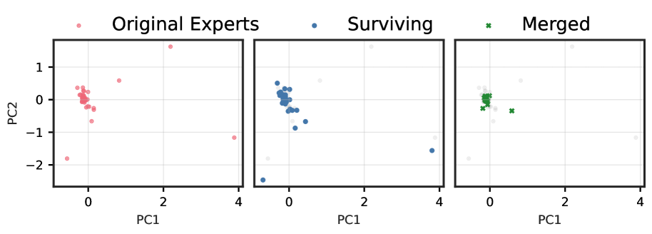
The image displays three horizontally arranged 2D scatter plots, each illustrating a different stage of data processing or selection related to "experts" in a Principal Component Analysis (PCA) space. The plots share common axes and a unified legend at the top.
---
### I. Overall Image Structure
The image is composed of three distinct subplots, each a scatter plot, presented side-by-side. A single legend is positioned centrally above all three plots. Each subplot visualizes data points based on two principal components, PC1 and PC2. Light grey grid lines are present in the background of each plot.
---
### II. Legend
The legend is located at the top-center of the entire figure, providing labels and corresponding visual markers for the data categories.
* **Light Red/Pink circle (•):** "Original Experts"
* **Dark Blue circle (•):** "Surviving"
* **Green 'x' symbol (x):** "Merged"
---
### III. Axis Labels and Markers
All three subplots share identical axis labels and marker ranges.
* **X-axis Label:** PC1
* **X-axis Markers:** -1, 0, 1, 2, 3, 4 (visible markers are 0, 2, 4, with implied ticks at -1, 1, 3)
* **Y-axis Label:** PC2 (explicitly labeled only on the leftmost subplot, but applies to all)
* **Y-axis Markers:** -2, -1, 0, 1 (visible markers are -2, -1, 0, 1)
---
### IV. Subplot Analysis: "Original Experts" (Leftmost Plot)
This subplot focuses on the initial set of "Original Experts."
* **Title (Implied):** Original Experts
* **Data Points:** All points are represented by light red/pink circles.
* **Main Cluster:** A dense cluster of approximately 18 points is observed around the origin. These points are concentrated within the approximate range of PC1 from -0.5 to 0.5 and PC2 from -0.2 to 0.4.
* **Outlier Points:** Six distinct outlier points are present:
1. (PC1: -0.5, PC2: -1.8)
2. (PC1: -0.5, PC2: -2.4)
3. (PC1: -0.2, PC2: 1.4)
4. (PC1: 0.5, PC2: 0.6)
5. (PC1: 2.5, PC2: 0.6)
6. (PC1: 3.8, PC2: -1.2)
* **Total "Original Experts" points:** Approximately 24 points.
---
### V. Subplot Analysis: "Surviving" (Middle Plot)
This subplot illustrates the "Surviving" subset of the "Original Experts," with the full set of "Original Experts" shown as a background context.
* **Title (Implied):** Surviving
* **Background Data Points (Ghosted):** All approximately 24 "Original Experts" points (as identified in the leftmost plot) are visible as light grey circles, providing a complete contextual view of the initial dataset.
* **Highlighted Data Points (Surviving):** These points are represented by dark blue circles, indicating which "Original Experts" have "survived."
* **Main Cluster:** A dense cluster of approximately 18 points is located around the origin (PC1: 0, PC2: 0). This cluster largely overlaps with the main cluster of "Original Experts," indicating that most points within the central cluster "survived."
* **Outlier Points:** Two distinct dark blue circles are observed, indicating that only two of the original outliers "survived":
1. (PC1: -0.5, PC2: -2.4) - This point was an "Original Expert" and "survived."
2. (PC1: 3.8, PC2: -1.2) - This point was an "Original Expert" and "survived."
* **Points that did NOT survive (visible as ghosted light grey circles, but were pink in the first plot):**
1. (PC1: -0.5, PC2: -1.8)
2. (PC1: -0.2, PC2: 1.4)
3. (PC1: 0.5, PC2: 0.6)
4. (PC1: 2.5, PC2: 0.6)
* Additionally, some points from the main cluster of "Original Experts" are now ghosted, implying they did not "survive."
---
### VI. Subplot Analysis: "Merged" (Rightmost Plot)
This subplot presents the "Merged" subset, again with the full set of "Original Experts" as background.
* **Title (Implied):** Merged
* **Background Data Points (Ghosted):** All approximately 24 "Original Experts" points (as identified in the leftmost plot) are visible as light grey circles, providing a complete contextual view of the initial dataset.
* **Highlighted Data Points (Merged):** These points are represented by green 'x' symbols, indicating which "Original Experts" have been "Merged."
* **Main Cluster:** A very dense cluster of approximately 18 points is located around the origin (PC1: 0, PC2: 0). This cluster appears significantly tighter and more concentrated than both the "Original Experts" and "Surviving" clusters, spanning approximately PC1 from -0.2 to 0.2 and PC2 from -0.1 to 0.2. This suggests a refinement or merging process that brings the central points closer together.
* **Outlier Point:** One distinct green 'x' symbol is observed:
1. (PC1: 0.8, PC2: -0.2) - This point was an "Original Expert" (likely from the edge of the main cluster or a very close outlier) and is now highlighted as "Merged."
* **Points that did NOT merge (visible as ghosted light grey circles, but were pink in the first plot):** All other original outliers, including the two that "survived" in the middle plot, are now ghosted.
1. (PC1: -0.5, PC2: -1.8)
2. (PC1: -0.5, PC2: -2.4)
3. (PC1: -0.2, PC2: 1.4)
4. (PC1: 0.5, PC2: 0.6)
5. (PC1: 2.5, PC2: 0.6)
6. (PC1: 3.8, PC2: -1.2)
* Additionally, some points from the main cluster of "Original Experts" are now ghosted, implying they were not included in the "Merged" set.
---
### VII. Key Trends and Observations
* **Filtering/Selection Process:** The series of plots demonstrates a progressive filtering or selection process applied to the "Original Experts."
* **Outlier Reduction:** The number of highlighted outliers decreases significantly from "Original Experts" (6 outliers) to "Surviving" (2 outliers) to "Merged" (1 outlier). This indicates that the filtering process primarily targets and removes outlying data points.
* **Cluster Concentration:** While the approximate number of points in the main cluster remains consistent across the stages, the "Merged" cluster (green 'x' symbols) shows a noticeably higher concentration and tighter grouping around the origin compared to the "Original Experts" and "Surviving" clusters. This suggests that the "Merging" process refines the central group of experts.
* **Contextual Background:** The consistent display of all "Original Experts" as light grey ghosted points in the middle and right plots effectively provides a baseline for comparison, allowing for clear visualization of which points are retained or highlighted at each stage.