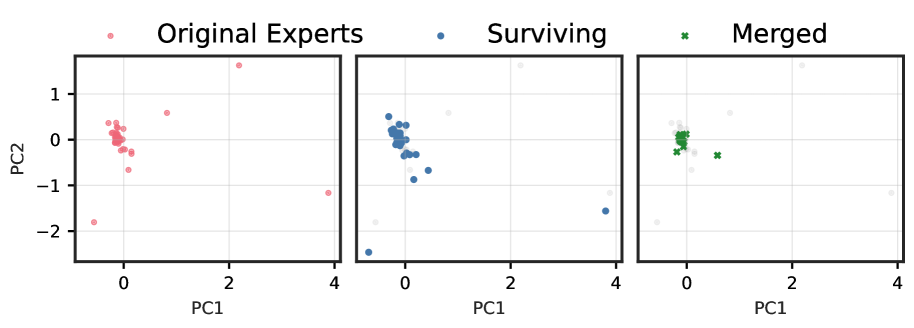
## Technical Description of Scatter Plots
The image presents a series of three scatter plots arranged horizontally, sharing a common legend and axes. The plots illustrate the distribution of data points across two principal components, labeled "PC1" and "PC2".
### Legend
A legend is positioned at the top center of the image, defining three categories of data points:
* **Original Experts:** Represented by red circular markers.
* **Surviving:** Represented by blue circular markers.
* **Merged:** Represented by green 'x' markers.
### Axes
All three plots share the same axes and scales:
* **Vertical Axis (Y-axis):** Labeled "PC2". Tick marks are placed at intervals of 1, specifically at -2, -1, 0, and 1.
* **Horizontal Axis (X-axis):** Labeled "PC1". Tick marks are placed at intervals of 2, specifically at 0, 2, and 4.
* A grid is overlaid on each plot, corresponding to the major tick marks.
### Plot 1 (Left Panel): Original Experts
This plot displays the distribution of the "Original Experts" data points (red circles).
* **Cluster:** A dense cluster of points is centered around the origin (PC1 ≈ 0, PC2 ≈ 0).
* **Outliers:** Several outlier points are scattered away from the central cluster:
* One point at approximately (PC1=2.2, PC2=1.6).
* One point at approximately (PC1=0.8, PC2=0.6).
* One point at approximately (PC1=-0.6, PC2=-1.8).
* One point at approximately (PC1=3.9, PC2=-1.2).
### Plot 2 (Middle Panel): Surviving
This plot shows the distribution of the "Surviving" data points (blue circles).
* **Cluster:** Similar to the first plot, a dense cluster of points is centered around the origin.
* **Outliers:** The outlier points from the "Original Experts" plot are also present, now colored blue, with some slight variations in position or additional points:
* One point at approximately (PC1=2.2, PC2=1.6).
* One point at approximately (PC1=0.8, PC2=0.6).
* One point at approximately (PC1=-0.6, PC2=-1.8).
* One point at approximately (PC1=3.8, PC2=-1.6).
* An additional outlier is visible at approximately (PC1=-0.8, PC2=-2.5).
### Plot 3 (Right Panel): Merged
This plot illustrates the "Merged" data points (green 'x' markers).
* **Cluster:** A dense cluster of green 'x' markers is centered around the origin, corresponding to the central clusters in the previous two plots.
* **Outliers:**
* One green 'x' marker is located at approximately (PC1=0.6, PC2=-0.4).
* The other outlier points seen in the "Original Experts" and "Surviving" plots are shown as faint, light grey circles, indicating they are not part of the "Merged" category.