## Line Chart: ECE vs. Number Explanations
### Overview
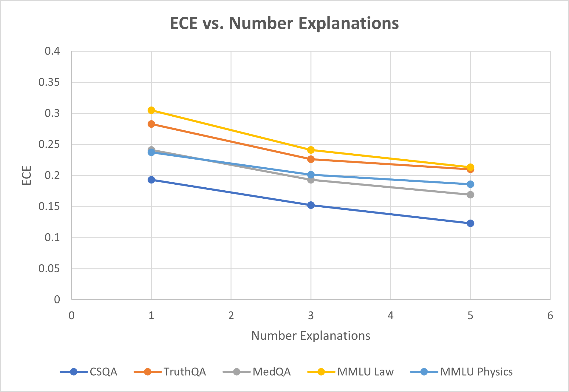
This line chart illustrates the relationship between Expected Calibration Error (ECE) and the number of explanations provided, for several different question answering datasets. The chart displays how ECE changes as the number of explanations increases from 1 to 5.
### Components/Axes
* **Title:** "ECE vs. Number Explanations" - positioned at the top-center of the chart.
* **X-axis:** "Number Explanations" - ranging from 0 to 6, with tick marks at 1, 2, 3, 4, and 5.
* **Y-axis:** "ECE" - ranging from 0 to 0.4, with tick marks at 0.05 intervals.
* **Legend:** Located at the bottom-center of the chart, listing the datasets:
* CSQA (Blue)
* TruthQA (Gray)
* MedQA (Dark Gray)
* MMLU Law (Orange)
* MMLU Physics (Teal)
### Detailed Analysis
The chart contains five distinct lines, each representing a different dataset.
* **CSQA (Blue):** The line slopes downward, indicating a decrease in ECE as the number of explanations increases.
* At 1 explanation: ECE ≈ 0.28
* At 2 explanations: ECE ≈ 0.25
* At 3 explanations: ECE ≈ 0.22
* At 4 explanations: ECE ≈ 0.19
* At 5 explanations: ECE ≈ 0.16
* **TruthQA (Gray):** The line is relatively flat, with a slight downward trend.
* At 1 explanation: ECE ≈ 0.26
* At 2 explanations: ECE ≈ 0.24
* At 3 explanations: ECE ≈ 0.22
* At 4 explanations: ECE ≈ 0.20
* At 5 explanations: ECE ≈ 0.18
* **MedQA (Dark Gray):** The line shows a moderate downward trend.
* At 1 explanation: ECE ≈ 0.21
* At 2 explanations: ECE ≈ 0.18
* At 3 explanations: ECE ≈ 0.16
* At 4 explanations: ECE ≈ 0.14
* At 5 explanations: ECE ≈ 0.13
* **MMLU Law (Orange):** The line starts with a high ECE and decreases significantly with more explanations.
* At 1 explanation: ECE ≈ 0.31
* At 2 explanations: ECE ≈ 0.27
* At 3 explanations: ECE ≈ 0.25
* At 4 explanations: ECE ≈ 0.23
* At 5 explanations: ECE ≈ 0.21
* **MMLU Physics (Teal):** The line shows a moderate downward trend, similar to MedQA.
* At 1 explanation: ECE ≈ 0.23
* At 2 explanations: ECE ≈ 0.20
* At 3 explanations: ECE ≈ 0.18
* At 4 explanations: ECE ≈ 0.17
* At 5 explanations: ECE ≈ 0.16
### Key Observations
* MMLU Law consistently exhibits the highest ECE values across all numbers of explanations.
* CSQA shows the most significant reduction in ECE as the number of explanations increases.
* TruthQA demonstrates the least change in ECE with increasing explanations.
* All datasets show a general trend of decreasing ECE with more explanations, suggesting that providing more explanations improves calibration.
### Interpretation
The chart demonstrates a clear inverse relationship between the number of explanations provided and the Expected Calibration Error (ECE) for various question answering datasets. This suggests that increasing the number of explanations helps models become better calibrated, meaning their predicted confidence levels more accurately reflect their actual correctness. The varying degrees of ECE reduction across datasets indicate that some datasets benefit more from explanations than others. The high ECE of MMLU Law suggests that this dataset is particularly challenging to calibrate, and requires more explanations to achieve reliable confidence estimates. The relatively stable ECE of TruthQA suggests that this dataset is already well-calibrated, or that the benefit of additional explanations is minimal. This data is valuable for understanding the impact of explainability techniques on model calibration and for identifying datasets where explainability is most crucial.