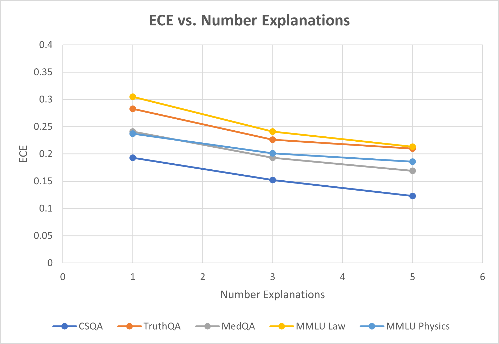
## Line Chart: ECE vs. Number Explanations
### Overview
The image is a line chart titled "ECE vs. Number Explanations." It plots the Expected Calibration Error (ECE) on the y-axis against the number of explanations on the x-axis for five different question-answering datasets. All five data series show a consistent downward trend, indicating that as the number of explanations increases, the ECE decreases.
### Components/Axes
* **Title:** "ECE vs. Number Explanations" (centered at the top).
* **Y-Axis:**
* **Label:** "ECE" (rotated vertically on the left side).
* **Scale:** Linear scale from 0 to 0.4.
* **Major Gridlines/Ticks:** At intervals of 0.05 (0, 0.05, 0.1, 0.15, 0.2, 0.25, 0.3, 0.35, 0.4).
* **X-Axis:**
* **Label:** "Number Explanations" (centered at the bottom).
* **Scale:** Linear scale from 0 to 6.
* **Major Gridlines/Ticks:** At integer intervals (0, 1, 2, 3, 4, 5, 6).
* **Legend:** Located at the bottom center of the chart. It contains five entries, each with a colored line and marker:
1. **CSQA:** Dark blue line with circular markers.
2. **TruthQA:** Orange line with circular markers.
3. **MedQA:** Gray line with circular markers.
4. **MMLU Law:** Yellow line with circular markers.
5. **MMLU Physics:** Light blue line with circular markers.
* **Plot Area:** Contains five lines connecting data points at x-values of 1, 3, and 5. A light gray grid is present in the background.
### Detailed Analysis
**Trend Verification:** All five lines slope downward from left to right, indicating a negative correlation between the number of explanations and ECE.
**Data Point Extraction (Approximate Values):**
The following table reconstructs the data points. Values are estimated based on the position of the markers relative to the y-axis gridlines.
| Dataset (Legend Color) | x=1 (Number Explanations) | x=3 (Number Explanations) | x=5 (Number Explanations) | Visual Trend Description |
| :--- | :--- | :--- | :--- | :--- |
| **CSQA** (Dark Blue) | ~0.19 | ~0.15 | ~0.12 | Steady, linear decline. Lowest ECE at all points. |
| **TruthQA** (Orange) | ~0.28 | ~0.225 | ~0.21 | Decline, with a slightly shallower slope between x=3 and x=5. |
| **MedQA** (Gray) | ~0.24 | ~0.19 | ~0.17 | Steady, linear decline. |
| **MMLU Law** (Yellow) | ~0.305 | ~0.24 | ~0.215 | Steep initial decline, then a shallower slope. Highest ECE at all points. |
| **MMLU Physics** (Light Blue) | ~0.235 | ~0.20 | ~0.185 | Steady, linear decline. Very close to MedQA at x=1, but diverges slightly higher at x=3 and x=5. |
**Spatial Grounding & Cross-Reference:**
* The legend is positioned at the bottom, centered horizontally.
* At x=1, the vertical order of points from highest to lowest ECE is: MMLU Law (Yellow), TruthQA (Orange), MedQA (Gray), MMLU Physics (Light Blue), CSQA (Dark Blue). This order is confirmed by matching each marker's color to its legend entry.
* At x=5, the order changes slightly: MMLU Law (Yellow) and TruthQA (Orange) are very close at the top, followed by MMLU Physics (Light Blue), MedQA (Gray), and CSQA (Dark Blue) at the bottom.
### Key Observations
1. **Universal Downward Trend:** Every dataset exhibits a reduction in ECE as the number of explanations increases from 1 to 5.
2. **Consistent Hierarchy:** The relative calibration performance (ordering by ECE) of the datasets remains largely consistent across the x-axis, with CSQA consistently having the lowest (best) ECE and MMLU Law consistently having the highest (worst) ECE.
3. **Convergence at Higher Explanations:** The gap between the highest (MMLU Law) and lowest (CSQA) ECE narrows from approximately 0.115 at x=1 to about 0.095 at x=5.
4. **Similar Slopes:** The rates of decline (slopes) for CSQA, MedQA, and MMLU Physics appear very similar and linear. TruthQA and MMLU Law show a slight flattening of the curve between x=3 and x=5.
### Interpretation
The chart demonstrates a clear relationship: providing more explanations (from 1 to 5) is associated with improved model calibration, as measured by a lower Expected Calibration Error (ECE), across all five evaluated QA datasets. This suggests that the process of generating or utilizing multiple explanations helps the model's confidence scores better align with its actual accuracy.
The persistent hierarchy among datasets indicates that inherent characteristics of the tasks or the model's performance on them create a baseline calibration level. For instance, the model appears least calibrated on legal reasoning (MMLU Law) and most calibrated on commonsense reasoning (CSQA), regardless of the number of explanations. The convergence trend hints that increasing explanations may have a slightly greater relative benefit for initially poorly calibrated tasks. This data is crucial for understanding how to improve the reliability of AI systems through explanation-based methods.