\n
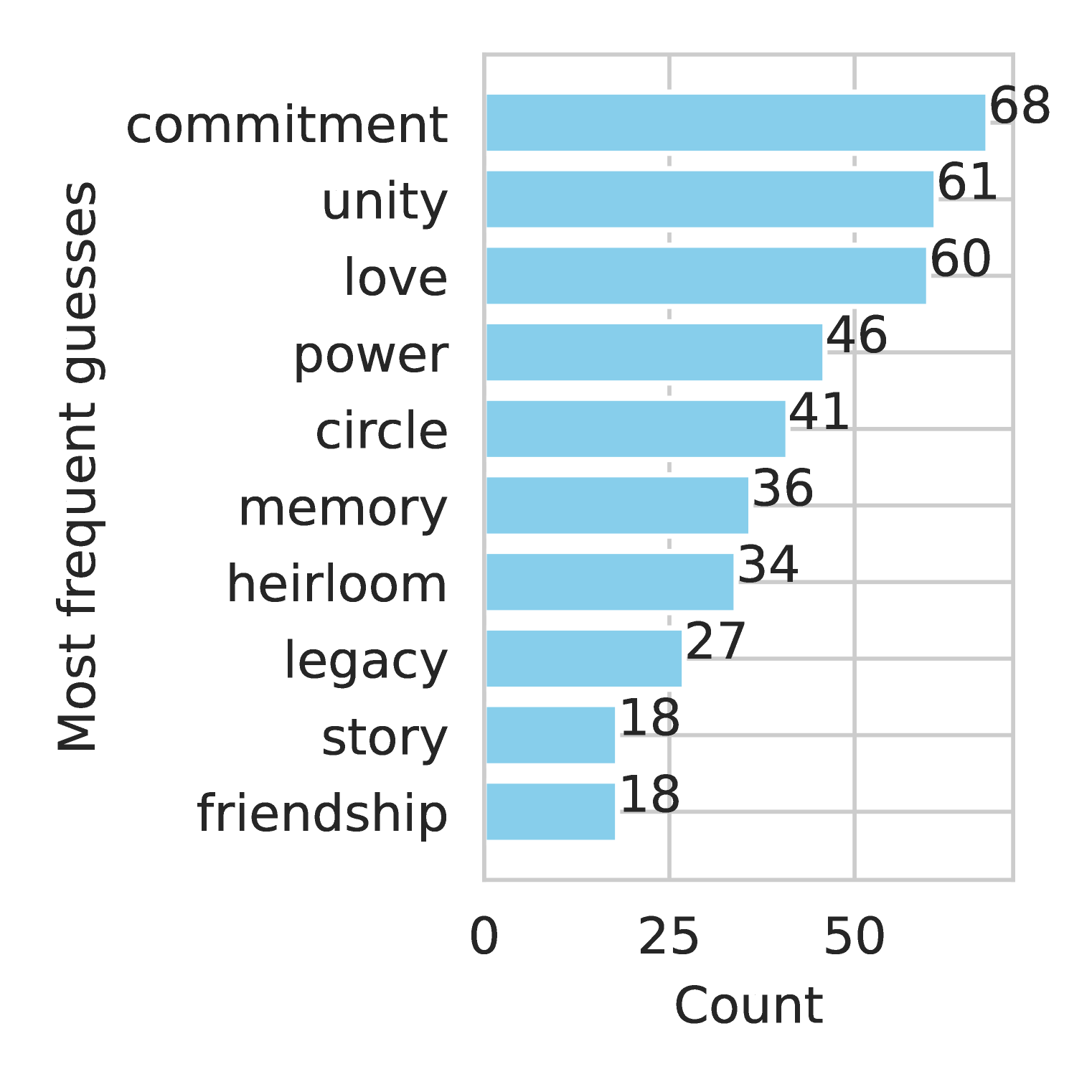
## Horizontal Bar Chart: Most Frequent Guesses
### Overview
This is a horizontal bar chart displaying the frequency of guesses for various concepts. The chart shows the "Most frequent guesses" on the vertical axis and the "Count" of those guesses on the horizontal axis. Each bar represents a concept, and its length corresponds to the number of times it was guessed.
### Components/Axes
* **Vertical Axis (Y-axis):** Labeled "Most frequent guesses". The categories listed are: commitment, unity, love, power, circle, memory, heirloom, legacy, story, and friendship.
* **Horizontal Axis (X-axis):** Labeled "Count". The scale ranges from 0 to approximately 70, with markings at 0, 25, and 50.
* **Bars:** Each bar is light blue in color.
* **Value Labels:** Each bar has a numerical value displayed at its right end, indicating the count for that concept.
### Detailed Analysis
The bars are arranged from top to bottom in descending order of their counts. Here's a breakdown of the counts for each concept:
* **Commitment:** Approximately 68
* **Unity:** Approximately 61
* **Love:** Approximately 60
* **Power:** Approximately 46
* **Circle:** Approximately 41
* **Memory:** Approximately 36
* **Heirloom:** Approximately 34
* **Legacy:** Approximately 27
* **Story:** Approximately 18
* **Friendship:** Approximately 18
The trend is a clear downward slope as you move down the list of concepts. The counts decrease significantly from "Commitment" to "Heirloom", and then more gradually from "Heirloom" to "Friendship".
### Key Observations
* "Commitment" is the most frequently guessed concept, with a count significantly higher than the others.
* "Story" and "Friendship" have the lowest counts, both at 18.
* There's a substantial gap in counts between the top three concepts ("Commitment", "Unity", "Love") and the rest.
* The counts are all whole numbers.
### Interpretation
The data suggests that, within the context of whatever the guesses relate to, "Commitment", "Unity", and "Love" are the most prominent or readily associated concepts. The lower counts for concepts like "Story" and "Friendship" indicate they are less frequently considered in relation to the subject matter. The chart could represent responses to an open-ended question, or the results of a word association task. The large difference in counts between the top concepts and the rest suggests a strong hierarchical relationship or a clear focus on certain themes. The fact that the counts are all whole numbers suggests that the data represents discrete responses (e.g., individual votes or selections). Without knowing the context of the guesses, it's difficult to provide a more specific interpretation, but the chart clearly highlights the relative importance of different concepts.