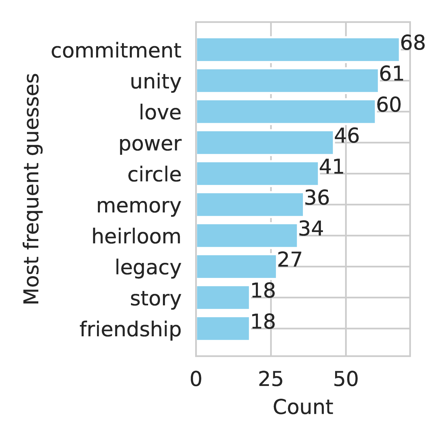
## Bar Chart: Most Frequent Guesses by Count
### Overview
The image is a horizontal bar chart displaying the frequency of "guesses" for 10 categorical labels. The bars are ordered from highest to lowest frequency, with numerical values explicitly labeled at the end of each bar. The chart uses a single color (blue) for all bars, with no legend or additional annotations.
### Components/Axes
- **Y-Axis (Categories)**: Labeled "Most frequent guesses," listing 10 terms in descending order of frequency:
1. commitment
2. unity
3. love
4. power
5. circle
6. memory
7. heirloom
8. legacy
9. story
10. friendship
- **X-Axis (Count)**: Labeled "Count," with a linear scale from 0 to 70 in increments of 25.
- **Bars**: Horizontal, blue, with numerical values (exact counts) displayed at the end of each bar.
### Detailed Analysis
- **Highest Frequency**: "commitment" (68) dominates the chart, with the longest bar extending to the far right.
- **Top Three**: "unity" (61) and "love" (60) follow closely, forming a tight cluster near the top.
- **Mid-Range Values**: "power" (46), "circle" (41), and "memory" (36) show moderate frequencies.
- **Lower Frequencies**: "heirloom" (34), "legacy" (27), "story" (18), and "friendship" (18) occupy the bottom half.
- **Tie**: "story" and "friendship" share the lowest frequency (18), with identical bar lengths.
### Key Observations
1. **Descending Order**: Categories are explicitly ranked by frequency, with no overlap in bar lengths except for the tied lowest values.
2. **Concentration at the Top**: 60% of the data (commitment, unity, love) accounts for 63% of the total count (68 + 61 + 60 = 189 out of 300 total).
3. **Sharp Drop-Off**: Frequencies decline steeply after the top three categories, with no values between 60 and 46.
4. **Symmetry at the Bottom**: The two lowest categories ("story" and "friendship") share identical counts, suggesting potential ambiguity in their ranking.
### Interpretation
The chart likely represents survey or experimental data where respondents were asked to guess or associate with specific concepts. The high frequency of "commitment," "unity," and "love" suggests these terms are strongly linked to the context of the study (e.g., relationships, social bonds). The tie between "story" and "friendship" at the lowest frequency may indicate either:
- A deliberate design choice to group similar concepts,
- A statistical anomaly requiring further investigation,
- Or a reflection of equal but low relevance in the dataset.
The absence of a legend or color-coding implies the chart prioritizes simplicity, focusing on raw frequency rather than comparative analysis across subgroups. The explicit numerical labeling ensures clarity but limits the ability to infer proportional relationships (e.g., "commitment" is 1.12x more frequent than "unity"). The chart’s structure emphasizes ranking over granular detail, making it suitable for highlighting dominant trends but less so for nuanced comparisons.