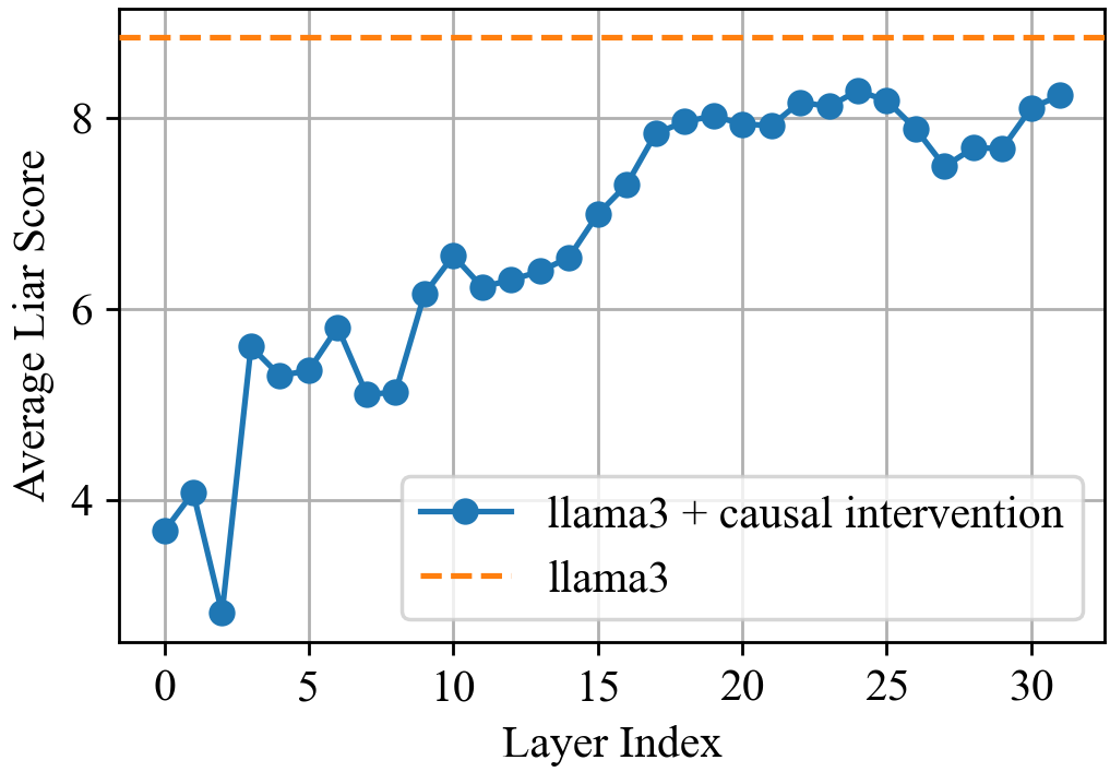
## Line Graph: Average Liar Score vs Layer Index
### Overview
The image is a line graph comparing two data series: "llama3 + causal intervention" (blue solid line) and "llama3" (orange dashed line). The x-axis represents Layer Index (0–30), and the y-axis represents Average Liar Score (0–9). The blue line shows a fluctuating trend with an overall upward trajectory, while the orange dashed line remains constant.
### Components/Axes
- **X-axis (Layer Index)**: Labeled "Layer Index" with ticks at 0, 5, 10, 15, 20, 25, 30.
- **Y-axis (Average Liar Score)**: Labeled "Average Liar Score" with ticks at 0, 2, 4, 6, 8.
- **Legend**: Located in the bottom-right corner, with:
- Blue solid line: "llama3 + causal intervention"
- Orange dashed line: "llama3"
- **Grid**: Light gray grid lines span the plot area.
### Detailed Analysis
#### Blue Line ("llama3 + causal intervention"):
- **Layer 0**: ~3.8
- **Layer 2**: ~3.0 (minimum value)
- **Layer 5**: ~5.5
- **Layer 10**: ~6.2
- **Layer 15**: ~7.2
- **Layer 20**: ~8.0
- **Layer 25**: ~8.3
- **Layer 30**: ~8.2
#### Orange Dashed Line ("llama3"):
- Constant value of **8.5** across all layers.
### Key Observations
1. The blue line starts below the orange line (Layer 0: 3.8 vs. 8.5) but surpasses it after Layer 10 (~6.2 vs. 8.5).
2. The blue line exhibits volatility early on (e.g., dip at Layer 2) but stabilizes and trends upward after Layer 10.
3. The orange line remains perfectly flat, indicating no change in "llama3" scores.
### Interpretation
The data suggests that the "causal intervention" significantly improves the Average Liar Score for "llama3" over successive layers. While the baseline ("llama3") remains static at 8.5, the intervention group starts lower but achieves parity with the baseline by Layer 10 and maintains higher scores thereafter. The initial dip at Layer 2 may indicate a transient adjustment period before the intervention's benefits manifest. This trend implies that the intervention has a cumulative, layer-dependent effect on performance.