## Bar Chart: Performance Metrics vs. Steps
### Overview
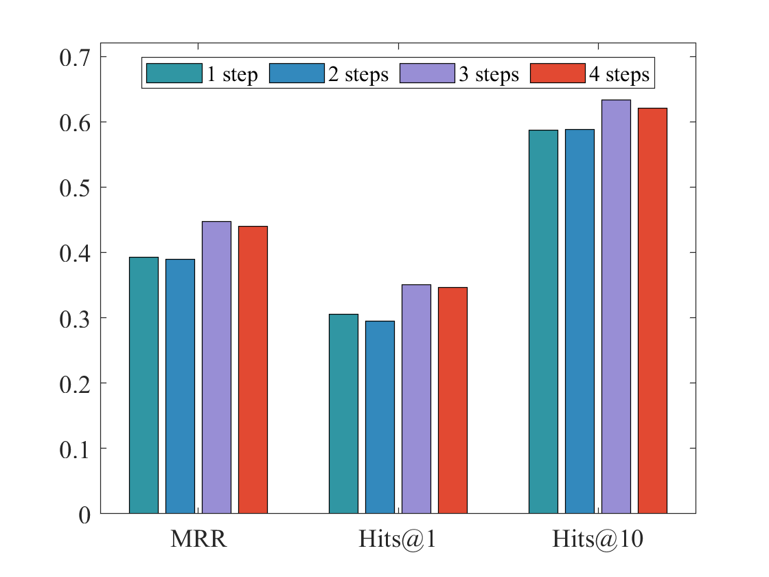
The image is a bar chart comparing the performance of a model across different metrics (MRR, Hits@1, Hits@10) using varying numbers of steps (1, 2, 3, and 4). The y-axis represents the performance score, ranging from 0 to 0.7. The x-axis represents the metrics.
### Components/Axes
* **Y-axis:** Performance score, ranging from 0 to 0.7 with increments of 0.1.
* **X-axis:** Metrics: MRR, Hits@1, Hits@10.
* **Legend:** Located at the top of the chart.
* Teal: 1 step
* Blue: 2 steps
* Purple: 3 steps
* Red: 4 steps
### Detailed Analysis
**MRR (Mean Reciprocal Rank):**
* 1 step (Teal): ~0.39
* 2 steps (Blue): ~0.39
* 3 steps (Purple): ~0.45
* 4 steps (Red): ~0.44
**Hits@1:**
* 1 step (Teal): ~0.31
* 2 steps (Blue): ~0.30
* 3 steps (Purple): ~0.36
* 4 steps (Red): ~0.35
**Hits@10:**
* 1 step (Teal): ~0.59
* 2 steps (Blue): ~0.59
* 3 steps (Purple): ~0.64
* 4 steps (Red): ~0.62
### Key Observations
* For all metrics, performance generally increases as the number of steps increases from 1 to 3.
* The performance for 4 steps is slightly lower than 3 steps for all metrics.
* Hits@10 shows the highest performance scores compared to MRR and Hits@1.
* The difference in performance between 1 step and 2 steps is minimal for MRR and Hits@10.
### Interpretation
The chart suggests that increasing the number of steps generally improves the model's performance, but there's a point of diminishing returns or even a slight decrease when going from 3 steps to 4 steps. This could indicate that the model benefits from increased complexity up to a certain point, after which it may start to overfit or encounter other issues. The Hits@10 metric consistently outperforms MRR and Hits@1, indicating that the model is better at retrieving relevant items within the top 10 results than at ranking the very first result correctly.