## Line Chart: Throughput vs. V
### Overview
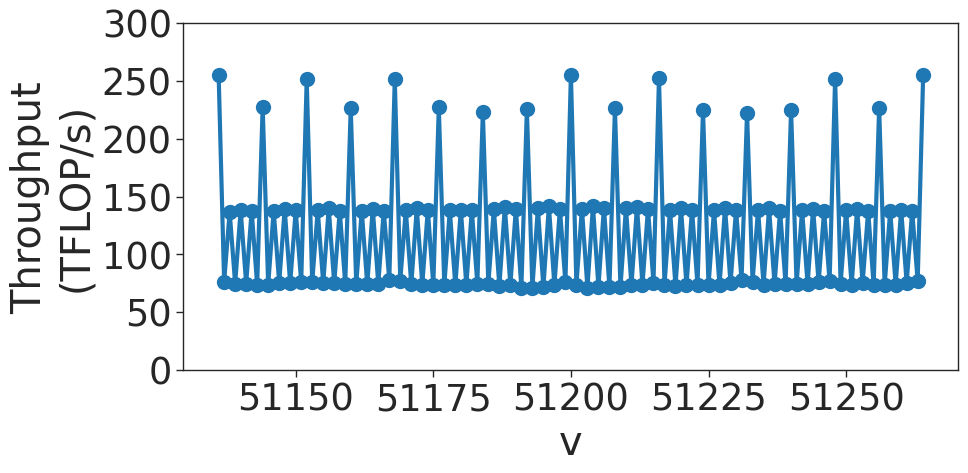
The image displays a line chart plotting "Throughput (TFLOP/s)" on the Y-axis against a variable "V" on the X-axis. The data exhibits a highly regular, periodic oscillatory pattern, characterized by distinct high-throughput spikes and a consistent lower-throughput baseline.
### Components/Axes
* **Y-Axis:** Labeled "Throughput (TFLOP/s)". The scale ranges from 0 to 300, with major tick marks at intervals of 50.
* **X-Axis:** Labeled "V". The scale ranges from approximately 51130 to 51270. Major tick marks are provided at 51150, 51175, 51200, 51225, and 51250.
* **Data Series:** A single blue line connecting circular data points. The line exhibits a "sawtooth" or "zig-zag" pattern, indicating rapid fluctuations in throughput.
### Detailed Analysis
* **Trend Verification:** The data is not a smooth curve. It follows a repeating, deterministic pattern of rapid oscillations. The line moves vertically between three distinct performance tiers.
* **Data Tiers (Approximate Values):**
* **High Peaks:** The highest points reach approximately 250–260 TFLOP/s. These occur at regular intervals across the X-axis.
* **Mid-range Points:** These points oscillate between approximately 130 and 140 TFLOP/s.
* **Low-range Baseline:** The lowest points form a consistent floor, oscillating slightly around 75 TFLOP/s.
* **Periodicity:** The pattern repeats with high consistency. The distance between the high peaks is roughly 10–15 units on the X-axis.
### Key Observations
* **Three-Tiered Structure:** The data is clearly stratified into three horizontal bands: a high band (~250 TFLOP/s), a middle band (~135 TFLOP/s), and a low band (~75 TFLOP/s).
* **Deterministic Behavior:** The extreme regularity of the oscillations suggests that the throughput is governed by a strict, repeating process rather than random noise.
* **Sawtooth Pattern:** The line connects these tiers in a rapid, alternating fashion, suggesting that the system being measured is switching between different states or execution paths very quickly as the variable "V" increments.
### Interpretation
* **What the data demonstrates:** This chart likely represents the performance profile of a computational process—such as a GPU kernel, a specific algorithm, or a memory access pattern—where the variable "V" (potentially representing a vector size, memory address, or loop index) causes the system to cycle through different execution efficiencies.
* **Why it matters:** The distinct three-tiered performance suggests the presence of "best-case," "average-case," and "worst-case" scenarios occurring within a tight loop.
* The **high peaks** likely represent optimal conditions, such as perfect cache alignment, full vectorization, or efficient memory coalescing.
* The **low baseline** likely represents performance bottlenecks, such as cache misses, scalar operations, or memory stalls.
* **Reading between the lines:** The high frequency of these oscillations indicates that the performance variance is likely tied to hardware-level architecture (e.g., memory bank conflicts or cache line boundaries) rather than high-level software logic. The variable "V" is almost certainly a parameter that cycles through specific alignments or strides, causing the performance to fluctuate predictably as the alignment changes.