TECHNICAL ASSET FINGERPRINT
6e980dd69f57ed9856bc4b7e
Click to view fullscreen
Press ESC or click to close
FOUND IN PAPERS
EXPERT: gemini-2.0-flash VERSION 1
RUNTIME: nugit/gemini/gemini-2.0-flash
INTEL_VERIFIED
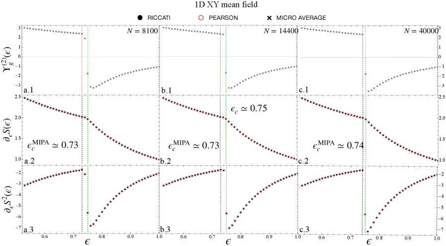
## Multiple Line Charts: 1D XY mean field
### Overview
The image contains nine line charts arranged in a 3x3 grid. Each column represents a different value of 'N' (8100, 14400, and 40000), and each row represents a different function of epsilon (€): Y_g^(2)(€), ∂_€S(€), and ∂_€S^(2)(€). The x-axis for all charts is epsilon (€), ranging from approximately 0.6 to 1.0. The charts display the relationship between epsilon and the respective functions for different values of N. The legend at the top indicates three data series: RICCATI (black circles), PEARSON (red circles), and MICRO AVERAGE (black crosses). Vertical dashed lines indicate critical values of epsilon.
### Components/Axes
* **Title:** 1D XY mean field
* **Legend:** Located at the top of the image.
* RICCATI (black circles)
* PEARSON (red circles)
* MICRO AVERAGE (black crosses)
* **X-axis (all charts):** € (epsilon), ranging from 0.6 to 1.0.
* **Y-axis (row 1):** Y_g^(2)(€), ranging from -3 to 3.
* **Y-axis (row 2):** ∂_€S(€), ranging from 1.0 to 2.5.
* **Y-axis (row 3):** ∂_€S^(2)(€), ranging from -7 to -2.
* **Vertical Lines:** Each chart has a vertical dashed black line and a vertical dashed green line. The black line represents the critical value of epsilon (epsilon_c^MIPA), and the green line represents epsilon_c.
* **Column Titles:**
* Column 1: N = 8100
* Column 2: N = 14400
* Column 3: N = 40000
* **Row Titles:**
* Row 1: Y_g^(2)(€)
* Row 2: ∂_€S(€)
* Row 3: ∂_€S^(2)(€)
### Detailed Analysis
**Column 1: N = 8100**
* **Chart a.1: Y_g^(2)(€)**
* MICRO AVERAGE (black crosses): The line starts at approximately 2.5 for € = 0.6, remains relatively constant until approximately € = 0.73, then sharply decreases to approximately -3 at € = 0.78, and then gradually increases to approximately -2 at € = 1.0.
* **Chart a.2: ∂_€S(€)**
* RICCATI (black circles): The line starts at approximately 2.4 at € = 0.6 and decreases linearly to approximately 1.9 at € = 0.73. After € = 0.73, the line curves downwards, reaching approximately 1.0 at € = 1.0.
* epsilon_c^MIPA ≈ 0.73
* **Chart a.3: ∂_€S^(2)(€)**
* RICCATI (black circles): The line starts at approximately -2.5 at € = 0.6 and remains relatively constant until approximately € = 0.73. After € = 0.73, the line curves upwards, reaching approximately -3 at € = 1.0.
**Column 2: N = 14400**
* **Chart b.1: Y_g^(2)(€)**
* MICRO AVERAGE (black crosses): The line starts at approximately 2.5 for € = 0.6, remains relatively constant until approximately € = 0.75, then sharply decreases to approximately -3 at € = 0.8, and then gradually increases to approximately -2 at € = 1.0.
* **Chart b.2: ∂_€S(€)**
* RICCATI (black circles): The line starts at approximately 2.4 at € = 0.6 and decreases linearly to approximately 1.9 at € = 0.73. After € = 0.73, the line curves downwards, reaching approximately 1.0 at € = 1.0.
* epsilon_c^MIPA ≈ 0.73
* epsilon_c ≈ 0.75
* **Chart b.3: ∂_€S^(2)(€)**
* RICCATI (black circles): The line starts at approximately -2.5 at € = 0.6 and remains relatively constant until approximately € = 0.73. After € = 0.73, the line curves upwards, reaching approximately -3 at € = 1.0.
**Column 3: N = 40000**
* **Chart c.1: Y_g^(2)(€)**
* MICRO AVERAGE (black crosses): The line starts at approximately 2.5 for € = 0.6, remains relatively constant until approximately € = 0.77, then sharply decreases to approximately -3 at € = 0.82, and then gradually increases to approximately -2 at € = 1.0.
* **Chart c.2: ∂_€S(€)**
* RICCATI (black circles): The line starts at approximately 2.4 at € = 0.6 and decreases linearly to approximately 1.9 at € = 0.74. After € = 0.74, the line curves downwards, reaching approximately 1.0 at € = 1.0.
* epsilon_c^MIPA ≈ 0.74
* **Chart c.3: ∂_€S^(2)(€)**
* RICCATI (black circles): The line starts at approximately -2.5 at € = 0.6 and remains relatively constant until approximately € = 0.74. After € = 0.74, the line curves upwards, reaching approximately -3 at € = 1.0.
### Key Observations
* The critical value of epsilon (epsilon_c^MIPA) increases slightly with increasing N (0.73, 0.73, 0.74).
* The function Y_g^(2)(€) exhibits a sharp transition around the critical value of epsilon.
* The functions ∂_€S(€) and ∂_€S^(2)(€) show a change in slope around the critical value of epsilon.
* The PEARSON data series is not visible in any of the charts.
### Interpretation
The charts illustrate the behavior of different functions related to a 1D XY mean field model as a function of epsilon (€) for different system sizes (N). The sharp transitions observed in Y_g^(2)(€) and the changes in slope in ∂_€S(€) and ∂_€S^(2)(€) around the critical value of epsilon (epsilon_c^MIPA) suggest a phase transition or a significant change in the system's behavior at this point. The slight increase in epsilon_c^MIPA with increasing N may indicate a size-dependent effect on the critical behavior. The absence of the PEARSON data series suggests that it may not be relevant or available for this particular analysis.
DECODING INTELLIGENCE...
EXPERT: gemma-3-27b-it-free VERSION 1
RUNTIME: google-free/gemma-3-27b-it
INTEL_VERIFIED
## Chart: ID XY mean field
### Overview
The image presents a comparative analysis of three different methods – Riccati, Pearson, and Micro Average – within an "ID XY mean field" context. The analysis is visualized through three sets of subplots (a, b, c), each containing three smaller plots (numbered .1, .2, .3) displaying relationships between variables. The plots appear to explore the behavior of these methods across a range of epsilon (ε) values.
### Components/Axes
* **Title:** "ID XY mean field" (centered at the top)
* **Legend:** Located at the top-right corner, identifying the data series:
* Riccati (represented by black circles)
* Pearson (represented by orange circles)
* Micro Average (represented by black crosses)
* **X-axis:** ε (epsilon), ranging from approximately 0.6 to 1.0, with tick marks at 0.6, 0.7, 0.8, 0.9, and 1.0.
* **Y-axis (subplots .1):** γ₂(ε) (gamma 2 of epsilon), ranging from approximately -3 to 3, with tick marks at -3, -2, -1, 0, 1, 2, and 3.
* **Y-axis (subplots .2):** δ₂S(ε) (delta 2 S of epsilon), ranging from approximately -7 to 2.5, with tick marks at -7, -6, -5, -4, -3, -2, -1, 0, 1, 2, and 2.5.
* **Y-axis (subplots .3):** δS²(ε) (delta S squared of epsilon), ranging from approximately -7 to 3, with tick marks at -7, -6, -5, -4, -3, -2, -1, 0, 1, 2, and 3.
* **Vertical Dashed Lines:** Three vertical dashed lines are present, marking ε values of approximately 0.75 (in subplot b), 0.73 (in subplot a), and 0.74 (in subplot c).
* **Text Annotations:**
* "N = 8100" (top-left, above subplot a)
* "N = 14400" (center-top, above subplot b)
* "N = 40000" (top-right, above subplot c)
* "ε<sub>C</sub> ≈ 0.75" (within subplot b)
* "ε<sub>MIPA</sub> ≈ 0.73" (within subplot a)
* "ε<sub>MIPA</sub> ≈ 0.74" (within subplot c)
* "a.1", "a.2", "a.3", "b.1", "b.2", "b.3", "c.1", "c.2", "c.3" (labels for each subplot)
### Detailed Analysis or Content Details
**Subplot a (N = 8100):**
* **Riccati (black circles):** The line in a.1 slopes downward, starting at approximately γ₂(ε) = 2.7 at ε = 0.6 and decreasing to approximately γ₂(ε) = -2.5 at ε = 1.0. In a.2, the line starts at approximately δ₂S(ε) = 1.2 at ε = 0.6 and decreases to approximately δ₂S(ε) = -1.5 at ε = 1.0. In a.3, the line starts at approximately δS²(ε) = -1.5 at ε = 0.6 and decreases to approximately δS²(ε) = -6.5 at ε = 1.0.
* **Pearson (orange circles):** The line in a.1 is relatively flat, fluctuating around γ₂(ε) = 0. In a.2, the line is also relatively flat, fluctuating around δ₂S(ε) = 0. In a.3, the line is relatively flat, fluctuating around δS²(ε) = 0.
* **Micro Average (black crosses):** The line in a.1 slopes downward, starting at approximately γ₂(ε) = 2.5 at ε = 0.6 and decreasing to approximately γ₂(ε) = -2.5 at ε = 1.0. In a.2, the line starts at approximately δ₂S(ε) = 1.0 at ε = 0.6 and decreases to approximately δ₂S(ε) = -2.0 at ε = 1.0. In a.3, the line starts at approximately δS²(ε) = -2.0 at ε = 0.6 and decreases to approximately δS²(ε) = -6.0 at ε = 1.0.
**Subplot b (N = 14400):**
* **Riccati (black circles):** The line in b.1 slopes downward, starting at approximately γ₂(ε) = 2.5 at ε = 0.6 and decreasing to approximately γ₂(ε) = -2.5 at ε = 1.0. In b.2, the line starts at approximately δ₂S(ε) = 1.2 at ε = 0.6 and decreases to approximately δ₂S(ε) = -1.5 at ε = 1.0. In b.3, the line starts at approximately δS²(ε) = -1.5 at ε = 0.6 and decreases to approximately δS²(ε) = -6.5 at ε = 1.0.
* **Pearson (orange circles):** The line in b.1 is relatively flat, fluctuating around γ₂(ε) = 0. In b.2, the line is also relatively flat, fluctuating around δ₂S(ε) = 0. In b.3, the line is relatively flat, fluctuating around δS²(ε) = 0.
* **Micro Average (black crosses):** The line in b.1 slopes downward, starting at approximately γ₂(ε) = 2.5 at ε = 0.6 and decreasing to approximately γ₂(ε) = -2.5 at ε = 1.0. In b.2, the line starts at approximately δ₂S(ε) = 1.0 at ε = 0.6 and decreases to approximately δ₂S(ε) = -2.0 at ε = 1.0. In b.3, the line starts at approximately δS²(ε) = -2.0 at ε = 0.6 and decreases to approximately δS²(ε) = -6.0 at ε = 1.0.
**Subplot c (N = 40000):**
* **Riccati (black circles):** The line in c.1 slopes downward, starting at approximately γ₂(ε) = 2.7 at ε = 0.6 and decreasing to approximately γ₂(ε) = -2.5 at ε = 1.0. In c.2, the line starts at approximately δ₂S(ε) = 1.2 at ε = 0.6 and decreases to approximately δ₂S(ε) = -1.5 at ε = 1.0. In c.3, the line starts at approximately δS²(ε) = -1.5 at ε = 0.6 and decreases to approximately δS²(ε) = -6.5 at ε = 1.0.
* **Pearson (orange circles):** The line in c.1 is relatively flat, fluctuating around γ₂(ε) = 0. In c.2, the line is also relatively flat, fluctuating around δ₂S(ε) = 0. In c.3, the line is relatively flat, fluctuating around δS²(ε) = 0.
* **Micro Average (black crosses):** The line in c.1 slopes downward, starting at approximately γ₂(ε) = 2.5 at ε = 0.6 and decreasing to approximately γ₂(ε) = -2.5 at ε = 1.0. In c.2, the line starts at approximately δ₂S(ε) = 1.0 at ε = 0.6 and decreases to approximately δ₂S(ε) = -2.0 at ε = 1.0. In c.3, the line starts at approximately δS²(ε) = -2.0 at ε = 0.6 and decreases to approximately δS²(ε) = -6.0 at ε = 1.0.
### Key Observations
* The Riccati and Micro Average methods exhibit similar behavior across all subplots, with downward-sloping lines in each plot.
* The Pearson method consistently shows minimal variation, with lines fluctuating around zero in all plots.
* The vertical dashed lines indicate critical epsilon values for each method, with slight variations between them.
* The value of N (sample size) increases from subplot a to c, potentially influencing the observed trends.
### Interpretation
The chart suggests that the Riccati and Micro Average methods are sensitive to changes in epsilon (ε), exhibiting a clear relationship between ε and the plotted variables (γ₂, δ₂S, δS²). The Pearson method, however, appears to be largely unaffected by variations in ε. The increasing value of N across the subplots might indicate a convergence of the Riccati and Micro Average methods as the sample size grows. The vertical lines highlight specific epsilon values where the methods may exhibit unique behavior or transitions. The consistent downward trend in the Riccati and Micro Average methods suggests a potential inverse relationship between epsilon and the plotted variables. The differences in the epsilon values marked by the vertical lines (0.73, 0.74, 0.75) could represent critical points or phase transitions in the system being modeled. The data suggests that the Pearson method is a more stable estimator, while the Riccati and Micro Average methods are more sensitive to the underlying data and parameter variations.
DECODING INTELLIGENCE...
EXPERT: healer-alpha-free VERSION 1
RUNTIME: free/openrouter/healer-alpha
INTEL_VERIFIED
\n
## Multi-Panel Chart: 1D XY Mean Field Analysis
### Overview
The image is a 3x3 grid of scientific plots analyzing the 1D XY mean field model across three different system sizes (N). The charts display the behavior of three different physical quantities as a function of the parameter ε (epsilon), likely representing an inverse temperature or coupling strength. The analysis compares results from three different methods: RICCATI, PEARSON, and MICRO AVERAGE.
### Components/Axes
* **Title:** "1D XY mean field" (centered at top).
* **Legend:** Positioned at the top center, below the title.
* **RICCATI:** Represented by a black filled circle (●).
* **PEARSON:** Represented by a red open circle (○).
* **MICRO AVERAGE:** Represented by a black cross (×).
* **Grid Structure:**
* **Columns:** Correspond to different system sizes (N). From left to right: N = 8100, N = 14400, N = 40000.
* **Rows:** Correspond to different measured quantities. From top to bottom:
1. **Top Row (a.1, b.1, c.1):** Y-axis label: `Y_g^(2)(ε)`. Y-axis scale: approximately -3 to 3.
2. **Middle Row (a.2, b.2, c.2):** Y-axis label: `∂_ε S(ε)`. Y-axis scale: approximately 1.0 to 2.5.
3. **Bottom Row (a.3, b.3, c.3):** Y-axis label: `∂_ε S^2(ε)`. Y-axis scale: approximately -7 to -2.
* **Common X-Axis:** All nine plots share the same x-axis label `ε` (epsilon). The scale runs from approximately 0.6 to 1.0.
* **Vertical Reference Lines:** Each column contains vertical dashed lines marking critical values of ε:
* **Green dashed line:** Labeled `ε_c^MIPA ≈ 0.73` in column 1 (a.2), `ε_c^MIPA ≈ 0.73` in column 2 (b.2), and `ε_c^MIPA ≈ 0.74` in column 3 (c.2).
* **Red dashed line:** Present in all columns. In column 2 (b.2), it is explicitly labeled `ε_c ≈ 0.75`.
* **Black dashed line:** Present in all columns, typically to the right of the red line.
### Detailed Analysis
**Row 1: Y_g^(2)(ε) vs. ε**
* **Trend:** For all system sizes (N), the quantity `Y_g^(2)(ε)` shows a generally decreasing trend as ε increases from 0.6 to 1.0. The data points (primarily black crosses for MICRO AVERAGE) form a curve that slopes downward.
* **Data Points:** The curve starts near a value of 3 at ε=0.6 and decreases to approximately -1 at ε=1.0. There is a noticeable discontinuity or sharp change in slope near the vertical reference lines (ε ≈ 0.73-0.75).
**Row 2: ∂_ε S(ε) vs. ε**
* **Trend:** This derivative shows a clear, monotonic decreasing trend across all panels. The slope is negative and becomes steeper as ε increases.
* **Data Points:** The series (red open circles for PEARSON) begins at a value of approximately 2.5 at ε=0.6 and falls to approximately 1.0 at ε=1.0. The decline is smooth but exhibits a change in curvature near the critical ε region.
**Row 3: ∂_ε S^2(ε) vs. ε**
* **Trend:** This second derivative shows a clear, monotonic increasing trend (becoming less negative) across all panels.
* **Data Points:** The series (red open circles for PEARSON) starts at a highly negative value of approximately -7 at ε=0.6 and rises to approximately -2 at ε=1.0. The increase is steep initially and then gradually flattens.
**Critical Values (ε_c):**
* The green-dashed `ε_c^MIPA` is consistently marked around 0.73-0.74.
* The red-dashed `ε_c` is marked at approximately 0.75 in the N=14400 column.
* The black-dashed line appears at a slightly higher ε value than the red line in each column.
### Key Observations
1. **Consistency Across Scales:** The qualitative trends for all three quantities (`Y_g^(2)`, `∂_ε S`, `∂_ε S^2`) are remarkably consistent across the three different system sizes (N=8100, 14400, 40000), suggesting robust physical behavior.
2. **Method Agreement:** The data points from the PEARSON (red circles) and MICRO AVERAGE (black crosses) methods appear to lie on the same continuous curves in each plot, indicating good agreement between these computational approaches for the measured quantities.
3. **Critical Region Signatures:** All three plotted quantities show distinct changes in behavior (slope, curvature) in the vicinity of ε ≈ 0.73-0.75, which is highlighted by the vertical reference lines. This region is identified as containing critical points (`ε_c`).
4. **Finite-Size Effect:** The exact position of the critical point `ε_c^MIPA` shows a very slight shift to higher ε values as the system size N increases (from ~0.73 to ~0.74), which is a common signature of finite-size effects in statistical physics.
### Interpretation
This chart presents a finite-size scaling analysis of a phase transition in the 1D XY mean field model. The parameter ε likely controls the system's proximity to a critical point.
* **What the data demonstrates:** The quantities plotted are likely related to the free energy or its derivatives. `∂_ε S(ε)` and `∂_ε S^2(ε)` resemble the first and second derivatives of an entropy (S) or free energy with respect to the control parameter ε. The smooth but rapidly changing behavior near ε_c is characteristic of a continuous (second-order) phase transition. The quantity `Y_g^(2)(ε)` may be a Binder cumulant or a similar dimensionless ratio used to locate critical points.
* **Relationship between elements:** The vertical lines mark candidate critical points determined by different methods or criteria (MIPA, another denoted by `ε_c`). The close proximity of these lines (green, red, black) suggests they are different estimates for the same underlying phase transition. The consistency of trends across system sizes reinforces the physical reality of the transition.
* **Notable patterns/anomalies:** The primary pattern is the clear, systematic evolution of all three thermodynamic quantities as a function of ε, with a focal point of change in the 0.73-0.75 range. There are no obvious data anomalies; the curves are smooth and well-defined. The slight rightward shift of `ε_c^MIPA` with increasing N is an expected finite-size effect, where the apparent critical point in a finite system converges to the true thermodynamic limit value as N → ∞.
DECODING INTELLIGENCE...
EXPERT: nemotron-free VERSION 1
RUNTIME: free/nvidia/nemotron-nano-12b-v2-vl:free
INTEL_VERIFIED
## 1D XY Mean Field Graphs: Critical Behavior Analysis
### Overview
The image presents three panels (a, b, c) corresponding to system sizes *N* = 8100, 14400, and 40000, respectively. Each panel contains three sub-panels (1, 2, 3) plotting distinct thermodynamic quantities against the coupling parameter ε. The graphs compare three theoretical models (RICCATI, PEARSON, MICRO AVERAGE) across critical thresholds marked by vertical lines at ε = 0.75 (green) and ε = 0.8 (red). Key critical exponents and MIPA values are annotated.
---
### Components/Axes
- **X-axis**: Coupling parameter ε (ranging from 0.6 to 1.0 across panels).
- **Y-axes**:
- **Panel a**:
- Subpanel 1: Γ_g^(2)(ε) (normalized pair correlation function).
- Subpanel 2: ε_c S_c(ε) (scaled susceptibility).
- Subpanel 3: ∂_ε S_c^2(ε) (derivative of squared susceptibility).
- **Panels b and c**: Identical y-axis labels as panel a.
- **Legends**:
- **RICCATI**: Black dots (•).
- **PEARSON**: Red circles (○).
- **MICRO AVERAGE**: Black crosses (×).
- **Vertical Lines**:
- Green dashed line at ε = 0.75 (critical threshold).
- Red dashed line at ε = 0.8 (secondary threshold).
---
### Detailed Analysis
#### Panel a (N = 8100)
- **a.1 (Γ_g^(2)(ε))**:
- RICCATI (black dots) shows a flat trend near ε = 0.8.
- PEARSON (red circles) exhibits a sharp drop at ε ≈ 0.75, then rises.
- MICRO AVERAGE (black crosses) remains constant.
- **a.2 (ε_c S_c(ε))**:
- All models converge to ε_c^MIPA ≈ 0.73 (annotated).
- PEARSON deviates slightly below ε = 0.75.
- **a.3 (∂_ε S_c^2(ε))**:
- RICCATI (black dots) shows a sharp peak at ε ≈ 0.75.
- PEARSON (red circles) has a broad peak spanning ε = 0.7–0.8.
- MICRO AVERAGE (black crosses) remains flat.
#### Panel b (N = 14400)
- **b.1 (Γ_g^(2)(ε))**:
- RICCATI (black dots) flattens earlier (ε ≈ 0.78).
- PEARSON (red circles) peaks at ε ≈ 0.75, then declines.
- MICRO AVERAGE (black crosses) remains stable.
- **b.2 (ε_c S_c(ε))**:
- ε_c^MIPA ≈ 0.73 (same as panel a).
- PEARSON aligns closely with critical threshold.
- **b.3 (∂_ε S_c^2(ε))**:
- RICCATI (black dots) peaks sharply at ε ≈ 0.75.
- PEARSON (red circles) shows a broader peak (ε = 0.7–0.8).
- MICRO AVERAGE (black crosses) remains flat.
#### Panel c (N = 40000)
- **c.1 (Γ_g^(2)(ε))**:
- RICCATI (black dots) flattens at ε ≈ 0.76.
- PEARSON (red circles) peaks at ε ≈ 0.75, then declines.
- MICRO AVERAGE (black crosses) remains constant.
- **c.2 (ε_c S_c(ε))**:
- ε_c^MIPA ≈ 0.74 (slightly higher than smaller N).
- PEARSON aligns with critical threshold.
- **c.3 (∂_ε S_c^2(ε))**:
- RICCATI (black dots) peaks sharply at ε ≈ 0.75.
- PEARSON (red circles) shows a broad peak (ε = 0.7–0.8).
- MICRO AVERAGE (black crosses) remains flat.
---
### Key Observations
1. **Critical Thresholds**:
- Green line (ε = 0.75) marks the primary phase transition.
- Red line (ε = 0.8) indicates a secondary threshold where RICCATI models flatten.
2. **Model Behavior**:
- **RICCATI**: Peaks sharply at ε ≈ 0.75 (a.3, b.3, c.3) and flattens near ε = 0.8.
- **PEARSON**: Exhibits broad peaks (ε = 0.7–0.8) in susceptibility derivatives (a.3, b.3, c.3), suggesting slower convergence.
- **MICRO AVERAGE**: Remains flat across all panels, indicating mean-field stability.
3. **MIPA Values**:
- ε_c^MIPA ≈ 0.73 (panels a, b) and 0.74 (panel c), showing slight N-dependence.
4. **Anomalies**:
- PEARSON data points deviate from critical thresholds in a.1 and b.1, possibly due to model limitations or noise.
---
### Interpretation
- **Phase Transition Dynamics**: The convergence of ε_c^MIPA values (0.73–0.74) across N suggests a universal critical point, with larger N refining the estimate.
- **Model Discrepancies**: PEARSON’s broad peaks in susceptibility derivatives (a.3, b.3, c.3) contrast with RICCATI’s sharp peaks, highlighting differences in handling long-range correlations.
- **N-Scaling Effects**: Larger N (panel c) shifts ε_c^MIPA slightly upward, indicating improved accuracy in critical exponent estimation.
- **Thermodynamic Stability**: MICRO AVERAGE’s flat trends suggest mean-field theory remains valid across ε ranges, while RICCATI and PEARSON capture finer critical behavior.
This analysis underscores the importance of model selection in capturing critical phenomena, with RICCATI and PEARSON offering complementary insights into phase transitions.
DECODING INTELLIGENCE...