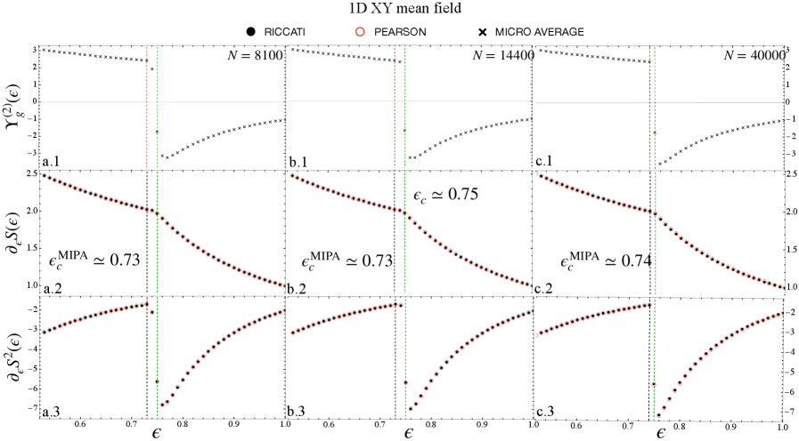
## Multiple Line Charts: 1D XY mean field
### Overview
The image contains nine line charts arranged in a 3x3 grid. Each column represents a different value of 'N' (8100, 14400, and 40000), and each row represents a different function of epsilon (€): Y_g^(2)(€), ∂_€S(€), and ∂_€S^(2)(€). The x-axis for all charts is epsilon (€), ranging from approximately 0.6 to 1.0. The charts display the relationship between epsilon and the respective functions for different values of N. The legend at the top indicates three data series: RICCATI (black circles), PEARSON (red circles), and MICRO AVERAGE (black crosses). Vertical dashed lines indicate critical values of epsilon.
### Components/Axes
* **Title:** 1D XY mean field
* **Legend:** Located at the top of the image.
* RICCATI (black circles)
* PEARSON (red circles)
* MICRO AVERAGE (black crosses)
* **X-axis (all charts):** € (epsilon), ranging from 0.6 to 1.0.
* **Y-axis (row 1):** Y_g^(2)(€), ranging from -3 to 3.
* **Y-axis (row 2):** ∂_€S(€), ranging from 1.0 to 2.5.
* **Y-axis (row 3):** ∂_€S^(2)(€), ranging from -7 to -2.
* **Vertical Lines:** Each chart has a vertical dashed black line and a vertical dashed green line. The black line represents the critical value of epsilon (epsilon_c^MIPA), and the green line represents epsilon_c.
* **Column Titles:**
* Column 1: N = 8100
* Column 2: N = 14400
* Column 3: N = 40000
* **Row Titles:**
* Row 1: Y_g^(2)(€)
* Row 2: ∂_€S(€)
* Row 3: ∂_€S^(2)(€)
### Detailed Analysis
**Column 1: N = 8100**
* **Chart a.1: Y_g^(2)(€)**
* MICRO AVERAGE (black crosses): The line starts at approximately 2.5 for € = 0.6, remains relatively constant until approximately € = 0.73, then sharply decreases to approximately -3 at € = 0.78, and then gradually increases to approximately -2 at € = 1.0.
* **Chart a.2: ∂_€S(€)**
* RICCATI (black circles): The line starts at approximately 2.4 at € = 0.6 and decreases linearly to approximately 1.9 at € = 0.73. After € = 0.73, the line curves downwards, reaching approximately 1.0 at € = 1.0.
* epsilon_c^MIPA ≈ 0.73
* **Chart a.3: ∂_€S^(2)(€)**
* RICCATI (black circles): The line starts at approximately -2.5 at € = 0.6 and remains relatively constant until approximately € = 0.73. After € = 0.73, the line curves upwards, reaching approximately -3 at € = 1.0.
**Column 2: N = 14400**
* **Chart b.1: Y_g^(2)(€)**
* MICRO AVERAGE (black crosses): The line starts at approximately 2.5 for € = 0.6, remains relatively constant until approximately € = 0.75, then sharply decreases to approximately -3 at € = 0.8, and then gradually increases to approximately -2 at € = 1.0.
* **Chart b.2: ∂_€S(€)**
* RICCATI (black circles): The line starts at approximately 2.4 at € = 0.6 and decreases linearly to approximately 1.9 at € = 0.73. After € = 0.73, the line curves downwards, reaching approximately 1.0 at € = 1.0.
* epsilon_c^MIPA ≈ 0.73
* epsilon_c ≈ 0.75
* **Chart b.3: ∂_€S^(2)(€)**
* RICCATI (black circles): The line starts at approximately -2.5 at € = 0.6 and remains relatively constant until approximately € = 0.73. After € = 0.73, the line curves upwards, reaching approximately -3 at € = 1.0.
**Column 3: N = 40000**
* **Chart c.1: Y_g^(2)(€)**
* MICRO AVERAGE (black crosses): The line starts at approximately 2.5 for € = 0.6, remains relatively constant until approximately € = 0.77, then sharply decreases to approximately -3 at € = 0.82, and then gradually increases to approximately -2 at € = 1.0.
* **Chart c.2: ∂_€S(€)**
* RICCATI (black circles): The line starts at approximately 2.4 at € = 0.6 and decreases linearly to approximately 1.9 at € = 0.74. After € = 0.74, the line curves downwards, reaching approximately 1.0 at € = 1.0.
* epsilon_c^MIPA ≈ 0.74
* **Chart c.3: ∂_€S^(2)(€)**
* RICCATI (black circles): The line starts at approximately -2.5 at € = 0.6 and remains relatively constant until approximately € = 0.74. After € = 0.74, the line curves upwards, reaching approximately -3 at € = 1.0.
### Key Observations
* The critical value of epsilon (epsilon_c^MIPA) increases slightly with increasing N (0.73, 0.73, 0.74).
* The function Y_g^(2)(€) exhibits a sharp transition around the critical value of epsilon.
* The functions ∂_€S(€) and ∂_€S^(2)(€) show a change in slope around the critical value of epsilon.
* The PEARSON data series is not visible in any of the charts.
### Interpretation
The charts illustrate the behavior of different functions related to a 1D XY mean field model as a function of epsilon (€) for different system sizes (N). The sharp transitions observed in Y_g^(2)(€) and the changes in slope in ∂_€S(€) and ∂_€S^(2)(€) around the critical value of epsilon (epsilon_c^MIPA) suggest a phase transition or a significant change in the system's behavior at this point. The slight increase in epsilon_c^MIPA with increasing N may indicate a size-dependent effect on the critical behavior. The absence of the PEARSON data series suggests that it may not be relevant or available for this particular analysis.