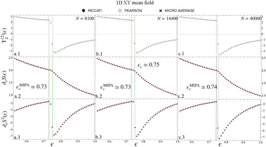
\n
## Multi-Panel Chart: 1D XY Mean Field Analysis
### Overview
The image is a 3x3 grid of scientific plots analyzing the 1D XY mean field model across three different system sizes (N). The charts display the behavior of three different physical quantities as a function of the parameter ε (epsilon), likely representing an inverse temperature or coupling strength. The analysis compares results from three different methods: RICCATI, PEARSON, and MICRO AVERAGE.
### Components/Axes
* **Title:** "1D XY mean field" (centered at top).
* **Legend:** Positioned at the top center, below the title.
* **RICCATI:** Represented by a black filled circle (●).
* **PEARSON:** Represented by a red open circle (○).
* **MICRO AVERAGE:** Represented by a black cross (×).
* **Grid Structure:**
* **Columns:** Correspond to different system sizes (N). From left to right: N = 8100, N = 14400, N = 40000.
* **Rows:** Correspond to different measured quantities. From top to bottom:
1. **Top Row (a.1, b.1, c.1):** Y-axis label: `Y_g^(2)(ε)`. Y-axis scale: approximately -3 to 3.
2. **Middle Row (a.2, b.2, c.2):** Y-axis label: `∂_ε S(ε)`. Y-axis scale: approximately 1.0 to 2.5.
3. **Bottom Row (a.3, b.3, c.3):** Y-axis label: `∂_ε S^2(ε)`. Y-axis scale: approximately -7 to -2.
* **Common X-Axis:** All nine plots share the same x-axis label `ε` (epsilon). The scale runs from approximately 0.6 to 1.0.
* **Vertical Reference Lines:** Each column contains vertical dashed lines marking critical values of ε:
* **Green dashed line:** Labeled `ε_c^MIPA ≈ 0.73` in column 1 (a.2), `ε_c^MIPA ≈ 0.73` in column 2 (b.2), and `ε_c^MIPA ≈ 0.74` in column 3 (c.2).
* **Red dashed line:** Present in all columns. In column 2 (b.2), it is explicitly labeled `ε_c ≈ 0.75`.
* **Black dashed line:** Present in all columns, typically to the right of the red line.
### Detailed Analysis
**Row 1: Y_g^(2)(ε) vs. ε**
* **Trend:** For all system sizes (N), the quantity `Y_g^(2)(ε)` shows a generally decreasing trend as ε increases from 0.6 to 1.0. The data points (primarily black crosses for MICRO AVERAGE) form a curve that slopes downward.
* **Data Points:** The curve starts near a value of 3 at ε=0.6 and decreases to approximately -1 at ε=1.0. There is a noticeable discontinuity or sharp change in slope near the vertical reference lines (ε ≈ 0.73-0.75).
**Row 2: ∂_ε S(ε) vs. ε**
* **Trend:** This derivative shows a clear, monotonic decreasing trend across all panels. The slope is negative and becomes steeper as ε increases.
* **Data Points:** The series (red open circles for PEARSON) begins at a value of approximately 2.5 at ε=0.6 and falls to approximately 1.0 at ε=1.0. The decline is smooth but exhibits a change in curvature near the critical ε region.
**Row 3: ∂_ε S^2(ε) vs. ε**
* **Trend:** This second derivative shows a clear, monotonic increasing trend (becoming less negative) across all panels.
* **Data Points:** The series (red open circles for PEARSON) starts at a highly negative value of approximately -7 at ε=0.6 and rises to approximately -2 at ε=1.0. The increase is steep initially and then gradually flattens.
**Critical Values (ε_c):**
* The green-dashed `ε_c^MIPA` is consistently marked around 0.73-0.74.
* The red-dashed `ε_c` is marked at approximately 0.75 in the N=14400 column.
* The black-dashed line appears at a slightly higher ε value than the red line in each column.
### Key Observations
1. **Consistency Across Scales:** The qualitative trends for all three quantities (`Y_g^(2)`, `∂_ε S`, `∂_ε S^2`) are remarkably consistent across the three different system sizes (N=8100, 14400, 40000), suggesting robust physical behavior.
2. **Method Agreement:** The data points from the PEARSON (red circles) and MICRO AVERAGE (black crosses) methods appear to lie on the same continuous curves in each plot, indicating good agreement between these computational approaches for the measured quantities.
3. **Critical Region Signatures:** All three plotted quantities show distinct changes in behavior (slope, curvature) in the vicinity of ε ≈ 0.73-0.75, which is highlighted by the vertical reference lines. This region is identified as containing critical points (`ε_c`).
4. **Finite-Size Effect:** The exact position of the critical point `ε_c^MIPA` shows a very slight shift to higher ε values as the system size N increases (from ~0.73 to ~0.74), which is a common signature of finite-size effects in statistical physics.
### Interpretation
This chart presents a finite-size scaling analysis of a phase transition in the 1D XY mean field model. The parameter ε likely controls the system's proximity to a critical point.
* **What the data demonstrates:** The quantities plotted are likely related to the free energy or its derivatives. `∂_ε S(ε)` and `∂_ε S^2(ε)` resemble the first and second derivatives of an entropy (S) or free energy with respect to the control parameter ε. The smooth but rapidly changing behavior near ε_c is characteristic of a continuous (second-order) phase transition. The quantity `Y_g^(2)(ε)` may be a Binder cumulant or a similar dimensionless ratio used to locate critical points.
* **Relationship between elements:** The vertical lines mark candidate critical points determined by different methods or criteria (MIPA, another denoted by `ε_c`). The close proximity of these lines (green, red, black) suggests they are different estimates for the same underlying phase transition. The consistency of trends across system sizes reinforces the physical reality of the transition.
* **Notable patterns/anomalies:** The primary pattern is the clear, systematic evolution of all three thermodynamic quantities as a function of ε, with a focal point of change in the 0.73-0.75 range. There are no obvious data anomalies; the curves are smooth and well-defined. The slight rightward shift of `ε_c^MIPA` with increasing N is an expected finite-size effect, where the apparent critical point in a finite system converges to the true thermodynamic limit value as N → ∞.