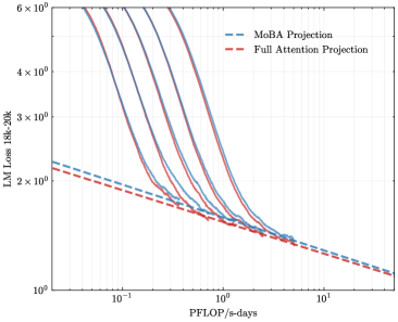
## Line Chart: LLM Loss vs. Compute (PFLOP/s-days)
### Overview
The image is a technical line chart comparing the training loss of a large language model (Llama-3 8B) against the amount of compute used, measured in PFLOP/s-days. It plots multiple training runs (solid lines) and projects their future performance using two different methods (dashed lines). The chart uses logarithmic scales on both axes.
### Components/Axes
* **Chart Type:** Log-Log Line Chart.
* **Y-Axis (Vertical):**
* **Label:** `LLM Loss (Llama-3 8B)`
* **Scale:** Logarithmic, ranging from `10^0` (1) to `6 x 10^2` (600).
* **Major Ticks:** 10^0, 2x10^2, 3x10^2, 4x10^2, 6x10^2.
* **X-Axis (Horizontal):**
* **Label:** `PFLOP/s-days`
* **Scale:** Logarithmic, ranging from `10^-1` (0.1) to `10^1` (10).
* **Major Ticks:** 10^-1, 10^0, 10^1.
* **Legend:**
* **Position:** Top-right corner of the plot area.
* **Entry 1:** `MoBA Projection` - Represented by a blue dashed line (`--`).
* **Entry 2:** `Full Attention Projection` - Represented by a red dashed line (`--`).
* **Data Series (Solid Lines):**
* There are **five distinct solid lines** in varying colors (from left to right/top to bottom): a dark purple line, a medium blue line, a lighter blue line, a red line, and a dark red/brown line.
* **Important Note:** These solid lines are **not explicitly labeled** in the legend. They likely represent different model configurations, training runs, or architectures whose performance is being tracked and projected.
### Detailed Analysis
1. **Trend of Solid Lines (Observed Data):**
* All five solid lines exhibit a **consistent downward slope** from left to right.
* This indicates a **strong inverse relationship**: as the compute budget (PFLOP/s-days) increases, the LLM Loss decreases.
* The lines are roughly parallel on this log-log plot, suggesting a similar power-law scaling relationship between loss and compute for all runs, though with different constants (offsets).
* The leftmost (dark purple) line starts at the highest loss (~600 at ~0.08 PFLOP/s-days) and ends at a loss of ~15 at ~2 PFLOP/s-days.
* The rightmost (dark red) line starts at a lower loss (~250 at ~0.1 PFLOP/s-days) and ends at a loss of ~10 at ~4 PFLOP/s-days.
2. **Projection Lines (Extrapolated Data):**
* **MoBA Projection (Blue Dashed):** This line originates from the endpoint of one of the central solid blue lines (at approximately 2 PFLOP/s-days, loss ~12). It projects a continued, slightly shallower downward slope, reaching a loss of approximately **8** at 10 PFLOP/s-days.
* **Full Attention Projection (Red Dashed):** This line originates from the endpoint of the rightmost solid red line (at approximately 4 PFLOP/s-days, loss ~10). It projects a downward slope that is **steeper than the MoBA projection**, converging to a similar loss value of approximately **8** at 10 PFLOP/s-days.
* **Cross-Reference:** The blue dashed line aligns with the blue solid line family, and the red dashed line aligns with the red solid line family, confirming the legend mapping.
### Key Observations
* **Scaling Law Confirmation:** The chart visually demonstrates the empirical scaling laws for LLMs, where loss follows a power-law decrease with increased compute.
* **Projection Divergence:** The two projection methods (MoBA vs. Full Attention) predict different paths to similar final performance. The Full Attention projection suggests a more efficient use of additional compute (steeper slope) from its starting point compared to the MoBA projection.
* **Performance Hierarchy:** The solid lines are stacked, indicating that different model configurations achieve different loss values for the same amount of compute. The configuration represented by the dark red line appears most efficient (lowest loss for a given compute).
* **Convergence Point:** Both projection lines, despite different slopes, appear to converge at the far right of the chart (~10 PFLOP/s-days), suggesting a predicted performance plateau or similar asymptotic limit under both projection methods.
### Interpretation
This chart is a tool for **predicting the return on investment (ROI) of additional compute** for training the Llama-3 8B model. The solid lines provide empirical evidence of past performance, while the dashed lines are crucial for **capacity planning and resource allocation**.
The key insight is the comparison between the "MoBA Projection" and "Full Attention Projection." MoBA (likely an acronym for a specific model architecture or training method) and Full Attention represent two different technical approaches. The chart suggests that while both predict similar ultimate performance (~8 loss at 10 PFLOP/s-days), the **Full Attention method is projected to be more compute-efficient in the extrapolated region**, achieving the same loss with fewer additional PFLOP/s-days from its last observed point.
The absence of labels for the solid lines is a significant limitation. It prevents us from knowing which specific model variants or training techniques correspond to the observed data. However, the clear grouping (blue family vs. red family) and the alignment of projections with these families imply that the projections are specifically modeling the future behavior of the two most relevant or promising configurations from the observed set.
In essence, the chart argues: "We have trained several models (solid lines). Based on their performance, if we continue training using the MoBA approach (blue dashed), we expect this outcome. If we use the Full Attention approach (red dashed), we expect a slightly better outcome for the same additional compute." This is critical for deciding where to invest the next million dollars of cloud compute time.