## Bar Charts and Line Chart: State Distributions and Regional Frequency
### Overview
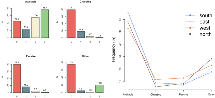
The image contains a composite of five charts. On the left is a 2x2 grid of four bar charts, each showing the percentage distribution of a different state ("Available", "Charging", "Passive", "Other") across four categories (labeled 0, 1, 2, 3). On the right is a single line chart plotting the "Frequency (%)" of these four states for four different regions ("south", "east", "west", "north").
### Components/Axes
**Left Panel (Bar Charts):**
* **Titles:** Four individual charts titled "Available", "Charging", "Passive", "Other".
* **Y-axis:** Labeled "%". Scale runs from 0 to 80 or 90, with major ticks every 10 or 20 units.
* **X-axis:** Categories labeled "0", "1", "2", "3".
* **Data Series:** Each chart contains four bars, one for each category. The bars are colored (from left to right): red, dark teal, light yellow, light green.
**Right Panel (Line Chart):**
* **Title:** None visible.
* **Y-axis:** Labeled "Frequency (%)". Scale runs from 0 to 60, with major ticks every 10 units.
* **X-axis:** Categories labeled "Available", "Charging", "Passive", "Other".
* **Legend:** Located in the top-right corner. Contains four entries:
* `south` - Blue line with circular markers.
* `east` - Light purple/lavender line with circular markers.
* `west` - Orange line with circular markers.
* `north` - Dark gray/charcoal line with circular markers.
### Detailed Analysis
**1. Bar Chart: "Available"**
* **Trend:** The percentage increases steadily from category 0 to 3.
* **Data Points (Approximate):**
* Category 0 (Red bar): 22.5%
* Category 1 (Teal bar): 11.9%
* Category 2 (Yellow bar): 27.6%
* Category 3 (Green bar): 38.1%
**2. Bar Chart: "Charging"**
* **Trend:** The percentage is very high for category 0 and drops sharply for subsequent categories.
* **Data Points (Approximate):**
* Category 0 (Red bar): 78.7%
* Category 1 (Teal bar): 17.3%
* Category 2 (Yellow bar): 3.7%
* Category 3 (Green bar): 0.3%
**3. Bar Chart: "Passive"**
* **Trend:** Similar to "Charging", with a very high value for category 0 and low values for others.
* **Data Points (Approximate):**
* Category 0 (Red bar): 79.2%
* Category 1 (Teal bar): 16.2%
* Category 2 (Yellow bar): 3.7%
* Category 3 (Green bar): 0.9%
**4. Bar Chart: "Other"**
* **Trend:** High value for category 0, very low for 1 and 2, and a moderate value for category 3.
* **Data Points (Approximate):**
* Category 0 (Red bar): 74.0%
* Category 1 (Teal bar): 4.9%
* Category 2 (Yellow bar): 1.3%
* Category 3 (Green bar): 19.8%
**5. Line Chart: Regional Frequency**
* **General Trend:** All four regional lines follow a similar pattern: very high frequency for "Available", a steep drop to a low point at "Charging", a slight rise or plateau at "Passive", and a moderate rise at "Other".
* **Data Series & Points (Approximate, based on visual alignment with grid):**
* **south (Blue):** Available ~65%, Charging ~8%, Passive ~8%, Other ~17%.
* **east (Light Purple):** Available ~58%, Charging ~10%, Passive ~9%, Other ~23%.
* **west (Orange):** Available ~52%, Charging ~12%, Passive ~13%, Other ~23%.
* **north (Dark Gray):** Available ~57%, Charging ~6%, Passive ~7%, Other ~28%.
### Key Observations
1. **Dominant State:** The "Available" state has the highest frequency across all regions and, in its bar chart, shows an increasing trend across categories 0-3.
2. **Concentrated States:** "Charging" and "Passive" states are heavily concentrated in category 0 (≈79% each), with minimal presence in categories 2 and 3.
3. **"Other" State Anomaly:** The "Other" state is unique. While also concentrated in category 0 (74%), it has a significant secondary peak in category 3 (19.8%), unlike "Charging" or "Passive".
4. **Regional Variation:** While the overall trend is consistent, the "south" region shows the highest "Available" frequency and the lowest "Other" frequency. The "north" region shows the highest "Other" frequency. The "west" region has the highest frequencies for "Charging" and "Passive".
### Interpretation
This data likely represents the operational status distribution of a system (e.g., electric vehicle charging stations, server nodes, or industrial equipment) across different modes or tiers (categories 0-3) and geographic regions.
* **System Behavior:** The system spends most of its time "Available", especially in category 0. The "Charging" and "Passive" states are almost exclusively associated with category 0, suggesting this category might represent a primary or default operational mode. The "Other" state's bimodal distribution (peaks at 0 and 3) indicates it may encompass two distinct types of activity or fault conditions.
* **Regional Insights:** The inverse relationship between "Available" and "Other" frequencies across regions (e.g., south has high Available/low Other, north has lower Available/high Other) could point to differences in usage patterns, infrastructure age, or maintenance schedules. The "west" region's higher "Charging" and "Passive" rates might indicate higher utilization or different operational protocols.
* **Data Relationship:** The bar charts provide a detailed breakdown of *how* each state is distributed across internal categories (0-3), while the line chart provides a high-level summary of *how often* each state occurs in different regions. They are complementary views of the same underlying system.