## Chart/Diagram Type: Combined Bar and Line Charts
### Overview
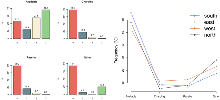
The image presents a combination of bar charts and a line chart, displaying frequency distributions across different categories. The bar charts show the distribution of "Available," "Charging," "Passive," and "Other" states, while the line chart compares these states across four regions: "south," "east," "west," and "north."
### Components/Axes
**Bar Charts (Top-Left and Bottom-Left):**
* **Titles:** "Available," "Charging," "Passive," "Other"
* **X-axis:** Categorical values 0, 1, 2, 3
* **Y-axis:** "%" (Percentage), ranging from 0 to 40 for "Available", and 0 to 80 for "Charging", "Passive", and "Other".
**Line Chart (Right):**
* **X-axis:** Categories "Available," "Charging," "Passive," "Other"
* **Y-axis:** "Frequency (%)", ranging from 0 to 60.
* **Legend (Top-Right):**
* Blue: "south"
* Light Purple: "east"
* Orange: "west"
* Black: "north"
### Detailed Analysis or Content Details
**Bar Charts:**
* **Available:**
* 0: 22.5%
* 1: 11.9%
* 2: 27.6%
* 3: 38.1%
* **Charging:**
* 0: 78.7%
* 1: 17.3%
* 2: 3.7%
* 3: 0.3%
* **Passive:**
* 0: 79.2%
* 1: 16.2%
* 2: 3.7%
* 3: 0.9%
* **Other:**
* 0: 74%
* 1: 4.9%
* 2: 1.3%
* 3: 19.8%
**Line Chart:**
* **Available:**
* South (Blue): ~65%
* East (Light Purple): ~52%
* West (Orange): ~54%
* North (Black): ~59%
* **Charging:**
* South (Blue): ~8%
* East (Light Purple): ~7%
* West (Orange): ~12%
* North (Black): ~2%
* **Passive:**
* South (Blue): ~7%
* East (Light Purple): ~5%
* West (Orange): ~13%
* North (Black): ~2%
* **Other:**
* South (Blue): ~20%
* East (Light Purple): ~20%
* West (Orange): ~25%
* North (Black): ~27%
### Key Observations
* In the bar charts, category '0' has the highest percentage in "Charging", "Passive", and "Other", while category '3' has the highest percentage in "Available".
* In the line chart, all regions show a high frequency for "Available" and a low frequency for "Charging" and "Passive". The frequency for "Other" is higher than "Charging" and "Passive" but lower than "Available".
* The "North" region has the lowest frequency for "Charging" and "Passive" but the highest for "Other".
### Interpretation
The data suggests that the "Available" state is more evenly distributed across categories 0-3, while "Charging," "Passive," and "Other" states are heavily concentrated in category 0. The line chart indicates regional differences in the frequency of these states. All regions have a high frequency of "Available," but the "North" region stands out with the lowest frequency for "Charging" and "Passive" and the highest for "Other," suggesting different operational characteristics or data collection methods in that region. The bar charts provide the distribution of each state, while the line chart compares the frequency of these states across different regions.