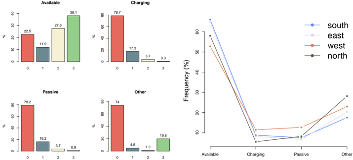
## Bar Charts and Line Graph: Device State Distribution by Region
### Overview
The image contains four grouped bar charts and a line graph. The bar charts represent device state distributions across four categories (0, 1, 2, 3) for four states: Available, Charging, Passive, and Other. The line graph shows frequency trends for four regions (south, east, west, north) across the same categories.
### Components/Axes
- **Bar Charts**:
- **X-axis**: Categories labeled 0, 1, 2, 3 (no explicit title).
- **Y-axis**: Percentage (%) with values ranging from 0% to 80%.
- **Legend**: Colors correspond to device states (red = Available, blue = Charging, green = Passive, yellow = Other).
- **Line Graph**:
- **X-axis**: Categories labeled Available, Charging, Passive, Other.
- **Y-axis**: Frequency (%) with values ranging from 0% to 60%.
- **Legend**: Colors correspond to regions (blue = south, gray = east, orange = west, dark green = north).
### Detailed Analysis
#### Bar Charts
1. **Available**:
- Category 0: 22.5% (red)
- Category 1: 11.9% (blue)
- Category 2: 27.6% (green)
- Category 3: 38.1% (green)
2. **Charging**:
- Category 0: 78.7% (red)
- Category 1: 17.3% (blue)
- Category 2: 3.7% (green)
- Category 3: 0.3% (green)
3. **Passive**:
- Category 0: 79.2% (red)
- Category 1: 16.2% (blue)
- Category 2: 3.7% (green)
- Category 3: 0.9% (green)
4. **Other**:
- Category 0: 74% (red)
- Category 1: 4.9% (blue)
- Category 2: 1.3% (green)
- Category 3: 19.8% (green)
#### Line Graph
- **South** (blue): Peaks at 65% in Available, drops to ~5% in Charging, rises to ~15% in Other.
- **East** (gray): Starts at ~55% in Available, dips to ~5% in Charging, rises to ~20% in Other.
- **West** (orange): Starts at ~50% in Available, dips to ~10% in Charging, rises to ~25% in Other.
- **North** (dark green): Starts at ~55% in Available, dips to ~5% in Charging, rises to ~30% in Other.
### Key Observations
1. **Bar Charts**:
- **Available** and **Other** states show significant increases in category 3 (38.1% and 19.8%, respectively).
- **Charging** and **Passive** states are dominated by category 0 (78.7% and 79.2%, respectively).
- Category 1 consistently has lower values across all states.
2. **Line Graph**:
- **South** has the highest frequency in Available but declines sharply in Charging.
- **North** shows the steepest rise from Passive to Other.
- **East** and **West** exhibit moderate trends, with East peaking in Other.
### Interpretation
The data suggests a hierarchical distribution of device states, with **Available** and **Other** states showing higher variability in category 3. The **Charging** and **Passive** states are predominantly concentrated in category 0, indicating a baseline or default state. Regionally, the **south** dominates in Available, while **north** shows a strong upward trend toward Other. The line graph implies regional disparities in device state transitions, with **south** and **north** exhibiting the most pronounced shifts. The high frequency of category 0 in Charging/Passive may reflect initial or stable states, while category 3 in Available/Other could represent advanced or transitional states. The data might relate to device lifecycle stages, regional adoption rates, or operational statuses.