\n
## Line Chart: Model Performance Reduction
### Overview
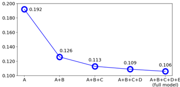
The image presents a line chart illustrating the reduction in a performance metric as additional components (B, C, D, and E) are added to an initial model "A". The y-axis represents the value of this metric, ranging from approximately 0.100 to 0.200. The x-axis represents the model configuration, starting with "A" and incrementally adding components up to the "full model" (A+B+C+D+E). The chart shows a decreasing trend, indicating that adding components reduces the metric's value.
### Components/Axes
* **X-axis:** Model Configuration: A, A+B, A+B+C, A+B+C+D, A+B+C+D+E (full model)
* **Y-axis:** Metric Value: Scale ranges from approximately 0.100 to 0.200.
* **Data Series:** A single blue line representing the metric value for each model configuration.
* **Data Points:** Each data point is marked with a circle and the corresponding metric value.
### Detailed Analysis
The line chart shows a clear downward trend. Let's analyze the data points:
* **A:** The initial model "A" has a metric value of approximately 0.192.
* **A+B:** Adding component "B" reduces the metric value to approximately 0.126.
* **A+B+C:** Adding component "C" further reduces the metric value to approximately 0.113.
* **A+B+C+D:** Adding component "D" reduces the metric value to approximately 0.109.
* **A+B+C+D+E (full model):** Adding component "E" reduces the metric value to approximately 0.106.
The slope of the line is steepest between "A" and "A+B", indicating the largest reduction in the metric value occurs with the addition of component "B". The slope gradually decreases as more components are added, suggesting diminishing returns in terms of metric value reduction.
### Key Observations
* The metric value consistently decreases as components are added to the model.
* The largest reduction in the metric value occurs when component "B" is added.
* The rate of reduction slows down as more components are added, approaching a plateau.
* The final metric value for the "full model" is approximately 0.106, significantly lower than the initial value of 0.192 for model "A".
### Interpretation
The data suggests that while adding components to the model reduces the metric value, there's a diminishing return with each additional component. This could indicate that the added components are contributing less and less to improving the model's performance according to this metric, or that they may even be introducing some form of negative impact. The initial drop from "A" to "A+B" is substantial, suggesting that component "B" has a significant impact on the metric. The plateauing trend towards the end suggests that adding further components may not be worthwhile, or that a different approach to model improvement is needed. The specific meaning of the metric value is unknown without further context, but the chart clearly demonstrates a trade-off between model complexity (number of components) and the measured metric. It is possible that the metric is an error rate, in which case lower values are better.