## Dashboard: RAG vs. Non-RAG Performance Metrics
### Overview
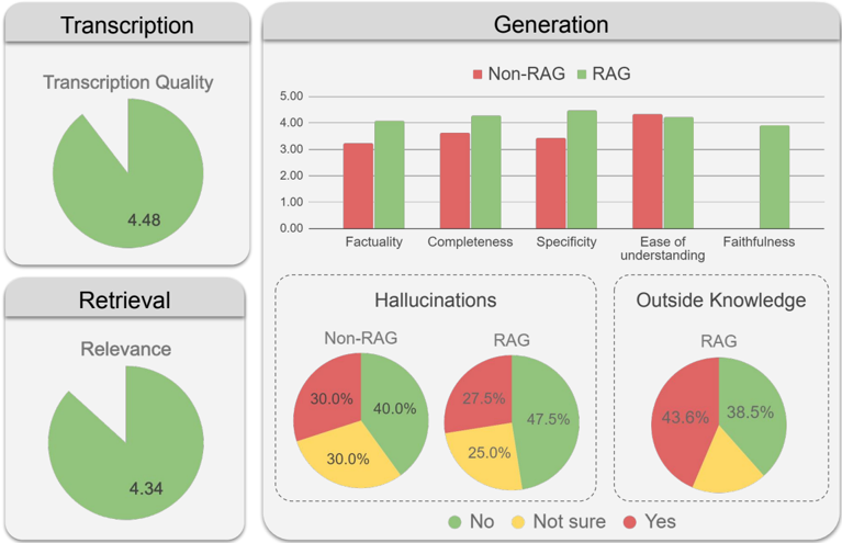
The image is a composite dashboard displaying performance metrics for two systems: "Non-RAG" and "RAG" (Retrieval-Augmented Generation). It is divided into five distinct panels, each containing a chart or diagram. The overall layout is a 2x2 grid with an additional panel spanning the top-right. The color scheme uses red for "Non-RAG," green for "RAG," and yellow for "Not sure" in specific contexts.
### Components/Axes
The dashboard is segmented into the following labeled panels:
1. **Top-Left Panel: "Transcription"**
* Contains a single pie chart titled "Transcription Quality."
* The chart is almost entirely green, with a small red slice.
* A numerical value "4.48" is overlaid on the green section.
2. **Top-Right Panel: "Generation"**
* Contains a grouped bar chart.
* **Y-Axis:** Numerical scale from 0.00 to 5.00, with increments of 1.00.
* **X-Axis:** Five categorical metrics: "Factuality," "Completeness," "Specificity," "Ease of understanding," and "Faithfulness."
* **Legend:** Located at the top of the panel. Red square = "Non-RAG", Green square = "RAG".
3. **Bottom-Left Panel: "Retrieval"**
* Contains a single pie chart titled "Relevance."
* The chart is almost entirely green, with a small red slice.
* A numerical value "4.34" is overlaid on the green section.
4. **Bottom-Center Panel: "Hallucinations"**
* Contains two side-by-side pie charts, labeled "Non-RAG" and "RAG."
* **Legend:** Located at the bottom of the entire dashboard. Green circle = "No", Yellow circle = "Not sure", Red circle = "Yes".
5. **Bottom-Right Panel: "Outside Knowledge"**
* Contains a single pie chart labeled "RAG."
* Uses the same "Hallucinations" legend (Green=No, Yellow=Not sure, Red=Yes).
### Detailed Analysis
**1. Transcription Quality (Pie Chart)**
* **Visual Trend:** The chart is dominated by a large green segment, indicating a high score or positive outcome.
* **Data Points:** The overlaid value is **4.48**. The red slice is very small, representing a minor negative or alternative category (likely "No" or "Poor Quality" based on the dashboard's color logic).
**2. Generation Metrics (Grouped Bar Chart)**
* **Visual Trend:** For each of the five metrics, the green bar (RAG) is taller than or equal to the red bar (Non-RAG), except for "Ease of understanding" where they are nearly equal.
* **Approximate Data Points (Y-axis values):**
* **Factuality:** Non-RAG ≈ 3.2, RAG ≈ 4.0
* **Completeness:** Non-RAG ≈ 3.6, RAG ≈ 4.2
* **Specificity:** Non-RAG ≈ 3.4, RAG ≈ 4.5
* **Ease of understanding:** Non-RAG ≈ 4.3, RAG ≈ 4.2 (very close, Non-RAG slightly higher)
* **Faithfulness:** Non-RAG ≈ 0.0 (no visible bar), RAG ≈ 3.9
**3. Retrieval Relevance (Pie Chart)**
* **Visual Trend:** Identical in structure to the Transcription Quality chart. Dominated by green.
* **Data Points:** The overlaid value is **4.34**. The red slice is very small.
**4. Hallucinations (Two Pie Charts)**
* **Non-RAG Chart:**
* Green ("No"): 40.0%
* Yellow ("Not sure"): 30.0%
* Red ("Yes"): 30.0%
* **RAG Chart:**
* Green ("No"): 47.5%
* Yellow ("Not sure"): 25.0%
* Red ("Yes"): 27.5%
* **Comparison:** The RAG system shows a higher percentage of "No" hallucinations and a lower percentage of "Yes" and "Not sure" compared to Non-RAG.
**5. Outside Knowledge (Pie Chart for RAG)**
* **Data Points:**
* Green ("No"): 38.5%
* Yellow ("Not sure"): 17.9% (calculated as 100% - 43.6% - 38.5%)
* Red ("Yes"): 43.6%
* **Note:** This chart only presents data for the RAG system.
### Key Observations
1. **RAG Superiority in Core Generation:** RAG outperforms Non-RAG significantly in Factuality, Completeness, and Specificity. The difference is most pronounced in Specificity.
2. **Faithfulness Gap:** The "Faithfulness" metric shows a stark contrast, with Non-RAG having a near-zero score while RAG scores highly (~3.9).
3. **Similar User Experience:** The "Ease of understanding" metric is the only one where the two systems are comparable, with Non-RAG having a negligible lead.
4. **Hallucination Reduction:** The RAG system demonstrates a measurable reduction in hallucinations ("Yes" decreases from 30.0% to 27.5%) and an increase in confirmed non-hallucinations ("No" increases from 40.0% to 47.5%).
5. **High Transcription & Retrieval Scores:** Both the "Transcription Quality" (4.48) and "Retrieval Relevance" (4.34) metrics are very high on a 5-point scale, suggesting strong performance in the foundational components of the RAG pipeline.
6. **Outside Knowledge Usage:** A significant portion (43.6%) of the RAG system's outputs are flagged as using "Outside Knowledge" (Red), which is a notable characteristic of its behavior.
### Interpretation
This dashboard presents a compelling case for the effectiveness of a Retrieval-Augmented Generation (RAG) system compared to a standard Non-RAG generative model. The data suggests that integrating a retrieval mechanism (evidenced by high "Relevance" scores) directly improves the core quality of generated text, making it more factual, complete, and specific. The most critical improvement is in "Faithfulness," implying RAG is far better at adhering to provided source material.
The reduction in hallucinations, while present, is modest (a 2.5 percentage point decrease in "Yes"). This indicates that while RAG mitigates the problem, it does not eliminate it. The high rate of "Outside Knowledge" usage (43.6%) for RAG is a double-edged sword: it shows the system is leveraging its training data, but also highlights a potential source of unverified information that could contribute to the remaining hallucinations.
The near-parity in "Ease of understanding" suggests that the technical improvements in accuracy and faithfulness do not come at the cost of readability. Overall, the dashboard illustrates that RAG provides a more reliable and grounded generation system, with its primary benefits being enhanced accuracy and source adherence, though vigilance regarding hallucinations and external knowledge integration remains necessary.