# Technical Document Extraction: Scatter Plot Analysis
## Overview
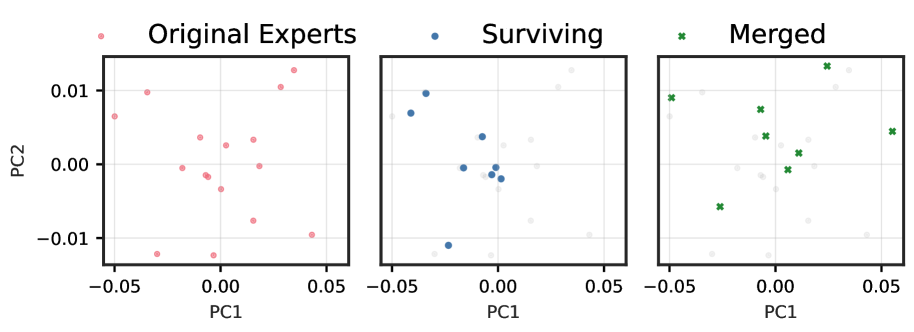
The image contains three scatter plots comparing three categories: **Original Experts**, **Surviving**, and **Merged**. Each plot uses Principal Component 1 (PC1) and Principal Component 2 (PC2) as axes, with values ranging from **-0.05 to 0.05** for both axes. Points are color-coded and symbol-coded to distinguish categories.
---
## Plot 1: Original Experts
- **Title**: Original Experts
- **Axes**:
- X-axis: PC1 (range: -0.05 to 0.05)
- Y-axis: PC2 (range: -0.01 to 0.01)
- **Data Points**:
- **Color**: Pink (`#FF69B4`)
- **Symbol**: Circular markers (`●`)
- **Distribution**:
- Points are scattered across the plot, with a slight concentration near the center (PC1 ≈ 0, PC2 ≈ 0).
- No clear clustering or linear trends observed.
---
## Plot 2: Surviving
- **Title**: Surviving
- **Axes**:
- X-axis: PC1 (range: -0.05 to 0.05)
- Y-axis: PC2 (range: -0.01 to 0.01)
- **Data Points**:
- **Color**: Blue (`#1E90FF`)
- **Symbol**: Circular markers (`●`)
- **Distribution**:
- Points are tightly clustered near the center (PC1 ≈ 0, PC2 ≈ 0).
- Reduced spread compared to "Original Experts," suggesting lower variability.
---
## Plot 3: Merged
- **Title**: Merged
- **Axes**:
- X-axis: PC1 (range: -0.05 to 0.05)
- Y-axis: PC2 (range: -0.01 to 0.01)
- **Data Points**:
- **Color**: Green (`#32CD32`)
- **Symbol**: Cross markers (`✖️`)
- **Distribution**:
- Points are spread across the plot, with some extending toward the upper-right quadrant (positive PC1 and PC2).
- Greater dispersion than "Surviving" but less than "Original Experts."
---
## Legend and Cross-Reference
- **Legend Colors**:
- Pink (`#FF69B4`): Original Experts
- Blue (`#1E90FF`): Surviving
- Green (`#32CD32`): Merged
- **Symbol Consistency**:
- Circular markers (`●`) used for "Original Experts" and "Surviving."
- Cross markers (`✖️`) used exclusively for "Merged."
---
## Key Observations
1. **Original Experts** exhibit the widest spread in both PC1 and PC2, indicating higher variability in their principal component values.
2. **Surviving** shows the most concentrated distribution, suggesting reduced dimensionality or filtering of data points.
3. **Merged** retains moderate spread, with a noticeable bias toward positive PC1 and PC2 values.
---
## Notes
- No explicit numerical data table is present; all information is derived from scatter plot distributions.
- Axis ranges and color/symbol coding are consistent across all plots.
- No textual annotations or additional legends are visible in the image.