## Heatmap: Layer Correlation Matrix
### Overview
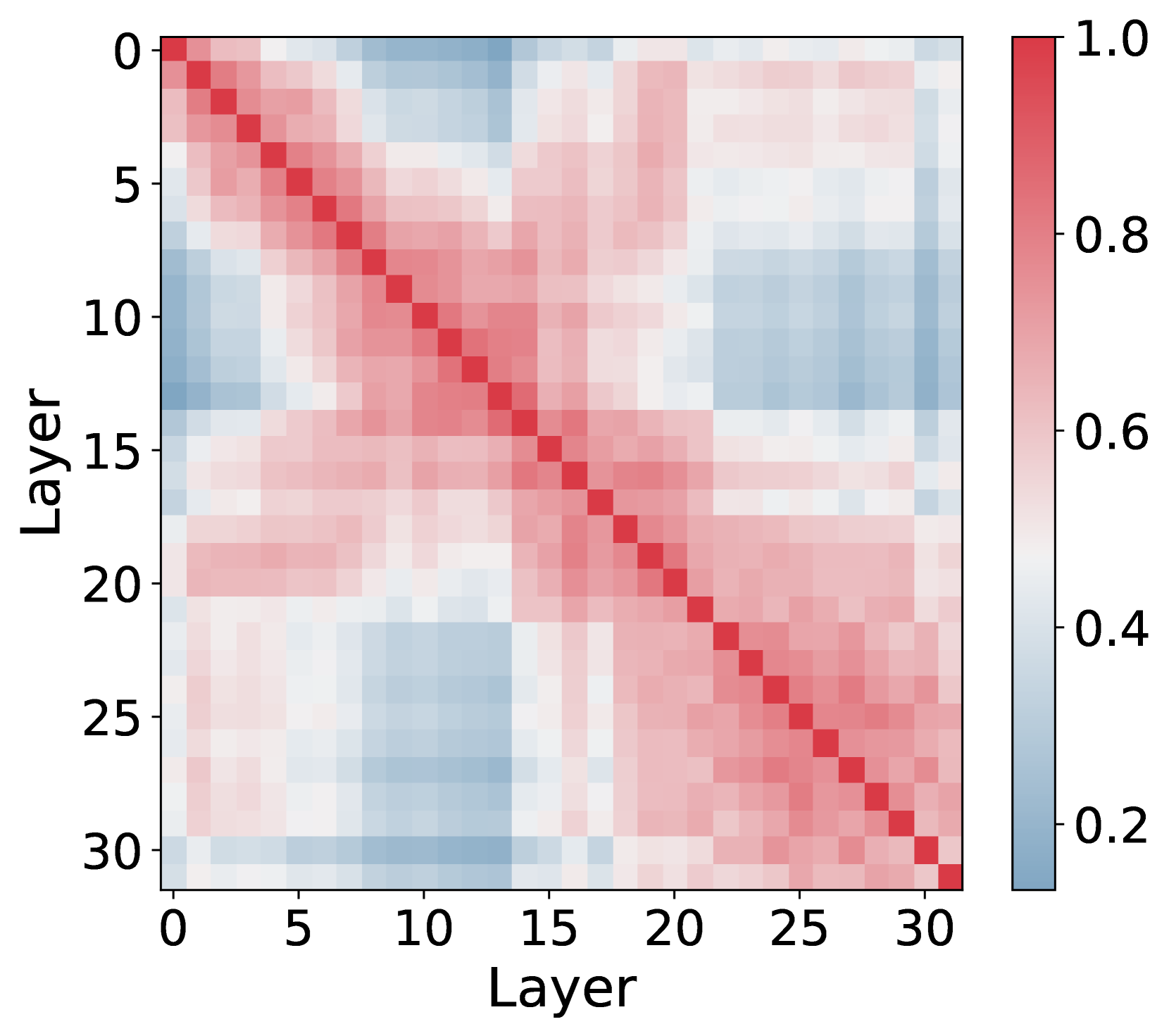
A square heatmap visualizing relationships between layers, with a diagonal red line dominating the center. The color gradient transitions from blue (low values) to red (high values), with white intermediate regions. The axes are labeled "Layer" with values 0–30, and a color bar indicates values from 0.2 to 1.0.
### Components/Axes
- **X-axis**: "Layer" (0–30, increments of 5)
- **Y-axis**: "Layer" (0–30, increments of 5)
- **Color Bar**: Vertical gradient from blue (0.2) to red (1.0), positioned on the right
- **Diagonal Line**: Solid red line from top-left (0,0) to bottom-right (30,30), matching the highest color bar value (1.0)
### Detailed Analysis
- **Color Distribution**:
- **Red Dominance**: Upper-right quadrant (layers 15–30 on both axes) shows concentrated red, indicating high values (0.8–1.0).
- **Blue Regions**: Lower-left quadrant (layers 0–15 on both axes) contains blue squares (0.2–0.4), suggesting low values.
- **White Transitions**: Diagonal bands around the red line (e.g., layers 10–20) show white/gray squares (0.4–0.6), representing intermediate values.
- **Diagonal Line**: Matches the color bar’s maximum value (1.0) and aligns with the brightest red squares along the 0–30 diagonal.
- **Edge Patterns**:
- Top-left corner (0,0) is blue (0.2), while the bottom-right corner (30,30) is red (1.0).
- Off-diagonal regions (e.g., layer 0 vs. 30) show mixed red/blue, with no clear pattern.
### Key Observations
1. **Perfect Correlation Diagonal**: The red line confirms a perfect correlation (value = 1.0) along the diagonal, typical of self-referential data.
2. **Quadrant Symmetry**: Red regions dominate the upper-right, while blue regions dominate the lower-left, suggesting inverse relationships between distant layers.
3. **Intermediate Zones**: White/gray squares form a "buffer" zone around the diagonal, indicating moderate correlations (0.4–0.6) for nearby layers.
### Interpretation
This heatmap likely represents a **correlation matrix** where:
- The diagonal (1.0) reflects identical layer comparisons (e.g., layer 5 vs. layer 5).
- Red areas (upper-right) suggest strong positive correlations between higher-numbered layers (e.g., layers 20–30).
- Blue areas (lower-left) indicate weak or negative correlations between lower-numbered layers (e.g., layers 0–10).
- The white/gray buffer zone implies diminishing correlation strength as layers diverge from the diagonal.
The pattern may reflect a hierarchical or sequential relationship between layers, where proximity in numbering correlates with similarity. The absence of a clear off-diagonal pattern suggests no dominant secondary relationships.