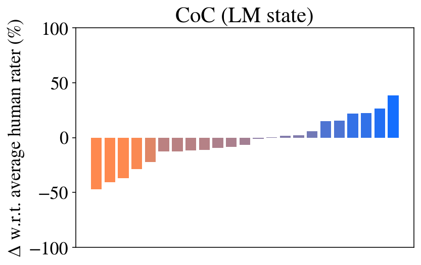
## Bar Chart: CoC (LM state) - Deviation from Average Human Rater
### Overview
The image is a bar chart titled "CoC (LM state)". It displays the percentage deviation (Δ) of various items or conditions relative to an average human rater's score. The chart shows a clear progression from negative deviations on the left to positive deviations on the right, visualized with a color gradient from orange to blue.
### Components/Axes
* **Title:** "CoC (LM state)" - Located at the top center of the chart.
* **Y-Axis:**
* **Label:** "Δ w.r.t. average human rater (%)" - This is a vertical label on the left side. "Δ" (Delta) signifies change or difference, and "w.r.t." means "with respect to".
* **Scale:** The axis ranges from -100 to 100, with major tick marks and numerical labels at -100, -50, 0, 50, and 100.
* **X-Axis:** There are no visible labels, titles, or tick marks on the horizontal axis. Each bar represents a distinct, unlabeled data point or category.
* **Data Series:** A single series of 17 vertical bars. The bars are colored with a gradient:
* The leftmost bars are a solid **orange**.
* The color transitions through muted brownish-purple tones in the middle.
* The rightmost bars are a solid **blue**.
* **Legend:** There is no explicit legend present in the image. The color gradient itself is the primary visual cue for the data's progression.
### Detailed Analysis
The chart contains 17 bars. Their approximate values, reading from left to right, are as follows. (Note: Values are visual estimates with inherent uncertainty).
1. **Bar 1 (Orange):** ~ -48%
2. **Bar 2 (Orange):** ~ -42%
3. **Bar 3 (Orange):** ~ -38%
4. **Bar 4 (Orange):** ~ -28%
5. **Bar 5 (Orange-Brown):** ~ -22%
6. **Bar 6 (Brown):** ~ -12%
7. **Bar 7 (Brown):** ~ -10%
8. **Bar 8 (Brown):** ~ -8%
9. **Bar 9 (Brown):** ~ -6%
10. **Bar 10 (Brown-Purple):** ~ -4%
11. **Bar 11 (Purple):** ~ -1% (Very close to zero, slightly negative)
12. **Bar 12 (Purple):** ~ 0% (Appears to be exactly on the zero line)
13. **Bar 13 (Purple-Blue):** ~ +5%
14. **Bar 14 (Blue):** ~ +15%
15. **Bar 15 (Blue):** ~ +22%
16. **Bar 16 (Blue):** ~ +28%
17. **Bar 17 (Blue):** ~ +40% (The rightmost and tallest positive bar)
**Trend Verification:** The data series exhibits a strong, consistent upward trend. The visual slope of the bar tops moves steadily from the bottom-left quadrant (negative values) to the top-right quadrant (positive values). The color gradient from orange to blue reinforces this directional progression.
### Key Observations
1. **Clear Progression:** The most notable pattern is the monotonic increase in value from the first to the last bar.
2. **Symmetry Around Zero:** The data spans both sides of the zero line, with roughly equal visual weight given to negative and positive deviations. The transition point (zero) occurs near the center of the chart (between bars 11 and 12).
3. **Magnitude of Deviation:** The largest negative deviation is approximately -48%, and the largest positive deviation is approximately +40%. The spread is substantial, indicating significant variance from the human rater baseline.
4. **Missing Context:** The lack of x-axis labels is a critical omission. It is impossible to determine what each bar represents (e.g., different model versions, prompts, tasks, or evaluation criteria).
### Interpretation
This chart likely visualizes the performance of a system or multiple system variants (denoted by "CoC" in an "LM state" – possibly "Chain of Code" for a Language Model) compared to a human benchmark.
* **What the data suggests:** The system's performance is highly variable. Some configurations (left, orange bars) perform significantly worse than the average human rater, while others (right, blue bars) perform significantly better. The smooth gradient suggests an ordered relationship between the items on the x-axis—perhaps a parameter was tuned progressively, or the items are sorted by performance.
* **How elements relate:** The color is directly tied to the value, serving as a redundant but effective visual encoding of the performance spectrum from poor (orange) to good (blue). The title "CoC (LM state)" implies this is a specific snapshot or condition of a broader evaluation.
* **Notable anomalies:** The bar at position 12 sits exactly at 0%, indicating a configuration that matches the average human rater's performance precisely. This could be a key reference point.
* **Underlying meaning:** The chart demonstrates that the "CoC" approach, under the tested "LM state," does not have a uniform effect. Its impact is context-dependent, leading to both substantial regressions and improvements relative to human judgment. The goal of the associated technical work would likely be to understand the factors causing this variance and to consistently achieve the performance seen on the right side of the chart.