# Technical Document: Human Coherency Comparison Chart Analysis
## Chart Overview
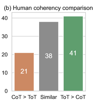
The image depicts a **bar chart** titled **"(b) Human coherency comparison"**. The chart compares three categories of human coherency metrics across a numerical scale.
---
## Axis Labels and Markers
- **X-Axis (Categories)**:
- `CoT > ToT` (orange bar)
- `Similar` (gray bar)
- `ToT > CoT` (green bar)
- **Y-Axis (Values)**:
- Title: `Human coherency comparison`
- Scale: 0 to 40 (increments of 10)
- Values:
- `CoT > ToT`: 21
- `Similar`: 38
- `ToT > CoT`: 41
---
## Data Points
| Category | Value | Color |
|----------------|-------|--------|
| CoT > ToT | 21 | Orange |
| Similar | 38 | Gray |
| ToT > CoT | 41 | Green |
---
## Observations
1. The chart uses **three distinct colors** (orange, gray, green) to differentiate categories, though no explicit legend is provided.
2. The highest coherency value (`41`) is observed in the `ToT > CoT` category, while the lowest (`21`) is in `CoT > ToT`.
3. The `Similar` category shows intermediate coherency (`38`).
---
## Structural Notes
- The chart is a **vertical bar chart** with no gridlines or error bars.
- No additional annotations or contextual text are present beyond axis labels and bar values.
---
## Conclusion
This chart quantitatively compares human coherency across three scenarios (`CoT > ToT`, `Similar`, `ToT > CoT`), with `ToT > CoT` demonstrating the highest measured coherency. The absence of a legend necessitates direct reference to bar colors for category identification.