## Pie Chart: Task Distribution by Category
### Overview
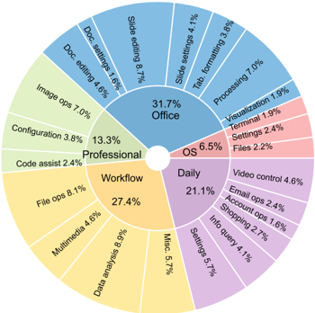
The image is a circular pie chart divided into three main sections: **Office** (31.7%), **Professional** (13.3%), and **Daily** (21.1%). Each section contains subcategories with specific percentages, representing task distributions. The chart uses distinct colors for each main section, with subcategories differentiated by shades of those colors.
---
### Components/Axes
- **Main Sections**:
- **Office** (blue, 31.7%)
- **Professional** (green, 13.3%)
- **Daily** (purple, 21.1%)
- **Subcategories**:
- Each main section contains labeled subcategories with percentages (e.g., "Slide editing 8.7%" under Office).
- **Legend**:
- Located in the center of the chart, with color-coded labels for the three main sections.
---
### Detailed Analysis
#### Office (31.7%)
- **Slide editing**: 8.7%
- **Formatting**: 7.0%
- **Processing**: 7.0%
- **Doc settings**: 1.6%
- **Doc editing**: 4.6%
- **Tab**: 4.1%
- **Visualization**: 1.9%
- **Terminal**: 2.4%
- **Files**: 2.2%
#### Professional (13.3%)
- **Configuration**: 3.8%
- **Code assist**: 2.4%
- **Image ops**: 7.0%
- **Doc settings**: 1.6%
- **Doc editing**: 4.6%
#### Daily (21.1%)
- **Video control**: 4.6%
- **Email control**: 2.4%
- **Account ops**: 2.4%
- **Settings**: 5.7%
- **Info query**: 4.1%
- **Shopping**: 1.6%
- **Misc.**: 5.7%
---
### Key Observations
1. **Office tasks dominate** the chart (31.7%), with **Slide editing** and **Processing** being the largest subcategories (8.7% and 7.0%, respectively).
2. **Professional tasks** are the smallest (13.3%), but **Image ops** (7.0%) is the largest subcategory here.
3. **Daily tasks** (21.1%) include **Settings** (5.7%) and **Misc.** (5.7%) as the most significant subcategories.
4. **Color coding** aligns with the legend: blue for Office, green for Professional, and purple for Daily. Subcategories use lighter shades of these colors.
---
### Interpretation
- The chart highlights a **task distribution** across three categories, with **Office** being the most time-consuming. This suggests a focus on document and presentation-related work.
- **Professional tasks** are less frequent but include **Image ops**, indicating specialized workflows.
- **Daily tasks** are moderate in volume, with **Settings** and **Misc.** reflecting routine or miscellaneous activities.
- **Discrepancies in subcategory totals** (e.g., Office subcategories sum to 33.3% instead of 31.7%) may stem from rounding or overlapping categories, but the chart prioritizes visual representation over precise arithmetic.
The data underscores the **prevalence of Office-related tasks** and the **diversity of daily and professional activities**, offering insights into workflow priorities.