# Technical Data Extraction: Sunburst Chart Analysis
## 1. Image Overview
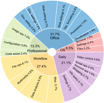
This image is a **Sunburst Chart** (a multi-level pie chart) representing a hierarchical distribution of tasks or software usage categories. The chart is divided into two concentric rings:
- **Inner Ring (Primary Categories):** Defines five major domains.
- **Outer Ring (Sub-categories):** Breaks down each primary category into specific tasks with associated percentage values.
The data is color-coded by primary category, and the percentages in the outer ring sum to the percentage shown in the corresponding inner ring segment.
---
## 2. Data Hierarchy and Values
The following table reconstructs the hierarchical data presented in the chart.
| Primary Category (Inner) | Primary % | Sub-category (Outer) | Sub-category % |
| :--- | :--- | :--- | :--- |
| **Office** (Blue) | **31.7%** | Slide editing | 8.7% |
| | | Processing | 7.0% |
| | | Doc. editing | 4.6% |
| | | Slide settings | 4.1% |
| | | Tab. formatting | 3.8% |
| | | Visualization | 1.9% |
| | | Doc. settings | 1.6% |
| **Workflow** (Yellow) | **27.4%** | Data analysis | 8.9% |
| | | File ops | 8.1% |
| | | Misc. | 5.7% |
| | | Multimedia | 4.6% |
| **Daily** (Purple) | **21.1%** | Settings | 5.7% |
| | | Video control | 4.6% |
| | | Info query | 4.1% |
| | | Shopping | 2.7% |
| | | Email ops | 2.4% |
| | | Account ops | 1.6% |
| **Professional** (Green) | **13.3%** | Image ops | 7.0% |
| | | Configuration | 3.8% |
| | | Code assist | 2.4% |
| **OS** (Red/Pink) | **6.5%** | Settings | 2.4% |
| | | Files | 2.2% |
| | | Terminal | 1.9% |
---
## 3. Component Analysis & Spatial Grounding
### Header/Title
There is no explicit text header or title embedded in the image.
### Main Chart Body
* **Center Hole:** The chart features a white circular void at the center.
* **Inner Ring (Categories):**
* **Office [Top/Right]:** The largest segment (31.7%), colored blue.
* **Workflow [Bottom/Left]:** The second largest (27.4%), colored yellow.
* **Daily [Bottom/Right]:** The third largest (21.1%), colored purple.
* **Professional [Middle/Left]:** Colored green (13.3%).
* **OS [Middle/Right]:** The smallest segment (6.5%), colored red/pink.
* **Outer Ring (Sub-categories):**
* Labels are oriented radially.
* Each sub-category segment's width is proportional to its percentage of the total 100%.
---
## 4. Key Trends and Observations
1. **Dominance of Productivity:** The "Office" category is the single largest domain at 31.7%. Within it, "Slide editing" (8.7%) and "Processing" (7.0%) are the most frequent activities.
2. **Workflow Complexity:** While "Workflow" is the second largest category (27.4%), its sub-categories "Data analysis" (8.9%) and "File ops" (8.1%) are individually among the highest-rated tasks in the entire dataset.
3. **Daily Utility:** "Daily" tasks (21.1%) are highly fragmented into six sub-categories, indicating a wide variety of routine activities like "Video control" and "Info query."
4. **Specialized Tasks:** "Professional" tasks (13.3%) are dominated by "Image ops" (7.0%), which accounts for more than half of that category's total weight.
5. **Minimal OS Interaction:** Direct "OS" (Operating System) tasks represent the smallest portion of the chart at 6.5%, suggesting the data tracks application-level usage rather than system maintenance.
## 5. Language Declaration
The text in this image is entirely in **English**. No other languages are present.