## Line Chart: Fitness Value vs. Generation for Different Initial Population Sizes
### Overview
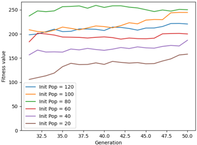
The image displays a line chart plotting "Fitness value" on the vertical y-axis against "Generation" on the horizontal x-axis. The chart compares the performance of six different experimental runs, each distinguished by a different initial population size ("Init Pop"). The data spans from generation 30 to generation 50.
### Components/Axes
* **Chart Type:** Multi-line chart.
* **X-Axis:**
* **Label:** "Generation"
* **Scale:** Linear, ranging from 30 to 50.
* **Major Tick Marks:** At 30, 32.5, 35, 37.5, 40, 42.5, 45, 47.5, 50.
* **Y-Axis:**
* **Label:** "Fitness value"
* **Scale:** Linear, ranging from 0 to 250.
* **Major Tick Marks:** At 0, 50, 100, 150, 200, 250.
* **Legend:**
* **Position:** Bottom-left corner of the plot area.
* **Content:** A list of six series, each with a colored line sample and a label.
* **Series (from top to bottom in legend):**
1. Blue line: `Init Pop = 120`
2. Orange line: `Init Pop = 100`
3. Green line: `Init Pop = 80`
4. Red line: `Init Pop = 60`
5. Purple line: `Init Pop = 40`
6. Brown line: `Init Pop = 20`
### Detailed Analysis
The chart shows the evolution of fitness values over 20 generations (30-50) for six different initial population sizes. Below is a breakdown of each data series, including its visual trend and approximate data points.
**1. Green Line (`Init Pop = 80`)**
* **Trend:** Consistently the highest-performing series. It shows a slight, steady upward trend across the entire generation range.
* **Data Points (Approximate):**
* Gen 30: ~240
* Gen 35: ~255
* Gen 40: ~260
* Gen 45: ~255
* Gen 50: ~260
**2. Orange Line (`Init Pop = 100`)**
* **Trend:** Starts as the second-highest, experiences a slight dip around generation 35, then recovers and trends upward, nearly converging with the green line by generation 50.
* **Data Points (Approximate):**
* Gen 30: ~205
* Gen 35: ~200
* Gen 40: ~220
* Gen 45: ~240
* Gen 50: ~250
**3. Blue Line (`Init Pop = 120`)**
* **Trend:** Begins lower than the orange line but shows a consistent, moderate upward slope throughout, ending as the third-highest.
* **Data Points (Approximate):**
* Gen 30: ~180
* Gen 35: ~200
* Gen 40: ~210
* Gen 45: ~215
* Gen 50: ~220
**4. Red Line (`Init Pop = 60`)**
* **Trend:** Remarkably stable and flat. It shows very little variation, maintaining a fitness value near 200 across all generations.
* **Data Points (Approximate):**
* Gen 30: ~200
* Gen 35: ~195
* Gen 40: ~195
* Gen 45: ~195
* Gen 50: ~200
**5. Purple Line (`Init Pop = 40`)**
* **Trend:** Fluctuates in a narrow band between 160 and 180, with no strong upward or downward trend. It is consistently below the red line.
* **Data Points (Approximate):**
* Gen 30: ~160
* Gen 35: ~165
* Gen 40: ~170
* Gen 45: ~170
* Gen 50: ~180
**6. Brown Line (`Init Pop = 20`)**
* **Trend:** Starts as the lowest-performing series but exhibits the most pronounced and consistent upward trend, showing significant improvement over the generations.
* **Data Points (Approximate):**
* Gen 30: ~105
* Gen 35: ~130
* Gen 40: ~140
* Gen 45: ~145
* Gen 50: ~160
### Key Observations
1. **Performance Hierarchy:** There is a clear, though not perfectly linear, relationship between initial population size and fitness value. In general, larger initial populations (80, 100, 120) achieve higher fitness values than smaller ones (60, 40, 20).
2. **Optimal Initial Population:** The `Init Pop = 80` (green line) consistently yields the highest fitness, suggesting it may be the most effective initial population size within this experimental setup.
3. **Diminishing Returns:** Increasing the initial population beyond 80 (to 100 and 120) does not result in better performance. In fact, `Init Pop = 120` (blue) underperforms both `Init Pop = 80` (green) and `Init Pop = 100` (orange).
4. **Stability vs. Growth:** The `Init Pop = 60` (red) series is uniquely stable, showing almost no improvement or degradation. In contrast, the smallest population (`Init Pop = 20`, brown) shows the greatest rate of improvement, though it starts from a much lower baseline.
5. **Convergence:** By generation 50, the top three lines (green, orange, blue) are converging toward a fitness value range of 220-260, while the bottom three (red, purple, brown) are in a lower range of 160-200.
### Interpretation
This chart likely visualizes the results of an evolutionary or genetic algorithm simulation. The "Fitness value" is a measure of solution quality, and "Generation" represents iterative improvement cycles.
The data suggests that **initial population size is a critical hyperparameter** that significantly influences both the final solution quality and the learning trajectory. A moderately large initial population (80) provides the best balance, likely offering sufficient genetic diversity to explore the solution space effectively without being so large as to hinder convergence or waste computational resources.
The poor performance of the largest population (120) could indicate **premature convergence** or inefficient search dynamics. The stability of the `Init Pop = 60` line is anomalous; it may represent a local optimum from which the algorithm cannot escape, or a parameter setting that stifles exploration. The strong upward trend of the smallest population (`Init Pop = 20`) demonstrates that even with limited initial diversity, the algorithm can improve significantly over time, but it may require more generations to reach the performance level of better-initialized runs.
In summary, the chart provides empirical evidence for tuning initial population size, highlighting that "more" is not always "better" and that an optimal middle ground exists for maximizing fitness in this specific problem domain.