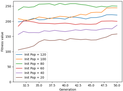
## Line Chart: Fitness Value vs. Generation for Different Initial Population Sizes
### Overview
This line chart depicts the relationship between generation number and fitness value for six different initial population sizes in an evolutionary algorithm or similar optimization process. The x-axis represents the generation number, and the y-axis represents the fitness value. Each line represents a different initial population size.
### Components/Axes
* **X-axis:** Generation (ranging from approximately 32.5 to 50.0, with increments of 2.5)
* **Y-axis:** Fitness Value (ranging from 0 to 250, with increments of 50)
* **Legend:** Located in the bottom-left corner, listing the following initial population sizes and their corresponding line colors:
* Init Pop = 120 (Blue)
* Init Pop = 100 (Orange)
* Init Pop = 80 (Green)
* Init Pop = 60 (Purple)
* Init Pop = 40 (Medium Violet)
* Init Pop = 20 (Brown)
### Detailed Analysis
Here's a breakdown of each line's trend and approximate data points:
* **Init Pop = 120 (Blue):** The line starts at approximately 200, fluctuates slightly, and generally remains between 200 and 230. It shows a slight upward trend towards the end of the chart, reaching approximately 230 at generation 50.
* **Init Pop = 100 (Orange):** This line begins at approximately 190, increases to a peak of around 250 at generation 45, and then decreases slightly to approximately 240 at generation 50.
* **Init Pop = 80 (Green):** This line exhibits the highest fitness values throughout the chart. It starts at approximately 240, increases to a peak of around 270 at generation 37.5, and then fluctuates between 250 and 270, ending at approximately 260 at generation 50.
* **Init Pop = 60 (Purple):** The line starts at approximately 170, increases to around 190 at generation 40, and then plateaus, ending at approximately 185 at generation 50.
* **Init Pop = 40 (Medium Violet):** This line starts at approximately 160, increases steadily to around 200 at generation 45, and then plateaus, ending at approximately 200 at generation 50.
* **Init Pop = 20 (Brown):** This line shows the lowest fitness values. It starts at approximately 100, increases steadily to around 150 at generation 50.
### Key Observations
* Larger initial population sizes (80 and 100) generally lead to higher fitness values.
* The line for Init Pop = 80 consistently demonstrates the highest fitness values.
* The lines for Init Pop = 120, 60, and 40 show relatively stable fitness values after an initial period of fluctuation.
* The line for Init Pop = 20 exhibits the slowest rate of fitness improvement.
* The lines for Init Pop = 100 and 80 show a peak in fitness around generation 45 and 37.5 respectively, followed by a slight decline.
### Interpretation
The data suggests that the initial population size significantly impacts the performance of the optimization process. A larger initial population size appears to provide a more diverse starting point, leading to higher fitness values and faster convergence. However, there's a diminishing return; increasing the initial population from 80 to 100 doesn't yield a substantial improvement. The initial population of 20 consistently performs the worst, indicating that a small population size may limit the exploration of the search space. The peaks observed in the lines for Init Pop = 100 and 80 could indicate a point of local optima, where the algorithm gets stuck before potentially finding a better solution. The overall trend suggests that there is a sweet spot for the initial population size, where the benefits of diversity are maximized without excessive computational cost. The chart demonstrates the importance of parameter tuning in evolutionary algorithms and optimization processes.