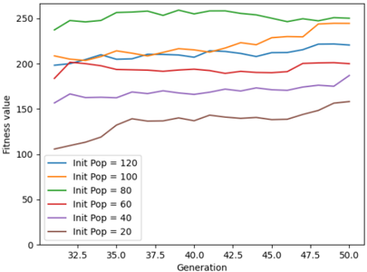
## Line Chart: Fitness Value Across Generations for Different Initial Populations
### Overview
The image is a line chart displaying the evolution of fitness values across generations for six distinct initial population sizes (20, 40, 60, 80, 100, 120). Each line represents a unique initial population, with fitness values plotted against generations (x-axis) and numerical fitness scores (y-axis). The chart spans 18 generations (32.5 to 50.0) and fitness values from 0 to 250.
### Components/Axes
- **X-axis (Horizontal)**: Labeled "Generation," with markers at 32.5, 35.0, 37.5, 40.0, 42.5, 45.0, 47.5, and 50.0.
- **Y-axis (Vertical)**: Labeled "Fitness value," with increments of 50 (0, 50, 100, 150, 200, 250).
- **Legend**: Positioned on the left side of the chart, mapping colors to initial population sizes:
- Blue: Init Pop = 120
- Orange: Init Pop = 100
- Green: Init Pop = 80
- Red: Init Pop = 60
- Purple: Init Pop = 40
- Brown: Init Pop = 20
### Detailed Analysis
1. **Green Line (Init Pop = 80)**:
- **Trend**: Starts at ~240 (generation 32.5), peaks at ~250 (generation 37.5), and stabilizes near 250 until generation 50.0.
- **Key Values**: Consistently the highest fitness value across all generations.
2. **Orange Line (Init Pop = 100)**:
- **Trend**: Begins at ~200 (generation 32.5), rises to ~220 (generation 37.5), fluctuates between 210–230, and reaches ~240 by generation 50.0.
- **Key Values**: Second-highest fitness, showing steady improvement over time.
3. **Blue Line (Init Pop = 120)**:
- **Trend**: Starts at ~200 (generation 32.5), dips to ~190 (generation 37.5), then rises to ~220 (generation 50.0).
- **Key Values**: Third-highest fitness, with a notable dip and recovery.
4. **Red Line (Init Pop = 60)**:
- **Trend**: Begins at ~180 (generation 32.5), fluctuates between 180–190, and stabilizes near 190 by generation 50.0.
- **Key Values**: Mid-range fitness, minimal growth over generations.
5. **Purple Line (Init Pop = 40)**:
- **Trend**: Starts at ~160 (generation 32.5), rises to ~170 (generation 37.5), and plateaus near 170 by generation 50.0.
- **Key Values**: Lower fitness, limited improvement over time.
6. **Brown Line (Init Pop = 20)**:
- **Trend**: Begins at ~100 (generation 32.5), increases to ~140 (generation 37.5), and reaches ~160 by generation 50.0.
- **Key Values**: Lowest initial fitness but shows the steepest growth trajectory.
### Key Observations
- **Higher Initial Populations**: Lines for Init Pop = 80, 100, and 120 dominate the upper fitness range, suggesting a correlation between larger populations and higher fitness.
- **Growth Trajectories**: Smaller populations (40, 20) show significant improvement over generations, while larger populations (80, 100, 120) exhibit stability or gradual growth.
- **Plateaus**: The green (80) and red (60) lines plateau early, indicating diminishing returns for mid-sized populations.
- **Anomalies**: The blue line (120) dips below the orange line (100) at generation 37.5, suggesting population size alone does not guarantee consistent performance.
### Interpretation
The data suggests that **initial population size influences fitness outcomes**, but the relationship is non-linear. Larger populations (80–120) achieve higher baseline fitness but show limited growth, while smaller populations (20–40) start lower but improve more dramatically over time. This could imply that smaller populations have greater adaptive potential or that larger populations face diminishing returns due to factors like genetic redundancy or resource constraints. The blue line’s dip highlights variability in performance, emphasizing the need for further analysis of population dynamics. The chart underscores the importance of balancing population size with evolutionary efficiency in optimization scenarios.