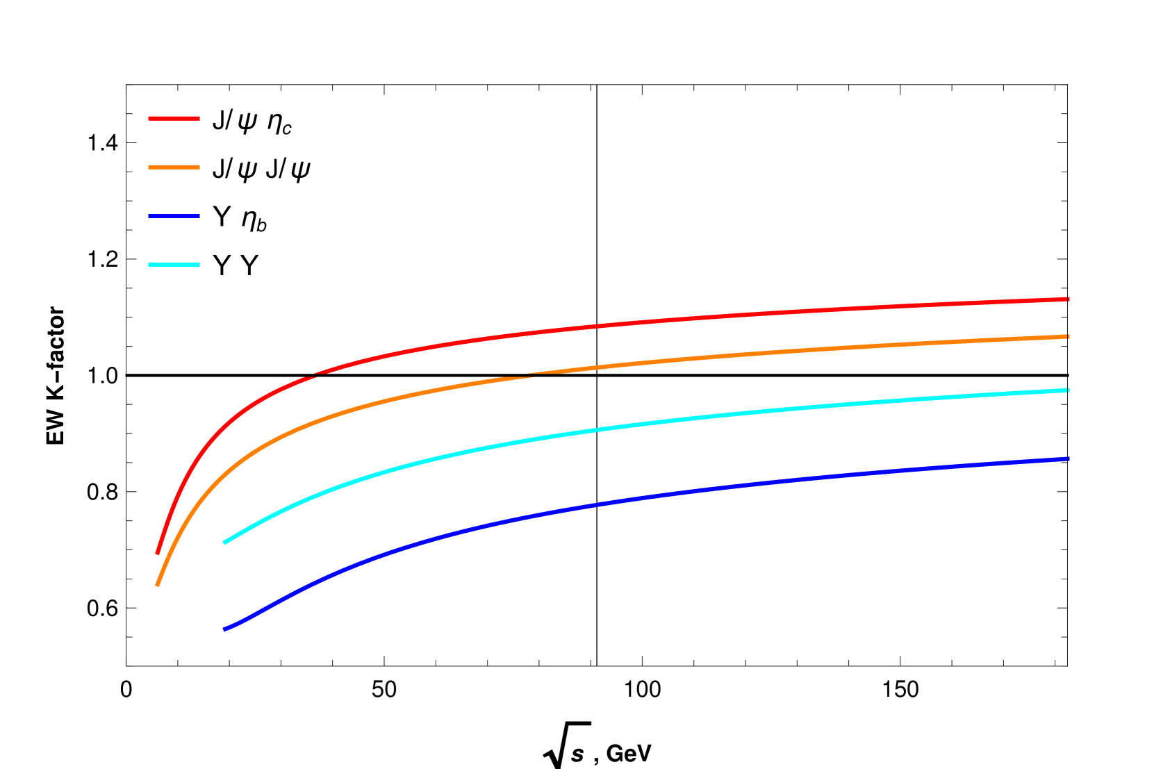
## Chart: EW K-factor vs. √s, GeV
### Overview
The image is a 2D line chart displaying the relationship between the EW K-factor (Electroweak K-factor) and the square root of s (√s), measured in GeV. There are four distinct data series represented by different colored lines: red, orange, blue, and cyan. A horizontal black line is present at EW K-factor = 1.0. A vertical black line is present at √s = 90 GeV.
### Components/Axes
* **X-axis (Horizontal):** √s, GeV (Square root of s, measured in GeV). The axis ranges from 0 to 150, with tick marks at intervals of 50 (0, 50, 100, 150).
* **Y-axis (Vertical):** EW K-factor (Electroweak K-factor). The axis ranges from 0.6 to 1.4, with tick marks at intervals of 0.2 (0.6, 0.8, 1.0, 1.2, 1.4).
* **Legend (Top-Left):**
* Red line: J/ψ ηc
* Orange line: J/ψ J/ψ
* Blue line: Y ηb
* Cyan line: Y Y
* **Horizontal Reference Line:** A black horizontal line is present at EW K-factor = 1.0.
* **Vertical Reference Line:** A black vertical line is present at √s = 90 GeV.
### Detailed Analysis
* **Red Line (J/ψ ηc):** This line starts at approximately 0.7 at √s = 0 and increases rapidly initially, then gradually flattens out to approximately 1.13 at √s = 150.
* (0, 0.7)
* (50, 0.98)
* (100, 1.08)
* (150, 1.13)
* **Orange Line (J/ψ J/ψ):** This line starts at approximately 0.63 at √s = 0 and increases rapidly initially, then gradually flattens out to approximately 1.02 at √s = 150.
* (0, 0.63)
* (50, 0.9)
* (100, 0.98)
* (150, 1.02)
* **Blue Line (Y ηb):** This line starts at approximately 0.56 at √s = 0 and increases gradually, reaching approximately 0.85 at √s = 150.
* (0, 0.56)
* (50, 0.72)
* (100, 0.79)
* (150, 0.85)
* **Cyan Line (Y Y):** This line starts at approximately 0.7 at √s = 0 and increases gradually, reaching approximately 0.95 at √s = 150.
* (0, 0.7)
* (50, 0.83)
* (100, 0.9)
* (150, 0.95)
### Key Observations
* All four lines show an increasing trend as √s increases.
* The red line (J/ψ ηc) has the highest EW K-factor values across the range of √s.
* The blue line (Y ηb) has the lowest EW K-factor values across the range of √s.
* The red and orange lines increase more rapidly at lower values of √s compared to the blue and cyan lines.
* The vertical line at √s = 90 GeV intersects all four data series, providing a reference point for comparison.
* The horizontal line at EW K-factor = 1.0 intersects the red and orange lines.
### Interpretation
The chart illustrates how the EW K-factor varies with the square root of s (√s) for different particle combinations (J/ψ ηc, J/ψ J/ψ, Y ηb, and Y Y). The K-factor is a correction factor used in theoretical calculations, and its dependence on √s provides insights into the underlying physics of these interactions. The fact that all K-factors increase with √s suggests that the corrections become more significant at higher energies. The different behaviors of the lines indicate that the magnitude of these corrections varies depending on the specific particle combination. The reference lines at EW K-factor = 1.0 and √s = 90 GeV provide a basis for comparing the relative magnitudes and trends of the K-factors.