\n
## Line Charts: Training Loss, Perplexity, and C4 Loss vs. Million Sequences
### Overview
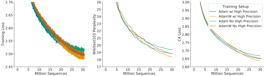
The image presents three line charts arranged horizontally. Each chart depicts the relationship between "Million Sequences" on the x-axis and a different metric on the y-axis: "Training Loss", "Wikitext103 Perplexity", and "C4 Loss". Each chart contains four data series, differentiated by color, representing different "Training Setup" configurations.
### Components/Axes
* **X-axis (all charts):** "Million Sequences", ranging from 0 to 30.
* **Chart 1 Y-axis:** "Training Loss"
* **Chart 2 Y-axis:** "Wikitext103 Perplexity"
* **Chart 3 Y-axis:** "C4 Loss"
### Data Series (Common to all charts)
The following training setups are represented by different colored lines in each chart:
* **Baseline:** (Color not specified in the description)
* **LoRA:** (Color not specified in the description)
* **QLoRA:** (Color not specified in the description)
* **QLoRA + DDP:** (Color not specified in the description)
### Chart-Specific Observations
* **Training Loss Chart:** The chart shows how the training loss decreases as the number of million sequences increases for each training setup.
* **Wikitext103 Perplexity Chart:** This chart illustrates the perplexity on the Wikitext103 dataset as a function of the number of million sequences. Lower perplexity indicates better performance.
* **C4 Loss Chart:** This chart displays the loss on the C4 dataset in relation to the number of million sequences.