\n
## Pie Chart: Quarterly Distribution
### Overview
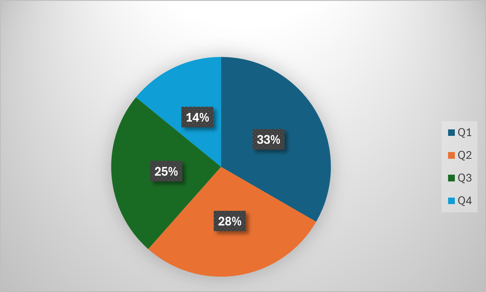
The image displays a pie chart on a light gray background, illustrating the proportional distribution of a whole across four categories labeled Q1, Q2, Q3, and Q4. The chart is divided into four colored segments, each containing a percentage label. A legend is positioned to the right of the chart.
### Components/Axes
* **Chart Type:** Pie Chart.
* **Legend:** Located on the right side of the image. It contains four entries, each with a colored square and a label:
* Dark Blue Square: **Q1**
* Orange Square: **Q2**
* Green Square: **Q3**
* Light Blue Square: **Q4**
* **Data Labels:** Each pie segment contains a dark gray, textured rectangular box with white text displaying a percentage value.
* **Background:** Solid light gray (#f0f0f0 approximate).
### Detailed Analysis
The pie chart is segmented into four parts. The visual size of each segment corresponds directly to its labeled percentage. The segments are arranged clockwise, starting from the top.
1. **Q1 (Dark Blue):**
* **Position:** Occupies the top-right quadrant of the pie, extending slightly into the bottom-right.
* **Value:** **33%**
* **Visual Trend:** This is the largest segment, representing approximately one-third of the total.
2. **Q2 (Orange):**
* **Position:** Located in the bottom-right and bottom-center of the pie.
* **Value:** **28%**
* **Visual Trend:** The second-largest segment, slightly smaller than Q1.
3. **Q3 (Green):**
* **Position:** Located in the bottom-left and left-center of the pie.
* **Value:** **25%**
* **Visual Trend:** The third-largest segment, representing exactly one-quarter of the total.
4. **Q4 (Light Blue):**
* **Position:** Occupies the top-left quadrant of the pie.
* **Value:** **14%**
* **Visual Trend:** The smallest segment, representing less than half the size of the Q1 segment.
**Data Verification:** The sum of the percentages (33% + 28% + 25% + 14%) equals 100%, confirming the chart represents a complete whole.
### Key Observations
* **Dominant Segment:** Q1 (33%) is the clear leader, holding a share 13 percentage points higher than the smallest segment, Q4.
* **Sequential Decline:** There is a general downward trend in share from Q1 to Q4 (33% → 28% → 25% → 14%), with the most significant drop occurring between Q3 and Q4 (an 11 percentage point decrease).
* **Balanced Middle:** Q2 (28%) and Q3 (25%) are relatively close in value, together accounting for over half (53%) of the total.
* **Visual Design:** The chart uses a simple, clean design with a subtle drop shadow on the pie. The percentage labels are clearly legible against their dark backgrounds.
### Interpretation
This pie chart effectively communicates the relative composition of a dataset divided into four quarterly categories. The data suggests a strong performance or allocation in the first quarter (Q1), which diminishes progressively through the year, with the fourth quarter (Q4) contributing the least.
**Possible Contexts:** Without a specific title, the data could represent various metrics such as:
* **Business:** Annual sales revenue, profit distribution, or budget allocation by quarter.
* **Operations:** Project completion rates, resource utilization, or incident reports per quarter.
* **General:** Any cyclical data measured over a standard fiscal or calendar year.
The notable drop in Q4 could indicate seasonal effects, end-of-year budget constraints, or a strategic shift in focus. The near-parity between Q2 and Q3 suggests a stable mid-year period. To derive concrete meaning, the specific metric being measured (e.g., "Revenue," "Customer Sign-ups," "Defect Rate") would need to be provided as a chart title or in accompanying text.