## Pie Chart: Quarterly Distribution
### Overview
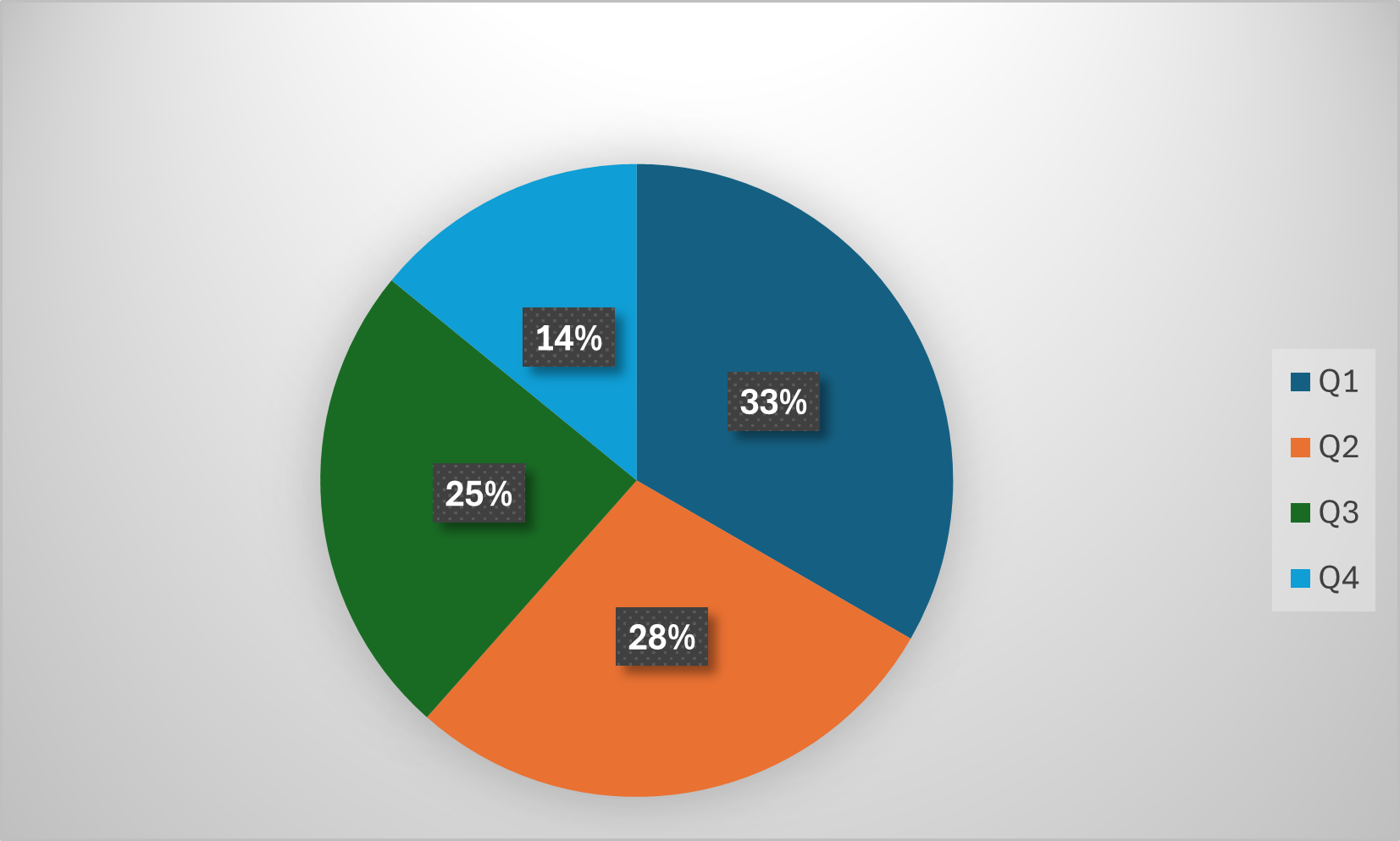
The image is a pie chart displaying the distribution of a whole across four quarters (Q1, Q2, Q3, Q4). Each quarter is represented by a different color, and the percentage each quarter represents is displayed on the chart.
### Components/Axes
* **Chart Type:** Pie Chart
* **Categories:** Q1, Q2, Q3, Q4
* **Colors:**
* Q1: Dark Teal
* Q2: Orange
* Q3: Dark Green
* Q4: Light Blue
* **Legend:** Located on the right side of the chart, listing each quarter and its corresponding color.
### Detailed Analysis
* **Q1 (Dark Teal):** 33%
* **Q2 (Orange):** 28%
* **Q3 (Dark Green):** 25%
* **Q4 (Light Blue):** 14%
### Key Observations
* Q1 has the largest share (33%).
* Q4 has the smallest share (14%).
* The shares of Q2 and Q3 are relatively close (28% and 25%, respectively).
### Interpretation
The pie chart illustrates the relative contribution of each quarter to a whole. Q1 contributes the most, suggesting it may be the most productive or significant quarter. Q4 contributes the least, suggesting it may be the least productive or significant quarter. The differences in percentages between the quarters indicate varying levels of contribution or activity across the year.