\n
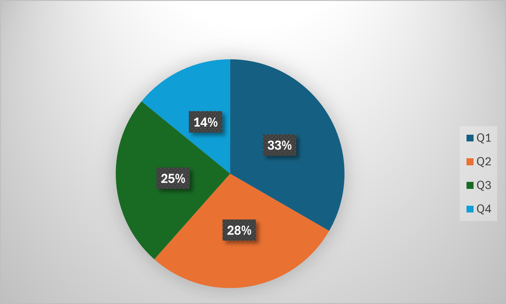
## Pie Chart: Quarterly Distribution
### Overview
The image is a pie chart illustrating the distribution of values across four quarters (Q1, Q2, Q3, and Q4). Each quarter is represented by a different color slice, and the percentage contribution of each quarter is displayed within its corresponding slice.
### Components/Axes
* **Title:** Not explicitly present, but the chart represents a quarterly distribution.
* **Legend:** Located in the top-right corner of the image.
* Q1: Dark Blue
* Q2: Orange
* Q3: Green
* Q4: Light Blue
* **Data Labels:** Percentage values are displayed within each slice of the pie chart.
### Detailed Analysis
The pie chart shows the following data:
* **Q1 (Dark Blue):** 33% - This slice occupies the largest portion of the pie chart, positioned at the top.
* **Q2 (Orange):** 28% - This slice is positioned to the bottom-right of the chart.
* **Q3 (Green):** 25% - This slice is positioned to the bottom-left of the chart.
* **Q4 (Light Blue):** 14% - This slice is positioned to the top-left of the chart and is the smallest slice.
The percentages sum to 100% (33% + 28% + 25% + 14% = 100%).
### Key Observations
* Q1 has the largest share, contributing approximately one-third of the total.
* Q2 and Q3 contribute similar amounts, around 28% and 25% respectively.
* Q4 has the smallest share, at only 14%.
* There is a significant difference between the largest (Q1) and smallest (Q4) contributions.
### Interpretation
The data suggests that the majority of the activity or value is concentrated in the first quarter (Q1). The second and third quarters (Q2 and Q3) contribute substantial portions as well, while the fourth quarter (Q4) lags significantly behind. This could indicate seasonality, a strong start to the year followed by a decline, or other factors influencing the distribution of values across the quarters. Further investigation would be needed to understand the underlying reasons for this pattern. The chart provides a clear visual representation of the relative importance of each quarter.