## Pie Chart: Quarterly Distribution
### Overview
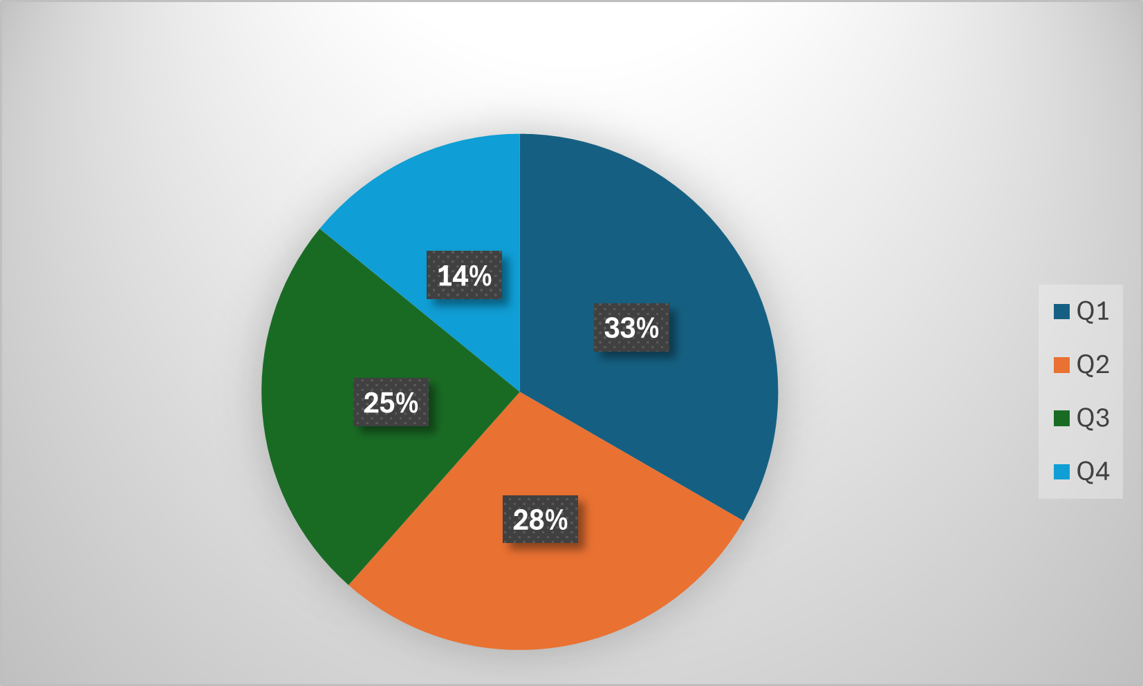
The image displays a pie chart divided into four colored segments, each labeled with a percentage and corresponding to a quarter (Q1–Q4). A legend on the right side maps colors to quarters. The chart visually represents proportional data distribution across four time periods.
### Components/Axes
- **Legend**: Located in the top-right corner, with four entries:
- **Q1**: Dark blue (#003366)
- **Q2**: Orange (#FF6600)
- **Q3**: Green (#006600)
- **Q4**: Light blue (#0099CC)
- **Segments**: Four distinct wedges, each annotated with a percentage:
- Q1: 33% (dark blue)
- Q2: 28% (orange)
- Q3: 25% (green)
- Q4: 14% (light blue)
- **Visual Structure**:
- Segments are arranged clockwise starting from the top (Q1 at 12 o'clock position).
- Percentages are displayed in white text within black rectangular labels inside each segment.
### Detailed Analysis
1. **Q1 (Dark Blue)**: Largest segment at 33%, occupying the top portion of the chart.
2. **Q2 (Orange)**: Second-largest at 28%, positioned below Q1.
3. **Q3 (Green)**: Third-largest at 25%, located to the left of Q2.
4. **Q4 (Light Blue)**: Smallest segment at 14%, placed at the bottom-right.
### Key Observations
- **Dominance of Q1**: Q1 accounts for the largest share (33%), suggesting a peak or priority in this period.
- **Gradual Decline**: Percentages decrease sequentially from Q1 (33%) to Q4 (14%), indicating a potential downward trend.
- **Color Consistency**: Legend colors match segment colors exactly (e.g., Q1’s dark blue aligns with the dark blue wedge).
### Interpretation
The chart likely represents data aggregated over four quarters, such as revenue, project milestones, or resource allocation. The largest allocation to Q1 (33%) could reflect strategic planning, seasonal demand, or fiscal year starts. The progressive reduction in subsequent quarters might indicate diminishing returns, budget exhaustion, or cyclical patterns. However, without contextual labels (e.g., "Revenue," "Project Phases"), the exact nature of the data remains ambiguous. The visual emphasis on Q1 suggests it holds significant importance in the analyzed metric.