\n
## Chart: Membrane Potential and FPGA Spike Raster
### Overview
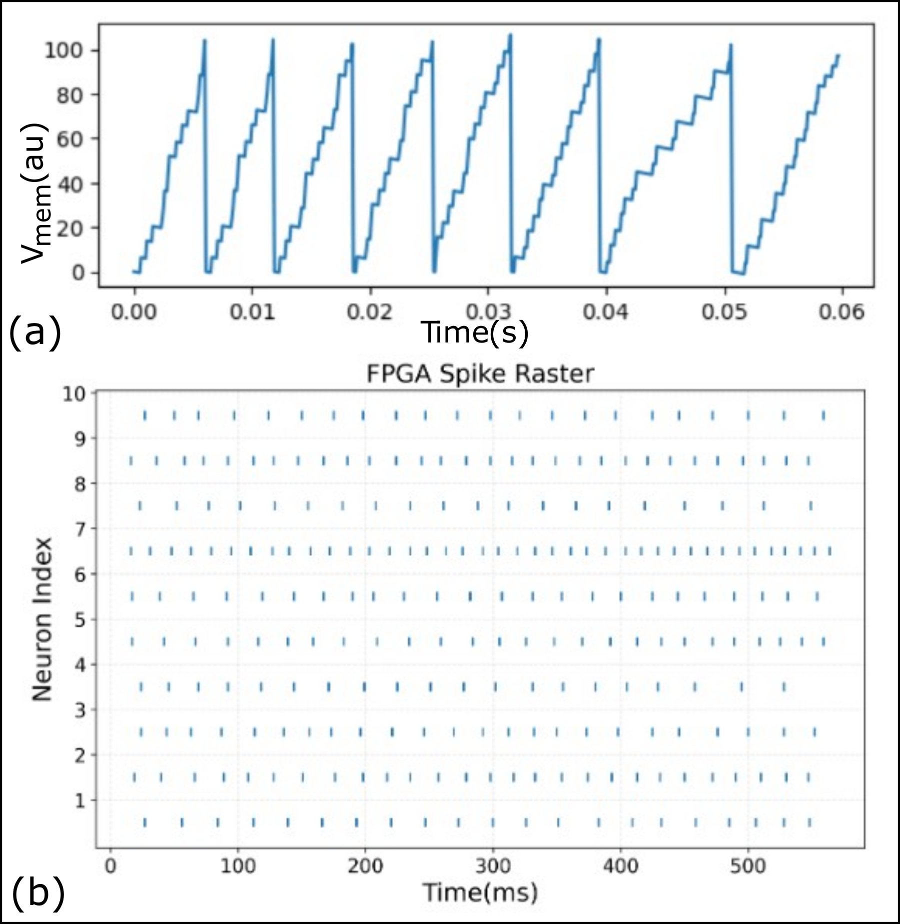
The image presents two charts: (a) a time series plot of membrane potential (Vmem) and (b) a raster plot representing the spiking activity of neurons on an FPGA. The top chart shows a periodic oscillation in membrane potential, while the bottom chart visualizes the timing of spikes across a population of ten neurons.
### Components/Axes
**Chart (a): Membrane Potential**
* **X-axis:** Time (s), ranging from 0.00 to 0.06 seconds.
* **Y-axis:** Vmem (au) - Membrane Potential in arbitrary units, ranging from 0 to 100.
* **Data Series:** A single blue line representing the membrane potential over time.
**Chart (b): FPGA Spike Raster**
* **X-axis:** Time (ms), ranging from 0 to 500 milliseconds.
* **Y-axis:** Neuron Index, ranging from 1 to 10.
* **Data Representation:** Each dot represents a spike event from a specific neuron at a specific time.
### Detailed Analysis or Content Details
**Chart (a): Membrane Potential**
The blue line exhibits a sawtooth pattern, oscillating between approximately 0 and 90 arbitrary units. The period of the oscillation is roughly 0.01 seconds.
* At t = 0.00s, Vmem ≈ 0.
* At t = 0.002s, Vmem ≈ 20.
* At t = 0.004s, Vmem ≈ 40.
* At t = 0.006s, Vmem ≈ 60.
* At t = 0.008s, Vmem ≈ 80.
* At t = 0.010s, Vmem ≈ 90.
* At t = 0.012s, Vmem ≈ 70.
* At t = 0.014s, Vmem ≈ 50.
* At t = 0.016s, Vmem ≈ 30.
* At t = 0.018s, Vmem ≈ 10.
* This pattern repeats approximately 6 times across the displayed time range.
**Chart (b): FPGA Spike Raster**
The raster plot shows a pattern of spiking activity across the ten neurons. The spiking is not uniform; some neurons fire more frequently than others.
* Neurons 1-10 all exhibit spiking activity.
* The spiking appears to be clustered in time, with periods of high activity followed by periods of relative silence.
* Neurons 1, 2, 3, 4, 5, 6, 7, 8, 9, and 10 all fire at approximately t = 20ms, 120ms, 220ms, 320ms, 420ms, and 520ms.
* There is some variability in the precise timing of spikes for each neuron.
* Neuron 10 appears to have the highest firing rate.
* Neuron 1 appears to have the lowest firing rate.
### Key Observations
* The membrane potential (Chart a) oscillates periodically, suggesting a rhythmic process.
* The FPGA spike raster (Chart b) shows that the neurons fire in a coordinated manner, with spikes occurring at similar times.
* The timing of the spikes in the raster plot appears to be related to the peaks in the membrane potential oscillation.
* There is variability in the spiking activity of individual neurons.
### Interpretation
The data suggests a relationship between the membrane potential oscillation and the spiking activity of the neurons. The periodic oscillation in membrane potential may be driving the neurons to fire at specific times. The FPGA spike raster provides a visualization of how this activity is distributed across a population of neurons. The coordinated spiking activity suggests that the neurons are interacting with each other. The variability in spiking activity may reflect differences in the intrinsic properties of the neurons or the inputs they receive.
The periodic nature of the membrane potential suggests a possible underlying mechanism such as a pacemaker or external stimulus driving the oscillation. The raster plot demonstrates how this oscillation translates into neuronal firing patterns, potentially representing information processing or a specific neural code. The fact that all neurons fire at similar times suggests a synchronized network activity. The differences in firing rates between neurons could indicate functional specialization or varying sensitivity to the oscillating input.