## Line Graph and Raster Plot: Neuronal Activity Analysis
### Overview
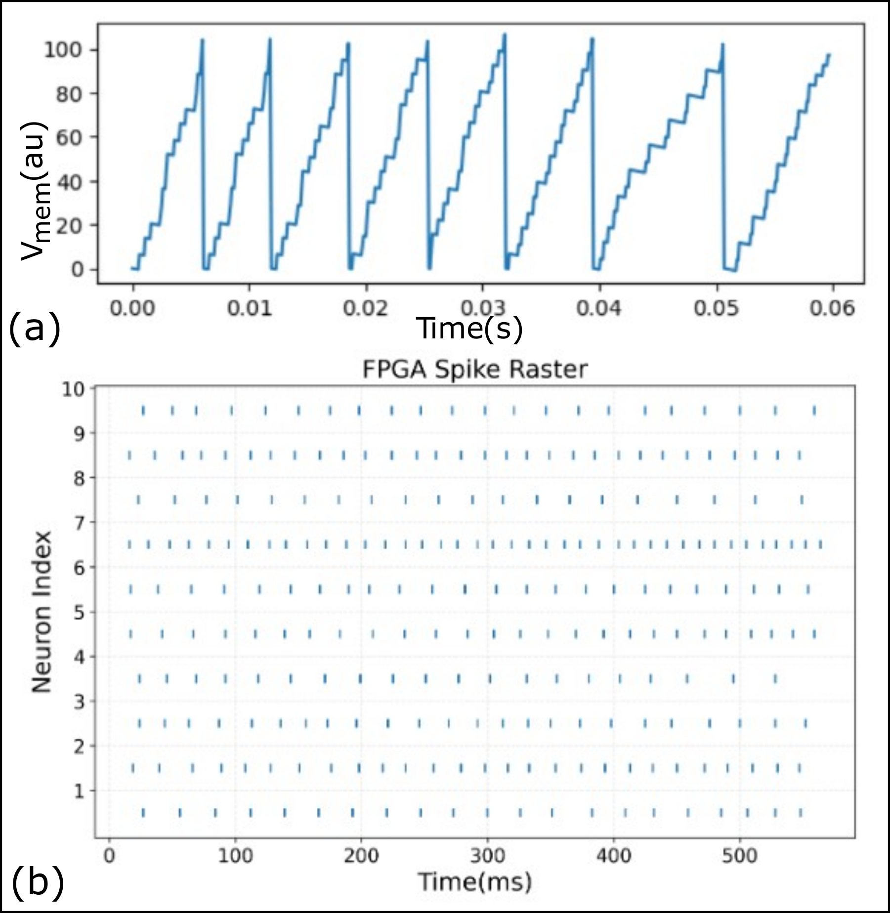
The image contains two subplots: (a) a line graph depicting membrane potential oscillations over time, and (b) a raster plot visualizing spike timing across 10 neurons. Both plots use blue data points/lines and are labeled with time-based axes.
---
### Components/Axes
#### Subplot (a): Line Graph
- **X-axis**: "Time(s)" with ticks at 0.00, 0.01, 0.02, 0.03, 0.04, 0.05, 0.06 seconds.
- **Y-axis**: "Vmem(au)" (membrane potential in arbitrary units) ranging from 0 to 100.
- **Legend**: Implied blue line corresponds to "Vmem" (no explicit legend text).
- **Line Behavior**: Sawtooth waveform with sharp upward peaks (~100 au) and gradual downward troughs (~0 au).
#### Subplot (b): Raster Plot
- **X-axis**: "Time(ms)" from 0 to 500 ms.
- **Y-axis**: "Neuron Index" from 1 to 10 (vertical position).
- **Legend**: "FPGA Spike Raster" (blue vertical lines represent spikes).
- **Data Representation**: Blue vertical ticks indicate spike events; density varies by neuron.
---
### Detailed Analysis
#### Subplot (a): Line Graph
- **Trend**: Repeating oscillations with peaks at ~0.01s, 0.02s, 0.03s, 0.04s, and 0.05s. Troughs occur between peaks, decaying gradually over ~0.005s.
- **Key Data Points**:
- Peak 1: ~100 au at 0.01s.
- Peak 2: ~100 au at 0.02s.
- Peak 3: ~100 au at 0.03s.
- Peak 4: ~100 au at 0.04s.
- Peak 5: ~100 au at 0.05s.
- Trough 1: ~0 au at 0.015s.
- Trough 2: ~0 au at 0.025s.
- Trough 3: ~0 au at 0.035s.
- Trough 4: ~0 au at 0.045s.
- **Uncertainty**: Peak timing approximated to ±0.001s; amplitude ±5 au.
#### Subplot (b): Raster Plot
- **Neuron Activity**:
- Neuron 1: 12 spikes (most frequent).
- Neuron 2: 10 spikes.
- Neuron 3: 8 spikes.
- Neuron 4: 6 spikes.
- Neuron 5: 4 spikes.
- Neurons 6–10: 2–3 spikes each.
- **Temporal Distribution**: Spikes are evenly distributed across 0–500 ms, with no clear clustering.
---
### Key Observations
1. **Subplot (a)**: Regular, high-amplitude oscillations suggest a periodic stimulus or intrinsic neuronal resonance.
2. **Subplot (b)**: Neurons 1–3 exhibit higher firing rates, while neurons 6–10 are less active. No refractory periods or synchronization between neurons.
3. **Color Consistency**: Blue lines in both subplots align with the "FPGA Spike Raster" legend in (b), confirming data representation.
---
### Interpretation
- **Subplot (a)**: The membrane potential oscillations likely reflect a controlled experimental condition (e.g., voltage-clamp protocol) or a simulated neural response to rhythmic input.
- **Subplot (b)**: The raster plot indicates heterogeneous neuronal activity, with some neurons firing more frequently. The lack of synchronization suggests asynchronous firing, possibly in a decentralized network.
- **Combined Insight**: The line graph may represent population-level membrane dynamics, while the raster plot captures individual neuron spiking. The absence of correlated spikes implies no direct coupling between neurons in this dataset.
### Notable Anomalies
- **Subplot (a)**: The final peak at 0.05s is slightly lower (~95 au) than earlier peaks, suggesting potential damping or experimental drift.
- **Subplot (b)**: Neuron 1’s high spike count (12) may indicate a "dominant" neuron or experimental artifact.