\n
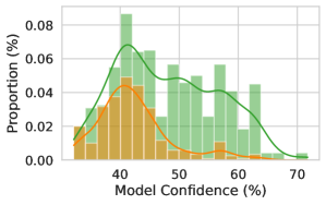
## Histogram with Density Curves: Model Confidence Distribution
### Overview
The image displays a statistical chart comparing the distribution of model confidence scores for two distinct groups or conditions, represented by green and orange colors. The chart combines histograms (bar charts) with overlaid kernel density estimation (KDE) curves to visualize the frequency distribution and probability density of confidence percentages.
### Components/Axes
* **Chart Type:** Histogram with overlaid density curves.
* **X-Axis:**
* **Label:** "Model Confidence (%)"
* **Scale:** Linear scale ranging from approximately 30% to 70%.
* **Major Ticks:** Labeled at 40, 50, 60, 70.
* **Minor Ticks:** Appear at 5-unit intervals (e.g., 35, 45, 55, 65).
* **Y-Axis:**
* **Label:** "Proportion (%)"
* **Scale:** Linear scale ranging from 0.00 to 0.08 (representing 0% to 8%).
* **Major Ticks:** Labeled at 0.00, 0.02, 0.04, 0.06, 0.08.
* **Data Series (Legend Implied by Color):**
* **Green Series:** Consists of semi-transparent green histogram bars and a solid green density curve.
* **Orange Series:** Consists of semi-transparent orange histogram bars and a solid orange density curve.
* **Spatial Grounding:** The green series is consistently positioned behind the orange series where they overlap. The green bars and curve are generally taller and extend further to the right (higher confidence) than the orange ones.
### Detailed Analysis
**Green Series (Bars and Curve):**
* **Trend:** The distribution is right-skewed, with a peak in the lower-middle confidence range and a long tail extending towards higher confidence values.
* **Peak:** The highest proportion (mode) occurs in the bin centered approximately at **42-43% confidence**, with a proportion value of about **0.085 (8.5%)**.
* **Shape:** The density curve rises steeply from ~30%, peaks around 42%, then declines gradually. It shows a secondary, smaller hump or plateau between **50% and 60% confidence** before tapering off near 70%.
* **Range:** The visible data spans from just below 30% to just above 70% confidence.
**Orange Series (Bars and Curve):**
* **Trend:** The distribution is also right-skewed but more concentrated at lower confidence levels compared to the green series.
* **Peak:** The highest proportion occurs in the bin centered approximately at **37-38% confidence**, with a proportion value of about **0.045 (4.5%)**.
* **Shape:** The density curve peaks earlier (at a lower confidence value) than the green curve and declines more rapidly. It has a much smaller presence beyond 50% confidence.
* **Range:** The visible data spans from just below 30% to approximately 60% confidence, with very low proportions above 55%.
**Comparative Points:**
* At confidence levels below ~45%, the orange series generally has a higher proportion than the green series.
* At confidence levels above ~45%, the green series has a significantly higher proportion than the orange series.
* The green distribution has a much heavier right tail, indicating a non-trivial proportion of predictions with high confidence (55-70%).
### Key Observations
1. **Bimodality Hint:** The green density curve suggests a potential bimodal distribution, with a primary peak near 42% and a secondary, broader mode between 50-60%.
2. **Divergent Distributions:** The two groups have clearly different confidence profiles. The "green" group produces more high-confidence predictions, while the "orange" group's predictions are more concentrated in the low-to-mid confidence range.
3. **Overlap Zone:** The highest overlap and competition between proportions occurs in the 35-45% confidence band.
4. **Uncertainty:** Exact bin heights and curve values are estimated from the visual representation. The y-axis "Proportion (%)" likely represents the relative frequency of predictions falling within each confidence bin.
### Interpretation
This chart is a diagnostic tool for evaluating model calibration or comparing two models/datasets. It answers: "How confident is the model in its predictions, and how is that confidence distributed?"
* **What the data suggests:** The green group appears to be a more "confident" model or a dataset where the model is more certain. However, high confidence does not necessarily equate to high accuracy; without a corresponding accuracy plot, we cannot assess calibration (whether a 70% confidence prediction is correct 70% of the time).
* **Relationship between elements:** The histogram bars show the empirical frequency of predictions in discrete confidence bins. The KDE curves smooth this data to estimate the underlying probability density function, making it easier to compare the shapes of the two distributions.
* **Notable anomalies/investigation:** The secondary hump in the green curve is a critical feature. It indicates a subpopulation of predictions where the model is moderately-to-highly confident (50-60%). An investigator should ask: What features or classes are associated with this secondary group? Are they correct? The stark difference between the green and orange distributions warrants investigation into the underlying causes—differences in model architecture, training data, or the inherent difficulty of the tasks assigned to each group. The chart reveals that the groups are not just different in average confidence, but in the entire shape of their confidence profiles.