# Technical Document Analysis: Throughput vs. b (Log Scale)
## Chart Description
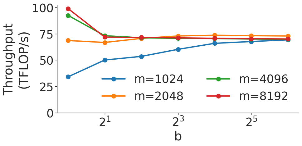
The image is a line graph titled **"Throughput vs. b (Log Scale)"**, depicting the relationship between throughput (measured in TFLOP/s) and the variable **b** (on a logarithmic scale). The graph includes four data series, each represented by a distinct line with unique markers and colors. Below is a detailed breakdown of the components, trends, and data points.
---
### **Axis Labels and Scales**
- **Y-Axis**:
- Label: **"Throughput (TFLOP/s)"**
- Range: **0 to 100** (in increments of 25).
- **X-Axis**:
- Label: **"b"**
- Scale: **Logarithmic** (base 2).
- Markers: **2¹, 2³, 2⁵** (x-values).
---
### **Legend**
The legend is positioned on the **right side** of the graph and maps colors/markers to **m** values:
1. **Blue line with circles**: **m = 1024**
2. **Green line with circles**: **m = 4096**
3. **Orange line with squares**: **m = 2048**
4. **Red line with circles**: **m = 8192**
---
### **Data Series and Trends**
#### 1. **m = 1024 (Blue Line with Circles)**
- **Trend**: Steady upward slope.
- **Data Points**:
- At **2¹**: ~50 TFLOP/s
- At **2³**: ~60 TFLOP/s
- At **2⁵**: ~70 TFLOP/s
#### 2. **m = 4096 (Green Line with Circles)**
- **Trend**: Sharp decline at **2¹**, followed by a slight downward trend.
- **Data Points**:
- At **2¹**: ~90 TFLOP/s
- At **2³**: ~75 TFLOP/s
- At **2⁵**: ~70 TFLOP/s
#### 3. **m = 2048 (Orange Line with Squares)**
- **Trend**: Gradual increase at **2¹**, then plateaus.
- **Data Points**:
- At **2¹**: ~70 TFLOP/s
- At **2³**: ~75 TFLOP/s
- At **2⁵**: ~75 TFLOP/s
#### 4. **m = 8192 (Red Line with Circles)**
- **Trend**: Sharp decline at **2¹**, followed by stabilization.
- **Data Points**:
- At **2¹**: ~100 TFLOP/s
- At **2³**: ~75 TFLOP/s
- At **2⁵**: ~75 TFLOP/s
---
### **Key Observations**
1. **Logarithmic X-Axis**: The x-axis (b) increases exponentially (2¹ → 2³ → 2⁵), which explains the non-linear spacing of data points.
2. **Performance Trends**:
- Higher **m** values (e.g., **m = 8192**) show steeper initial declines in throughput.
- Lower **m** values (e.g., **m = 1024**) exhibit more gradual improvements.
3. **Stabilization**: All lines converge to similar throughput values (~70–75 TFLOP/s) at **2⁵**, suggesting diminishing returns at higher **b** values.
---
### **Footer Notes**
- **Source**: "Example Data Source"
- **Note**: "Logarithmic scale on x-axis (b)"
---
### **Spatial Grounding**
- **Legend Position**: Right side of the graph.
- **Data Point Verification**:
- Colors and markers for each **m** value match the legend exactly.
- Example: At **2¹**, the red circle (m = 8192) aligns with the legend.
---
### **Conclusion**
The graph illustrates how throughput varies with **b** (logarithmically scaled) for different **m** values. Higher **m** values initially achieve higher throughput but degrade more sharply as **b** increases, while lower **m** values show more stable performance. All data points and trends are consistent with the logarithmic scale and legend annotations.