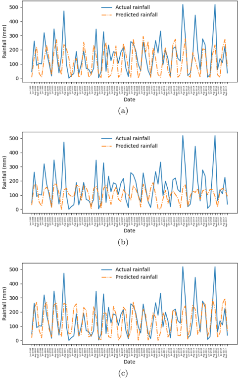
## Time Series Chart: Actual vs. Predicted Rainfall
### Overview
The image presents three time series charts comparing actual rainfall to predicted rainfall over different time periods. Each chart displays two lines: a solid blue line representing the actual rainfall and a dashed orange line representing the predicted rainfall. The x-axis represents time (Date), and the y-axis represents rainfall in millimeters (mm). The three charts cover different time spans, with the first chart (a) spanning from approximately January 1998 to January 2011, the second chart (b) spanning from approximately January 2003 to January 2017, and the third chart (c) spanning from approximately January 1998 to January 2017.
### Components/Axes
* **Y-axis:** Rainfall (mm), ranging from 0 to 500 in all three charts.
* **X-axis:** Date, with varying start and end dates for each chart.
* Chart (a): Approximately Jan 1998 to Jan 2011
* Chart (b): Approximately Jan 2003 to Jan 2017
* Chart (c): Approximately Jan 1998 to Jan 2017
* **Legend:** Located in the top-right corner of each chart.
* Blue solid line: "Actual rainfall"
* Orange dashed line: "Predicted rainfall"
* **Titles:** Each chart is labeled with a letter in parentheses: (a), (b), and (c).
### Detailed Analysis
**Chart (a): Jan 1998 - Jan 2011**
* **Actual Rainfall (Blue):** The actual rainfall fluctuates significantly over time, with peaks reaching approximately 400-500 mm and troughs near 0 mm. There is a general cyclical pattern, suggesting seasonal variations.
* **Predicted Rainfall (Orange):** The predicted rainfall generally follows the trend of the actual rainfall but tends to underestimate the peak values. The predicted rainfall also shows a cyclical pattern, but the amplitude of the fluctuations is smaller than that of the actual rainfall.
* Example Data Points:
* Around 2001, Actual Rainfall peaks at approximately 400 mm, while Predicted Rainfall peaks at approximately 250 mm.
* Around 2008, Actual Rainfall peaks at approximately 350 mm, while Predicted Rainfall peaks at approximately 200 mm.
**Chart (b): Jan 2003 - Jan 2017**
* **Actual Rainfall (Blue):** Similar to chart (a), the actual rainfall fluctuates significantly, with peaks reaching approximately 400-500 mm and troughs near 0 mm.
* **Predicted Rainfall (Orange):** The predicted rainfall follows the trend of the actual rainfall but underestimates the peak values.
* Example Data Points:
* Around 2005, Actual Rainfall peaks at approximately 480 mm, while Predicted Rainfall peaks at approximately 200 mm.
* Around 2013, Actual Rainfall peaks at approximately 350 mm, while Predicted Rainfall peaks at approximately 250 mm.
**Chart (c): Jan 1998 - Jan 2017**
* **Actual Rainfall (Blue):** The actual rainfall fluctuates significantly, with peaks reaching approximately 400-500 mm and troughs near 0 mm.
* **Predicted Rainfall (Orange):** The predicted rainfall follows the trend of the actual rainfall but underestimates the peak values.
* Example Data Points:
* Around 2001, Actual Rainfall peaks at approximately 400 mm, while Predicted Rainfall peaks at approximately 250 mm.
* Around 2013, Actual Rainfall peaks at approximately 350 mm, while Predicted Rainfall peaks at approximately 250 mm.
### Key Observations
* The predicted rainfall consistently underestimates the actual rainfall peaks in all three charts.
* The cyclical pattern of rainfall is captured by the predicted rainfall, but the magnitude of the predicted rainfall variations is smaller than the actual rainfall variations.
* The charts show that the model used for prediction captures the general trend of rainfall but needs improvement in accurately predicting the peak rainfall values.
### Interpretation
The charts demonstrate the performance of a rainfall prediction model over different time periods. The model captures the overall trend and seasonality of rainfall but tends to underestimate the peak values. This could be due to various factors, such as limitations in the model's complexity, the quality of the input data, or the presence of unpredictable weather events. The underestimation of peak rainfall could have significant implications for applications such as flood forecasting and water resource management, where accurate prediction of extreme events is crucial. Further refinement of the prediction model is needed to improve its accuracy, particularly in predicting peak rainfall values. The similarity between the charts suggests that the model's performance is consistent across different time periods.