TECHNICAL ASSET FINGERPRINT
724e818081c1a40ce4f57692
Click to view fullscreen
Press ESC or click to close
FOUND IN PAPERS
EXPERT: healer-alpha-free VERSION 1
RUNTIME: free/openrouter/healer-alpha
INTEL_VERIFIED
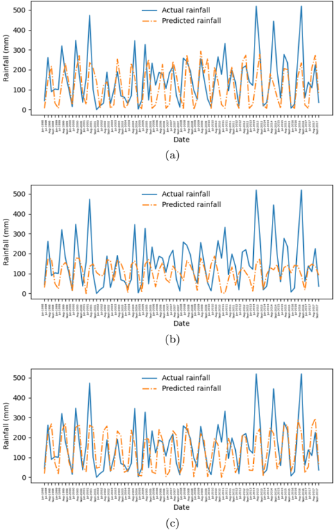
## Time Series Line Charts: Actual vs. Predicted Rainfall Comparison
### Overview
The image contains three vertically stacked time series line charts, labeled (a), (b), and (c). Each chart plots "Actual rainfall" and "Predicted rainfall" over the same date range. The charts appear to compare the performance of different predictive models or the same model under different conditions against observed rainfall data. The overall visual impression is that the predicted rainfall (orange dashed line) generally follows the pattern of the actual rainfall (blue solid line) but with varying degrees of accuracy in capturing peak magnitudes.
### Components/Axes
* **Chart Type:** Three separate time series line charts.
* **Subplot Labels:** (a) - Top chart, (b) - Middle chart, (c) - Bottom chart. These are centered below each respective chart.
* **X-Axis (All Charts):**
* **Label:** "Date"
* **Scale:** Categorical, showing specific dates. The dates are densely packed and rotated vertically for readability.
* **Date Range:** Starts at "1-Jan-00" and ends at "19-Dec-00", indicating the data spans the year 2000. Dates are listed at irregular intervals (e.g., 1-Jan-00, 15-Jan-00, 29-Jan-00, 12-Feb-00, etc.).
* **Y-Axis (All Charts):**
* **Label:** "Rainfall (mm)"
* **Scale:** Linear, from 0 to 500 mm.
* **Major Ticks:** 0, 100, 200, 300, 400, 500.
* **Legend (All Charts):**
* **Position:** Top-right corner within each chart's plot area.
* **Items:**
1. **Actual rainfall:** Represented by a solid blue line.
2. **Predicted rainfall:** Represented by a dashed orange line.
### Detailed Analysis
**Chart (a) - Top:**
* **Trend Verification:** The blue "Actual rainfall" line shows high volatility with numerous sharp peaks and troughs throughout the year. The orange "Predicted rainfall" line also shows high volatility and closely tracks the timing of the peaks and troughs of the actual data.
* **Data Points & Comparison:**
* The model captures the timing of major rainfall events well.
* It frequently underestimates the magnitude of the highest peaks. For example, several actual peaks exceed 400 mm (e.g., around late March, early June, late July, and mid-October), while the corresponding predicted peaks often only reach 200-300 mm.
* The model also appears to overestimate some lower rainfall periods, with the orange line often sitting above the blue line during troughs.
* The fit appears relatively consistent throughout the year, without a clear period of significantly better or worse performance.
**Chart (b) - Middle:**
* **Trend Verification:** Similar to chart (a), both lines are highly volatile. The correlation in timing between actual and predicted peaks remains strong.
* **Data Points & Comparison:**
* The underestimation of peak rainfall is more pronounced here than in chart (a). The highest actual peaks (again near 500 mm in late July and mid-October) are met with predicted values that are significantly lower, often below 300 mm.
* The predicted line (orange) appears slightly smoother or less extreme in its fluctuations compared to the actual line (blue), suggesting the model may be damping the most extreme values.
* The general pattern of overestimation during low-rainfall periods persists.
**Chart (c) - Bottom:**
* **Trend Verification:** The pattern of strong temporal correlation continues. The predicted line follows the up-and-down movement of the actual data very closely.
* **Data Points & Comparison:**
* The performance in capturing peak magnitudes appears slightly improved compared to chart (b), but still shows underestimation. Some predicted peaks reach closer to the 300-400 mm range where actual peaks are near 500 mm.
* The alignment during the middle of the year (roughly May through August) seems particularly tight in terms of timing, though magnitude discrepancies remain.
* The model continues to show a tendency to predict higher rainfall than observed during the lowest points of the series.
### Key Observations
1. **Consistent Temporal Alignment:** Across all three charts, the predicted rainfall model is highly effective at identifying *when* rainfall events occur. The peaks and troughs of the orange and blue lines are almost perfectly synchronized in time.
2. **Systematic Magnitude Bias:** The primary discrepancy is in the *amount* of rainfall. The model consistently underestimates the volume of the heaviest rainfall events and often overestimates the volume during dry periods.
3. **Model Comparison:** While all three models (a, b, c) share the same fundamental behavior, chart (b) shows the most severe underestimation of peak events. Charts (a) and (c) appear somewhat similar, with (c) possibly showing a marginally better capture of peak heights in the latter half of the year.
4. **Data Characteristics:** The actual rainfall data for this location in the year 2000 is characterized by high variability and extreme events, with multiple days exceeding 400 mm and a few approaching the 500 mm limit of the chart.
### Interpretation
The data demonstrates a predictive model (or models) that has successfully learned the temporal patterns and seasonality of rainfall for this specific location and year. The strong synchronization indicates the input features used by the model are highly relevant for determining the timing of weather systems.
However, the systematic underestimation of peak rainfall suggests a limitation. This could be due to several factors: the model may be trained on data that doesn't include enough extreme events, it may be using a loss function that penalizes large errors less severely (e.g., Mean Absolute Error vs. Root Mean Square Error), or the physical processes driving the most extreme precipitation might be underrepresented in the model's architecture or input data.
The overestimation during low-rainfall periods is a common artifact in regression models, which often regress toward the mean. This "conservative" prediction behavior means the model is better at saying "it will rain" than "it will not rain," and better at predicting moderate rain than extreme deluges or complete dryness.
For a technical document, this analysis suggests that while the model is reliable for forecasting the *occurrence* of rain, it should not be trusted for precise *quantitative* predictions of extreme rainfall events, which are critical for flood forecasting and infrastructure planning. Further model development should focus on improving the representation of extreme value distributions.
DECODING INTELLIGENCE...