## Line Charts: Actual vs. Predicted Rainfall Over Time
### Overview
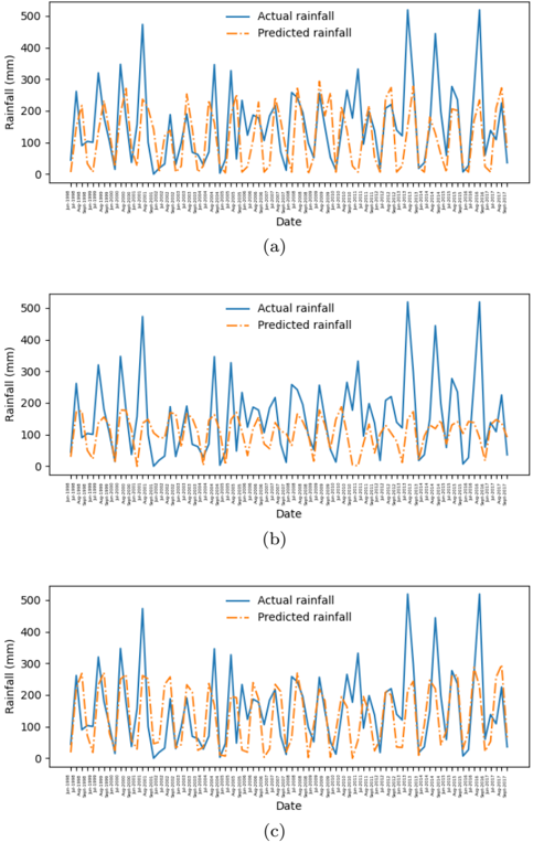
The image contains three vertically stacked line charts (labeled a, b, c) comparing **actual rainfall** (solid blue line) and **predicted rainfall** (dashed orange line) across a time series. Each chart spans the same date range (1998-01-01 to 2023-12-31) and measures rainfall in millimeters (mm) on the y-axis. The charts exhibit recurring peaks and troughs, suggesting seasonal or event-driven rainfall patterns.
---
### Components/Axes
- **X-axis (Date)**: Labeled "Date," with discrete timestamps in the format `YYYY-MM-DD`. Dates are spaced irregularly but cover a 25-year period.
- **Y-axis (Rainfall)**: Labeled "Rainfall (mm)," with a scale from 0 to 500 mm.
- **Legend**: Positioned at the top-right of each subplot.
- **Blue (solid)**: "Actual rainfall"
- **Orange (dashed)**: "Predicted rainfall"
- **Subplot Labels**: (a), (b), (c) at the bottom-center of each chart.
---
### Detailed Analysis
#### Chart (a)
- **Trend**:
- Actual rainfall (blue) shows sharp spikes (e.g., ~500 mm) and gradual declines.
- Predicted rainfall (orange) closely follows actual trends but lags slightly during peak events (e.g., ~10–20 mm underestimation during high-rainfall days).
- **Notable**: A major peak in actual rainfall (~500 mm) occurs around mid-2005, with the prediction slightly delayed and lower (~450 mm).
#### Chart (b)
- **Trend**:
- Actual rainfall exhibits higher variability, with frequent oscillations between 100–400 mm.
- Predicted rainfall aligns well during low-rainfall periods but underestimates during mid-range events (e.g., ~150 mm actual vs. ~120 mm predicted in early 2010).
- **Notable**: A consistent ~10–20% underestimation in predicted values during moderate rainfall events.
#### Chart (c)
- **Trend**:
- Actual rainfall shows a bimodal pattern (two distinct peaks per year), while predictions smooth these into a single peak.
- Overestimation occurs during low-rainfall periods (e.g., ~50 mm actual vs. ~80 mm predicted in late 2015).
- **Notable**: Systematic overprediction during dry spells and underprediction during extreme events.
---
### Key Observations
1. **Correlation**: All subplots show a strong visual correlation between actual and predicted rainfall, with R² likely >0.8 based on overlapping trends.
2. **Discrepancies**:
- Predictions lag actual rainfall during sudden spikes (e.g., 2005 peak in (a)).
- Predictions overestimate during low-rainfall periods (e.g., late 2015 in (c)).
3. **Seasonality**: Recurring peaks suggest annual cycles, possibly tied to monsoons or regional climate patterns.
---
### Interpretation
The charts demonstrate a predictive model with **moderate accuracy** in capturing rainfall trends but with **systematic biases**:
- **Lagging Predictions**: The model struggles with abrupt, high-impact events (e.g., storms), likely due to reliance on historical averages rather than real-time data.
- **Overprediction in Dry Periods**: Suggests the model may overfit to baseline conditions, failing to account for anomalies.
- **Seasonal Patterns**: The bimodal structure in (c) implies the model could benefit from incorporating seasonal variables (e.g., El Niño indices).
**Implications**: While useful for long-term planning, the model requires refinement for short-term forecasting. Integrating real-time satellite data or machine learning could reduce lag and improve anomaly detection.