\n
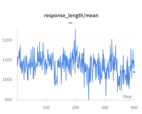
## Line Chart: Mean Response Length Over Steps
### Overview
The image displays a line chart tracking the mean response length (likely in tokens or characters) over a series of training or evaluation steps. The chart shows high volatility in the metric, with no strong long-term upward or downward trend, but significant short-term fluctuations.
### Components/Axes
* **Chart Title:** `response_length/mean` (centered at the top).
* **Y-Axis:** Vertical axis on the left. It is labeled with numerical values but lacks a descriptive title (e.g., "Mean Length"). The scale runs from **900** at the bottom to **1200** at the top, with major tick marks at 900, 1000, 1100, and 1200.
* **X-Axis:** Horizontal axis at the bottom. It is labeled **"Step"** (bottom-right corner). The scale runs from **0** to **400**, with major tick marks at 100, 200, 300, and 400.
* **Legend:** Located at the top-center, just below the title. It consists of a single entry: a short, horizontal blue line segment. **There is no accompanying text label** for this data series. Based on the chart title, the blue line represents the `response_length/mean`.
* **Data Series:** A single, highly variable blue line plotted across the chart area.
### Detailed Analysis
* **Trend Verification:** The blue line exhibits a **highly volatile, oscillating pattern**. It does not show a consistent monotonic trend (steady increase or decrease). Instead, it fluctuates rapidly around a central band.
* **Key Data Points & Ranges:**
* **Central Tendency:** The line primarily oscillates within the range of approximately **1000 to 1150**.
* **Notable Peak:** The highest point on the chart occurs near **Step 200**, where the value spikes to approximately **1250** (above the 1200 grid line).
* **Notable Trough:** The lowest point occurs near **Step 250**, where the value dips to approximately **900** (touching the bottom axis line).
* **Starting Point:** At Step 0, the value begins near **1100**.
* **Ending Point:** At Step 400, the value ends near **1050**.
* **Volatility:** The line shows frequent, sharp changes in direction, indicating high variance in the mean response length from one step to the next.
### Key Observations
1. **High Variance:** The most striking feature is the noise or volatility in the metric. The mean response length is not stable across steps.
2. **Absence of Clear Trend:** Over the 400 steps shown, there is no visually obvious learning curve (e.g., consistently increasing length). The process appears to be in a state of dynamic equilibrium.
3. **Extreme Outliers:** The peak near step 200 (~1250) and the trough near step 250 (~900) are significant outliers compared to the typical operating range of 1000-1150.
4. **Missing Legend Label:** The legend provides a color key but no textual description for the data series, which is a minor documentation gap.
### Interpretation
This chart likely visualizes a metric from a machine learning or iterative system process, such as the average length of outputs generated by a model during training or evaluation.
* **What the data suggests:** The high volatility indicates that the factor controlling response length (e.g., model parameters, prompt complexity, decoding settings) is either not being optimized for this metric or is inherently unstable. The system is not converging toward a consistent output length.
* **How elements relate:** The "Step" axis represents progression through time or iterations. The "response_length/mean" is the measured outcome at each step. The lack of a trend suggests that whatever process is running is not systematically encouraging longer or shorter responses.
* **Notable anomalies:** The sharp peak and trough around steps 200-250 are critical points for investigation. They could correspond to specific events in the process: a change in data batch, a hyperparameter adjustment, a system glitch, or the model encountering an unusual input that triggered atypically long or short responses.
* **Practical implication:** If the goal is to control or stabilize response length, this chart shows the current process is failing to do so. The next steps would involve diagnosing the cause of the variance (e.g., analyzing the data or conditions at the outlier steps) and implementing measures to reduce noise if stability is desired.